Table of Contents >> Show >> Hide
- Tip #1: Think Modular and Streamlined (So It Feels Built-In)
- Tip #2: Elevate Your Baskets (Because Plastic Screams “Basement”)
- Tip #3: Skip Furniture Sets (Matchy-Matchy Isn’t the Same as Designer)
- Tip #4: Add Art (So Storage Feels Like Decor, Not a Utility Closet)
- Tip #5: Take Your Own Style Approach (But Curate It Like a Pro)
- Tip #6: Weave in Accessories (The Details Are the “Luxury Tax”)
- Putting It All Together: A Quick “Expensive Storage” Checklist
- Conclusion
- Real-World Experiences: What Actually Works (and What Doesn’t)
The living room is where life happensmovie nights, snack plates, packages you swear you’ll break down later, and the mysterious
collection of remotes that multiply like gremlins. Storage is supposed to help, but somehow it can also make a room feel cheaper:
mismatched bins, overloaded shelves, and furniture that looks like it was “added” instead of designed.
The good news? “Expensive-looking” storage isn’t about buying the priciest cabinet on the internet. It’s about intention:
clean lines, a cohesive plan, and a few upgrades that read customeven if your budget is more “weekday happy hour” than “penthouse bar.”
Below are six designer-style moves that make living room storage look elevated, tailored, and honestly… kind of smug (in a good way).
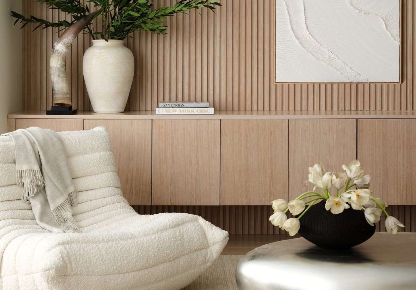
Tip #1: Think Modular and Streamlined (So It Feels Built-In)
Designers love storage that looks like it belongs to the architecture, not like it wandered in carrying a coupon. The fastest way to
get that custom vibe is to use modular piecesthen make them feel continuous and intentional.
Why this looks expensive
High-end rooms often have built-ins or furniture that reads as one “installation.” Long, low storage and repeated units create calm,
symmetry, and that “of course this was planned” energy.
How to do it
- Go low and long: A wide media console (or two identical cabinets side-by-side) looks more architectural than a single narrow piece.
- Repeat shapes: Two matching units (same height and depth) feel deliberate; two random pieces feel like roommates.
- Close the gaps: If you’re using modular cabinets, add filler strips or trim so there’s no awkward space collecting dust and regret.
- Commit to alignment: Tops line up. Shelves line up. Hardware lines up. “Close enough” is for darts, not design.
- Hide cords: Cable clutter is the fastest way to turn “luxury lounge” into “electronics aisle.” Use cord covers or route cables behind furniture.
Example you can copy
Try two matching door-front cabinets under a wall-mounted TV. Center them, add a single oversized tray for remotes, and place two
table lampsone on each endto create a balanced “built-in” moment. Suddenly it feels like a designer planned your Saturday nights.
Budget-friendly shortcut
If custom built-ins aren’t happening, don’t panic. Use modular cabinets and “finish” them: add trim, caulk seams, and paint the entire
unit a single color (especially one that complements the wall). The goal is to erase the “flat-pack” vibe and replace it with “custom millwork.”
Tip #2: Elevate Your Baskets (Because Plastic Screams “Basement”)
Baskets are a designer’s secret weapon: they hide clutter, soften hard lines, and add texture. But not all baskets are created equal.
The wrong ones look like you panic-bought them five minutes before guests arrived. (No judgment. We’ve all been there.)
Why this looks expensive
High-end rooms layer materialswood, woven fibers, leather, metal, and linen. Premium-looking baskets add warmth and texture while
keeping “stuff” out of sight. That combination reads curated, not chaotic.
How to do it
- Choose a matching “basket family”: Same tone, same weave, same silhouette. Variety is fun; visual noise is not.
- Upgrade the material: Think seagrass, rattan, water hyacinth, felt, canvas, or structured fabric bins with crisp edges.
- Go lidded where possible: Lids instantly make storage feel more polished (and less “everything dump zone”).
- Add one chic label system: Leather tags, simple clip labels, or neat printed labelskeep it consistent and clean.
- Size with purpose: A too-small basket looks fussy; a too-big one becomes a black hole. Match the scale to the shelf or cube.
Example you can copy
On open shelves, use three matching woven baskets on the bottom row for toys, extra throw blankets, and “stuff we need but don’t want to see.”
On upper shelves, switch to smaller fabric bins for cords and controllers. It’s the same ideajust scaled and styled.
Budget-friendly shortcut
If you already own mismatched baskets, unify them with a simple trick: add identical label tags, or choose one neutral tone to repeat
(like all warm natural or all black). You’re not replacing everythingyou’re giving it a coordinated costume.
Tip #3: Skip Furniture Sets (Matchy-Matchy Isn’t the Same as Designer)
You know that living room “collection” where everything matchesthe console, the side tables, the shelving unitlike it arrived as a
group project? It can look flat fast. Designers usually mix pieces on purpose so a room feels layered and collected over time.
Why this looks expensive
A curated mix suggests you invested thoughtfully, not impulsively. High-end spaces often combine different finishes and eras while
keeping the overall palette cohesive.
How to do it
- Pick one “anchor” finish: For example, warm wood or matte black. Then repeat it in small doses (frames, hardware, lamp bases).
- Mix storage types: Pair one closed cabinet for hiding clutter with one open shelf for display. Balance is what makes it feel designed.
- Vary the visual weight: A chunky cabinet + airy shelving works better than two heavy pieces competing for attention.
- Keep heights intentional: If two storage pieces are different heights, make it look deliberateadd art or lighting to bridge the gap.
Example you can copy
Combine a walnut media console (warm, grounded) with painted floating shelves (light, airy). Tie them together with two matching brass
picture frames and a single ceramic vase in a similar warm tone. Nothing “matches,” but everything belongs.
Budget-friendly shortcut
If you already have a matching set, you can still fix the “showroom” vibe: swap hardware, add a contrasting lamp or art piece, and
introduce texture (woven baskets, boucle pillow, linen shade). It’s like giving your furniture a personality.
Tip #4: Add Art (So Storage Feels Like Decor, Not a Utility Closet)
Expensive rooms don’t treat storage like a necessary evilthey treat it like part of the design. The easiest way to do that is to
layer art around and within your storage zones.
Why this looks expensive
Art instantly elevates function into style. It also pulls attention upward, making storage feel integrated and curated rather than
purely practical.
How to do it
- Use one oversized piece above low storage: A large framed print or canvas over a console reads “gallery,” not “TV stand.”
- Lean art on shelves: A framed piece casually leaned (and secured if needed) adds depth and that designer “collected” look.
- Try a mini gallery wall next to storage: A cluster of frames can make a cabinet feel like part of a bigger composition.
- Consider lighting: A small picture light or discreet LED puck lights on shelves can make everything feel curated and high-end.
Example you can copy
Put a wide, closed-door cabinet under the TV. On one side, style a stack of art books with a small framed print leaning behind them.
Add a simple lamp and a tray. The storage disappears into the sceneand the room suddenly looks like it has a design plan.
Budget-friendly shortcut
You don’t need a museum budget. Frame printable art, thrift oversized frames, or use a single large black-and-white photo. Big art reads
expensive because it looks intentional and confident.
Tip #5: Take Your Own Style Approach (But Curate It Like a Pro)
The quickest way to make storage look pricey is to make it feel personalwithout letting it drift into “random.” Designers often
build around a story: a color palette, a vibe, a few materials, and a consistent rhythm on shelves.
Why this looks expensive
Luxury interiors usually feel cohesive because they follow a concept. Even maximal rooms look “designed” when there’s a unifying thread
(color, texture, shape, or theme).
How to do it
- Choose a shelf palette: Pick 2–3 main colors plus a neutral. This keeps open storage from looking chaotic.
- Use the “edit button”: Leave breathing room. Negative space is what makes shelves look styled, not stuffed.
- Group items intentionally: Stack books in a mix of vertical and horizontal piles. Cluster decor in odd numbers (3s and 5s look natural).
- Create zones: One shelf for books, one for ceramics, one for baskets. When everything goes everywhere, it reads messy.
- Rotate displays: Swap items seasonally so shelves stay fresh without turning into a storage museum.
Example you can copy
If your living room leans modern, keep shelf decor sculptural: a matte vase, a simple object, and a few large books. If your style is
cozy and collected, use woven baskets, warm wood frames, and a few meaningful souvenirsjust keep the palette consistent so it feels curated.
Budget-friendly shortcut
Use what you already own, but “filter” it through a style rule. For example: only display items that are white/black/wood-toned, or
only show pieces that are rounded and organic. The rule creates instant designer cohesion.
Tip #6: Weave in Accessories (The Details Are the “Luxury Tax”)
Here’s the truth: expensive-looking storage is rarely about the storage itself. It’s about the styling and finishing details
the things that make a piece look custom, curated, and complete. Think of accessories as the jewelry that makes a basic outfit look intentional.
Why this looks expensive
Designers rely on small upgradeshardware, lighting, texture, and careful shelf stylingto create that layered, “finished” feel.
These details signal quality and intention even when the base piece is budget-friendly.
How to do it
- Upgrade hardware (if you can): Swapping knobs and pulls is a small change with a big impact. Choose a finish that fits your room’s palette.
- Add lighting: Picture lights, LED strips under shelves, or puck lights inside bookcases make storage feel like a display.
- Use trays to corral “little mess” items: Remotes, candles, coastersput them on a tray so it looks styled, not scattered.
- Layer textures: Combine smooth (ceramic, glass) with soft (linen, woven) and natural (wood) for depth.
- Anchor with greenery: A plant or branchy arrangement adds life and breaks up boxy storage lines.
- Keep accessories scaled up: One larger statement piece often looks more expensive than five tiny trinkets.
Example you can copy
On a bookcase: one large vase, a stack of three coffee-table books, and a framed photo leaning behind. Add a small bowl for keys.
Finish with a basket on the bottom shelf. It looks styled, functional, and not at all like you panic-cleaned five minutes before company.
Budget-friendly shortcut
If you do nothing else, do this: add one great tray, one substantial vase, and one matching set of baskets or bins. Those three moves
create instant “designer” structure in a space that used to look like miscellaneous storage.
Putting It All Together: A Quick “Expensive Storage” Checklist
- One plan: Decide what gets hidden (closed storage) and what gets displayed (open storage).
- One palette: Keep storage pieces and bins in a cohesive set of tones.
- One focal moment: Add art, a lamp, or lighting so storage looks like decor.
- One editing pass: Remove the tiny clutter. Keep fewer, larger items on display.
- One finishing touch: Hardware, trim, or lightingpick at least one “detail” upgrade.
Conclusion
Living room storage looks expensive when it looks intentional. Go streamlined and modular to get that built-in feel, choose baskets
that look elevated, avoid matchy-matchy sets, add art, curate your shelves with a real style point of view, and finish everything with
accessories that feel “designed,” not accidental.
Start small: pick one wall, one cabinet, or one shelf unit and apply just two tipslike upgraded baskets and a big piece of art.
You’ll be shocked how quickly your living room goes from “functional” to “financially stable.”
Real-World Experiences: What Actually Works (and What Doesn’t)
In real homes, the challenge isn’t choosing storageit’s making storage survive daily life without looking like a garage sale. One of the
most common “before” situations is a living room where storage exists, but it’s fighting itself: open shelves packed edge-to-edge,
random bins in every color, and a media console doing its best while cords hang out like they pay rent.
The biggest “aha” moment people have is realizing that expensive-looking storage is more about editing than adding. When someone
removes 20% of what’s on displayjust by clearing out small clutter and leaving breathing roomthe whole setup instantly looks calmer and more
intentional. It’s like shelves finally exhale. And once the shelves look calmer, the rest of the room magically appears more polished too.
Another pattern that shows up again and again: homeowners try to “organize” by buying lots of little containers. The intention is great,
but tiny bins often create visual static. A better experience is switching to fewer, larger containersespecially matching baskets or structured
fabric binsso the eye reads the storage as a clean set, not a patchwork. The moment the bins match, the room looks like it has a design plan.
Bonus: it’s easier to maintain because you’re not playing a daily game of “Which small container did I put the thing in?”
Rentals bring their own real-life twist. When you can’t install built-ins, people often assume they’re stuck with “temporary” looking storage.
What works surprisingly well is a simple, repeatable trio: two modular cabinets + a unified paint moment + good hardware.
Painting a cabinet the same color as the wall (or a complementary shade) makes it feel anchored instead of floating. Add a pull or knob with a
little personalitysomething that feels substantialand suddenly the furniture reads more custom, even if it arrived in a flat box and a mild
emotional crisis.
Families with kids often think “expensive-looking storage” is impossible because toys exist (and toys are not known for their minimalist color palette).
The most successful setups usually split storage into two clear categories: closed storage for the visual chaos and open storage for the pretty stuff.
A closed cabinet or lidded baskets become the “toy parking garage,” while open shelves display a few books, a framed photo, and one decorative object.
This approach keeps the room feeling adult without requiring anyone to pretend they don’t own Play-Doh.
The most consistent “after” result comes from one simple habit: creating a landing zone for the small daily mess. Remotes, chargers,
coasters, and random receipts aren’t moral failuresthey just need a home. A tray on the console or a lidded box on a shelf turns daily clutter into
something that looks styled on purpose. People often say this is the change that makes the room feel “hotel-level tidy” without extra effort.
And finally: lighting is the underrated hero. Even an average shelf setup looks more expensive with subtle illuminationpuck lights, LED strips, or a
small lamp nearby. The experience is always the same: once storage is lit like a display, it stops feeling like storage and starts feeling like design.
That’s the real trickyour living room storage doesn’t have to disappear. It just has to look like it deserves to be seen.