Table of Contents >> Show >> Hide
- What Is the Features & Events Dashboard in Userpilot?
- What Can You Track in Userpilot?
- Why This Dashboard Matters for Product Teams
- What You Can Learn from the Dashboard
- Best Practices for Building a Better Features & Events Dashboard
- Common Mistakes to Avoid
- Experience Section: What Teams Usually Learn After Living with a Features & Events Dashboard
- Conclusion
There are two kinds of product teams in the world: the ones that make decisions from evidence, and the ones that stare deeply into a spreadsheet and hope the numbers start making eye contact. If you want to stay in the first category, a strong product analytics setup matters. That is where the Features & Events Dashboard in Userpilot earns its keep.
At its best, this dashboard is not just a scoreboard for clicks. It is a practical control center for understanding how people move through your product, which features they actually use, where they get stuck, and what behaviors signal activation, adoption, or future churn. For SaaS teams trying to improve onboarding, feature adoption, and retention without turning every question into a long engineering project, that is a big deal.
This guide breaks down what the Userpilot Features & Events Dashboard is, how it fits into a broader product analytics workflow, what metrics matter most, and how smart teams use it to turn user behavior data into better product decisions. Think of it as a map for turning “interesting numbers” into “useful actions.” Those are very different species.
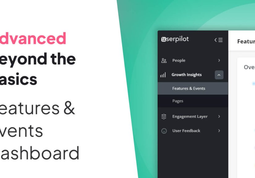
What Is the Features & Events Dashboard in Userpilot?
The Features & Events Dashboard is part of Userpilot’s product engagement analytics layer. It is designed to help teams analyze user actions inside a product by organizing and visualizing event data in a way that is actually usable. Instead of forcing teams to piece together behavior from scattered reports, it brings important activity into one place so they can track engagement patterns, feature usage, and behavior across different user groups.
In practical terms, the dashboard helps answer questions like these:
- Which product features are getting used the most?
- Which events signal that a user has reached real value?
- Are new users adopting a feature, or just clicking around politely before disappearing?
- Do enterprise accounts behave differently from self-serve customers?
- What actions happen before or after a key event?
That matters because product teams do not just need more data. They need behavioral context. A spike in usage means very little until you know who triggered it, what they did next, and whether that action correlates with retention or conversion.
What Can You Track in Userpilot?
One of the most useful things about Userpilot is that it gives teams multiple ways to define and collect events. That flexibility matters because not every meaningful user action lives in the frontend.
Labeled events
Labeled events are a no-code or low-code way to capture product interactions. Teams can use Userpilot’s visual labeler or selectors to mark UI elements and track what users do with them. This is especially helpful when product managers or growth teams want to move quickly without waiting in line behind engineering tasks that somehow always become “next sprint material.”
Tracked events
Tracked events are created through code, SDKs, or APIs. These are often better for actions that require metadata, logic, or backend validation. For example, a team may want to track when a customer creates a project, upgrades a subscription, exports a report, or reaches a certain usage threshold. Those are often richer than simple clicks because they include properties that make segmentation and analysis far more powerful.
Custom events
Custom events let teams combine multiple user actions into a single higher-level signal. That is useful when value is not tied to one isolated action, but to a group of related behaviors. If a meaningful success moment requires visiting a settings page, inviting a teammate, and launching a workflow, a custom event can capture that broader outcome instead of forcing teams to analyze each action in isolation.
Feature and behavioral tracking
Userpilot’s approach also supports feature usage analysis, event occurrences, and broader behavioral data that can feed into dashboards for product usage, retention, and core feature engagement. In other words, the Features & Events Dashboard is not a lonely island. It connects to a wider analytics environment that helps teams understand not only what happened, but whether it mattered.
Why This Dashboard Matters for Product Teams
A dashboard like this becomes valuable when it is tied to business questions, not vanity reporting. The best product teams use event tracking to identify value moments, improve onboarding, and prioritize product work based on real usage rather than assumptions or whoever spoke most confidently in the last roadmap meeting.
Here is where the dashboard delivers real value:
1. It makes feature adoption visible
Feature adoption is one of the clearest indicators of whether a release is actually landing with users. A new feature can have a beautiful launch announcement, a slick tooltip, and a celebratory Slack emoji storm, yet still fail quietly if users do not adopt it. By tracking unique users, usage trends, adoption rates, and repeat engagement, Userpilot gives teams a more honest picture.
This is especially important because feature adoption is rarely just about awareness. Sometimes users do not find a feature. Sometimes they find it but do not understand it. Sometimes they understand it but do not think it is worth repeating. Those are three different problems, and event data helps you tell them apart.
2. It helps define activation more clearly
Strong product analytics starts by defining what “getting value” looks like. That activation moment might be publishing a first dashboard, inviting a teammate, creating a campaign, or completing a first workflow. The Features & Events Dashboard helps teams identify and track those moments instead of settling for softer metrics like page views or generic logins.
That is important because a user opening your product is not the same as a user succeeding with your product. One is traffic. The other is progress.
3. It improves segmentation and targeting
Raw event counts are only mildly useful until you break them down by segment. Userpilot’s dashboard filters make it easier to analyze behavior by user segment, company, event type, page, category, platform, and time period. That means teams can ask sharper questions, such as whether power users adopt a feature faster, whether trial users stall before conversion, or whether a specific customer tier behaves differently after onboarding.
Better segmentation leads to better action. It helps teams trigger more relevant in-app guidance, launch more targeted campaigns, and avoid the classic mistake of treating all users as if they arrived from the same planet.
4. It supports behavior-based experiences
One of Userpilot’s strengths is that event data is not only for reporting. Teams can use it to trigger contextual experiences based on actual user behavior. That means analytics can move from passive observation to active intervention. If a user completes a meaningful action, they can see the next step. If they stall before a key milestone, they can get nudged toward success. If they overuse a workaround instead of adopting a better feature, the product can guide them in a smarter direction.
What You Can Learn from the Dashboard
A well-structured product analytics dashboard should help teams move from observation to diagnosis. The Userpilot environment includes a range of metrics and companion dashboards that support that process.
Usage and popularity
You can identify the most popular features and events, see which pages get the most visits, and understand which users or companies are the most engaged. This helps teams distinguish core behaviors from background noise.
Frequency and depth
Average occurrences per user matter because a feature used once may signal curiosity, while repeated usage usually signals value. If a feature has broad reach but low repeat interaction, it may have strong discoverability and weak utility. Ouch, but useful.
Adoption rate
Adoption rate is one of the most important measures in any feature adoption dashboard. It shows the percentage of active users who perform a meaningful event. This is a much stronger indicator than raw totals because it accounts for how many users are active in the first place.
Stickiness and retention
Userpilot’s broader dashboards also connect behavior to stickiness, retention, and return usage. This is where teams can separate flashy features from durable ones. A feature that gets a launch-week spike and then vanishes probably solved a marketing problem. A feature users keep coming back to solved a customer problem.
Paths before and after key events
Path-style analysis helps reveal what users do right before and after a core action. That is gold for onboarding design, feature discovery, and expansion strategy. If high-value users consistently visit a specific page before adopting a feature, that page may deserve stronger promotion. If users often exit after one step, you may have found friction hiding in plain sight.
Best Practices for Building a Better Features & Events Dashboard
The smartest teams do not treat event tracking as a random collection hobby. They follow a clear measurement strategy. Here are the practices that tend to separate useful dashboards from decorative ones.
Start with a tracking plan
Before teams start collecting everything that moves, they should decide which events actually matter, what each event means, what properties should be attached, and how the data will be used. Clean naming conventions and a clear event taxonomy make dashboards dramatically easier to maintain.
Track value moments, not just interface motion
Clicks are fine. Progress is better. A mature event tracking strategy focuses on actions tied to activation, adoption, retention, and revenue. Not every interaction deserves executive attention. Nobody needs a quarterly strategy meeting about “hovered over icon three times.”
Combine autocapture with intentional instrumentation
Autocapture speeds up data collection and helps teams move faster, but intentional tracking still matters for events that need business context, metadata, or backend logic. The strongest setup usually combines both approaches: broad behavioral visibility plus explicitly defined success events.
Use segmentation early
An event that looks healthy overall can hide major problems inside key cohorts. A feature may be thriving with existing accounts but failing with new users. Or it may work well for small teams and flop for enterprise customers. Segment first, celebrate second.
Pair quantitative and qualitative insight
Event data shows what happened. It does not always explain why. Teams get better results when they pair dashboards with session replay, user feedback, in-app surveys, or interviews. That combination makes it easier to solve the right problem instead of just decorating it with another chart.
Common Mistakes to Avoid
Even a strong dashboard can become a fancy cupboard for bad data. Here are some common mistakes:
- Tracking too many events: More volume does not equal more clarity.
- Using vague event names: If “Completed Action” can mean six things, it means nothing.
- Ignoring repeat usage: First use matters, but retained use matters more.
- Confusing traffic with value: Page views and logins are not always meaningful outcomes.
- Skipping follow-up action: A dashboard without a decision is just wall art with timestamps.
Experience Section: What Teams Usually Learn After Living with a Features & Events Dashboard
Once teams start using a dashboard like Userpilot’s consistently, the experience tends to follow a familiar pattern. First comes excitement. Suddenly, everyone can see events, segments, adoption rates, and behavioral patterns without chasing custom reports. Product managers feel powerful. Growth teams feel fast. Customer success gets curious. Leadership gets a screenshot and says, “Love this.” So far, so good.
Then comes the awkward middle phase, which is where the real learning starts.
This is usually the point where teams realize that their event naming is a little chaotic. One event says “Invite Team Member,” another says “Invited teammate,” and a third says “Team Invite Sent.” Congratulations: you now have three ways to measure one behavior and four ways to argue about it. The dashboard did not create the mess, but it absolutely put a spotlight on it. That is a good thing. Better to notice the mess than build decisions on top of it.
The next experience many teams have is discovering that their assumptions about user behavior were charmingly wrong. A feature everyone thought was central to the product may turn out to be lightly used. A tiny workflow nobody brags about in meetings may be doing the heavy lifting for retention. This is one of the most valuable moments a dashboard can create. It replaces internal mythology with observable behavior.
Another common experience is learning that adoption is not one metric but a chain of related signals. Teams often launch a feature and celebrate first-use numbers, only to find that repeat usage is weak. The dashboard helps expose that difference quickly. It shows whether users tried something once because it was new, or whether they came back because it was useful. That distinction saves teams from shipping “successful” features that quietly fail after the applause dies down.
Over time, the best teams also get better at linking dashboards to action. They stop asking broad questions like “How is engagement?” and start asking targeted ones like “Which onboarding segment reaches the report-builder feature within seven days?” or “Which accounts use the export workflow repeatedly before upgrading?” Those questions are smaller, but they are much more powerful. They lead to changes in onboarding flows, in-app prompts, lifecycle messaging, roadmap priorities, and support playbooks.
There is also a human lesson buried in all of this: dashboards are most useful when they are shared across teams, not hoarded by one department like a secret family recipe. Product sees friction. Customer success sees context. Marketing sees activation patterns. Leadership sees business impact. When everyone works from the same behavioral foundation, the product gets sharper and the debates get shorter.
In the long run, the most meaningful experience with a Features & Events Dashboard is not that it gives you more charts. It gives you better judgment. It teaches teams how to define value more clearly, measure behavior more honestly, and respond to user reality instead of internal guesswork. That may not sound glamorous, but in SaaS, better judgment is often the feature behind the feature.
Conclusion
The Features & Events Dashboard in Userpilot is most valuable when teams use it as more than a reporting surface. It becomes a decision tool when it is tied to activation, feature adoption, retention, and better customer experiences. With the right event structure, useful segmentation, and a focus on meaningful behavior, the dashboard can help teams identify what users value, where they struggle, and what changes will actually improve the product.
That is the real win. Not more dashboards. Better decisions. The charts are just the polite messengers.