Table of Contents >> Show >> Hide
- Trend #1: Deep Green Cabinets That Bring the Outdoors In
- Trend #2: Inky Blues and Moody Blue-Greens
- Trend #3: Natural Wood and Warm Brown Tones
- Trend #4: Two-Tone and Color-Blocked Cabinetry
- How to Choose the Right Cabinet Color Trend for Your Kitchen
- Practical Tips for a Successful Cabinet Color Refresh
- 500-Word Experience: What It’s Really Like to Follow These Cabinet Color Trends
- Final Thoughts
If your kitchen cabinets could talk, many of them would be saying, “Please stop calling me Builder Beige.”
The good news? Right now is an amazing moment to give them a fresh coat of personality. Designers across the
United States are seeing homeowners step away from flat, cold neutrals and move toward warmer, moodier, and
more nature-inspired kitchen cabinet color trends.
From deep greens that feel like a walk through the woods to handsome navy blues and airy natural wood,
this year’s best cabinet colors are all about warmth, character, and longevity. Below, we’ll look at four
cabinet color trends that are truly making a splash, how to use them in real kitchens (not just magazine
fantasy land), and what to consider before cracking open that first paint can.
Trend #1: Deep Green Cabinets That Bring the Outdoors In
Ask almost any designer which cabinet color is having a moment, and you’ll hear the same word over and
over: green. Not lime or neon, but deeper, grounded greensthink forest, olive, or moss. These shades feel
calm, sophisticated, and a little bit dramatic, all at once.
Why deep green works so well in kitchens
- Nature-inspired: Dark or mid-tone greens echo the trees and plants outside your window, which helps the kitchen feel serene instead of sterile.
- Surprisingly neutral: Green pairs beautifully with white, cream, warm wood, brass, matte black, marble, and even stainless steel. It’s more versatile than people expect.
- Great for hiding mess: Compared with bright white, a dark or mid-tone green is more forgiving of fingerprints, splashes, and the occasional coffee drip you notice three hours later.
Best ways to use green cabinets
You don’t have to go full emerald dungeon to join the trend. Here are a few practical approaches:
- All-lower green, light uppers: Paint only the lower cabinets or island a rich green and keep upper cabinets white or a soft warm neutral. This creates weight at the bottom and keeps the room feeling open.
- Green island, neutral perimeter: A green island is like a statement necklace for your kitchenbold but removable if your style changes later.
- Muted sage or olive on all cabinets: If your kitchen gets plenty of natural light, a slightly muted green across all cabinets can feel soft and relaxed instead of dark and heavy.
What it pairs with
Deep greens love warm materials. White oak or walnut floors, butcher-block counters, unlacquered brass, and
stone with warm veining (like creamy quartz or marble) all look fantastic. Add in woven shades or rattan stools,
and suddenly your kitchen feels like it belongs in a designer’s portfolio.
Trend #2: Inky Blues and Moody Blue-Greens
If green is the new favorite, navy and inky blue are the long-time best friends that are not going anywhere.
Design magazines, cabinet makers, and paint brands all report strong demand for deep blues on kitchen cabinetry,
often described as “ink,” “midnight,” or “charcoal blue.” These colors offer the drama of black cabinets, but
with a softer, more approachable feel.
What makes navy and inky blues so popular
- Timeless but current: Dark blue cabinets feel modern right now, but they’re classic enough that you probably won’t hate them in five years.
- Works with existing finishes: Blue plays nicely with cool stainless appliances, black hardware, and even existing gray countertops.
- Ideal for open layouts: In an open-concept home, navy cabinets can visually “anchor” the kitchen so it doesn’t disappear into the rest of the living space.
How to style moody blue cabinets
Because deep blue can read dramatic, you’ll want to balance it with lighter and warmer elements:
- Countertops: White or pale stone with subtle veining keeps things from feeling too heavy.
- Backsplash: A simple white subway tile, creamy zellige, or pale terrazzo pairs beautifully with navy.
- Hardware: Brass or champagne bronze adds warmth; matte black creates a modern, tailored look.
- Lighting: Don’t skip this. Pendants and under-cabinet lighting will stop dark blues from reading “cave-like.”
For smaller kitchens, consider limiting blue to an island or a single cabinet run. In larger spaces, a full wall
of navy paired with white uppers or wood open shelving looks layered, not overwhelming.
Trend #3: Natural Wood and Warm Brown Tones
After years of cool gray everything, warm wood is back in a big way. Designers are specifying white oak,
rift-cut oak, walnut, and other light to mid-tone wood finishes that show off the natural grain. Instead of
heavy, orange-y stain from the 1990s, today’s wood cabinets are more subtlematte, slightly desaturated, and
often finished in tones described as “driftwood,” “latte,” or “biscuit.”
Why homeowners are returning to wood cabinets
- Warmth and texture: Wood instantly makes a kitchen feel cozy and high-end. Even a simple flat-front cabinet door looks special in a beautiful wood veneer.
- Less maintenance than paint: Scratches on painted cabinets can be obvious. On wood, the grain helps hide normal wear and tear.
- Resale-friendly: Natural wood is generally seen as timeless, which is helpful if you plan to sell in the next few years.
How to keep wood cabinets feeling modern, not dated
- Go lighter and cooler: Avoid very red or orange stains; look for neutral or slightly cool-toned browns or light oak finishes.
- Choose simpler door profiles: Flat-panel or slim Shaker doors keep the look clean and current.
- Pair with soft neutrals: Creamy walls, warm white tile, and brushed metal hardware keep the look airy instead of heavy.
Many new kitchens combine wood base cabinets with painted uppers, or use wood only on the island for warmth.
This gives you the benefits of the trend without committing to wall-to-wall wood.
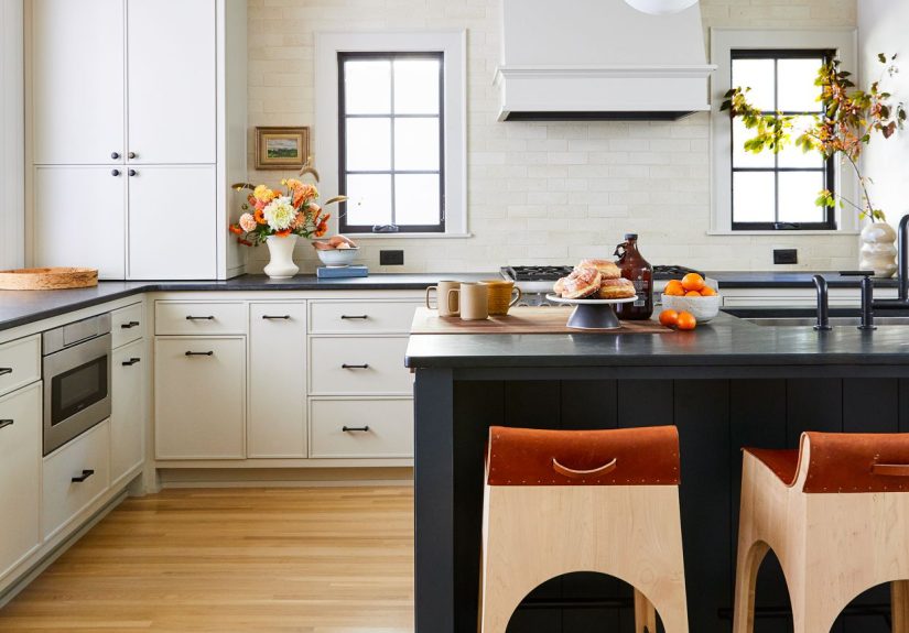
Trend #4: Two-Tone and Color-Blocked Cabinetry
If you scroll through Instagram or Pinterest and think, “Why do all these kitchens look so interesting?”
there’s a good chance you’re seeing two-tone cabinetry and color-blocking at work. Rather than one single
cabinet color, designers are mixing two (sometimes three) cabinet colors in deliberate ways.
Popular two-tone cabinet combinations
- Green lowers + white uppers: Soft white on the top and a richer green on the bottom strikes a beautiful balance between calm and character.
- Navy island + wood perimeter: This combo feels elevated and is very popular in modern-farmhouse and transitional kitchens.
- Warm white + natural wood: Using wood for the island or tall pantry cabinets and off-white elsewhere adds gentle contrast without feeling busy.
Why two-tone cabinets are trending
- Design flexibility: You can introduce a bolder color without committing to it on every single door and drawer.
- Great for awkward layouts: Color-blocking can visually organize the spacetall pantry cabinets might be one color, base cabinets another.
- Works with existing finishes: If you’re keeping your current counters or flooring, two-tone cabinets can help bridge colors that might not match a single paint shade.
To keep a two-tone kitchen looking intentional (not chaotic), choose colors with similar undertones. For example,
a warm greige pairs better with a warm wood than with a cool, blue-gray. When in doubt, tape paint swatches to
different cabinets and look at them morning, noon, and evening. Your lighting will change how each color reads.
How to Choose the Right Cabinet Color Trend for Your Kitchen
Knowing what’s trendy is fun, but you still have to pick one color (or two) that actually works in
your home. Here are a few practical things to consider before you join the deep-green-or-navy club.
1. Pay attention to light and orientation
South-facing kitchens can handle deeper, moodier colors without feeling like a cave. North-facing or windowless
kitchens may do better with lighter greens, softer blues, or plenty of wood and warm whites to bounce light around.
2. Evaluate the finishes you’re keeping
Unless you’re doing a full gut renovation, your cabinet color needs to get along with your existing flooring,
countertops, and appliances. Warm, creamy counters pair well with green and wood. Cooler gray counters might
look better with navy or blue-green. If something clashes, it will stand out more once the cabinets are freshly painted.
3. Think about long-term personality
If you change your décor every two years, a bold trend color on cabinets might not bother you. If you want to
love your kitchen for a decade, opt for colors that feel rich but not extreme: deep olive instead of neon green,
navy instead of true black, or a warm mushroom brown instead of icy gray.
4. Always test samples on your actual cabinets
This is the least glamorous step but the most important. Order peel-and-stick samples or paint small poster boards
and tape them directly to your cabinet doors. Look at them in daylight, at night, and with your actual lighting.
The same color that looks perfect on your phone might pull way too blue or too yellow in your home.
Practical Tips for a Successful Cabinet Color Refresh
Once you’ve chosen a color trend to embrace, a little planning goes a long way toward a professional-looking result.
- Prep like a pro: Clean cabinets thoroughly, sand lightly, and use the right primer for your cabinet material.
- Choose the right sheen: Satin or semi-gloss are popular for cabinetsthey’re easier to wipe down than flat paint but not as shiny as high gloss.
- Upgrade hardware: New hardware is like new jewelry for your cabinets. Simple bar pulls or knobs in a finish that matches your faucet will instantly modernize the space.
- Consider hiring out: If you have a large kitchen or very damaged cabinets, a professional painter or refacing company can be worth the investment.
500-Word Experience: What It’s Really Like to Follow These Cabinet Color Trends
Trends are great in theory, but what happens once the paint dries and real life returnswith grocery bags,
pasta night, and the occasional mystery spill? Here’s what many homeowners and renovators discover after living
with these trending cabinet colors for a while.
Living with deep green cabinets
People who choose dark or mid-tone green are often surprised by how calm their kitchens feel. The color has
enough depth to feel special, but it doesn’t shout the way a bold red or bright yellow might. One common comment
is, “It feels like my kitchen is part of the garden now.” The potential downside? If the shade is too dark and
the kitchen is already short on light, it can feel heavy in winter. Many owners solve this with warmer under-cabinet
lighting or by keeping upper cabinets lighter.
Real-world navy and inky blue
Homeowners who go for navy almost always say the same thing: “It looks expensive.” Deep blue tends to photograph
beautifully, so it’s a favorite for listing photos and social media. On a practical level, it hides scuffs better
than white but will show flour dust and dried water spots if you look closely. Parents with small kids often prefer
a slightly softer blue-gray instead of a super dark navy so every sticky fingerprint doesn’t pop.
The reality of natural wood and warm browns
People who switch from painted cabinets to wood usually talk about how much warmer and more relaxed the kitchen
feels. The grain adds a layer of visual interest even when everything is clean and minimal. However, wood does require
a bit of maintenancewiping up spills quickly and using gentle cleaners to avoid damaging the finish. In very bright
kitchens, sunlight can slowly shift the tone of the wood, so it’s smart to ask your finisher about UV-resistant topcoats.
Two-tone cabinets in everyday life
Two-tone kitchens often end up being the most complimented rooms in the house. Guests tend to notice the contrast
and say things like, “I never would’ve thought to do that, but it looks amazing.” From a practical standpoint,
painting only the lower cabinets or island a deeper shade can make touch-ups easier; those are the doors most likely
to take a beating from kids, pets, and rogue vacuum cleaners. The main challenge is getting the proportions righttoo
many competing colors or finishes can look busy. Sticking to two main cabinet colors plus one metal finish usually feels
balanced.
What most people don’t regret
Across all of these trends, the thing homeowners rarely regret is moving toward warmer, more character-rich colors.
Whether it’s a forest green island, an inky blue pantry wall, or a kitchen full of gently stained white oak, these
choices make the space feel personal and inviting. Even if trends evolve, colors rooted in naturegreens, blues, and
wood tonestend to age gracefully.
The biggest regrets usually come from rushing decisions. The most successful projects have one thing in common:
the owners took time to look at samples, compare finishes, and think about how they actually cook and live. If you
do that, you’re far more likely to end up with cabinets that still make you smile when you turn on the coffee maker
first thing in the morning.
Final Thoughts
Today’s kitchen cabinet color trends are less about following a strict rulebook and more about creating a space
that feels warm, personal, and connected to the rest of your home. Deep greens, inky blues, natural wood tones, and
two-tone combinations are leading the way because they balance style and longevity. Choose the palette that fits your
light, your lifestyle, and your long-term plansand your cabinets will keep “making a splash” long after this year’s
trend lists move on.