Table of Contents >> Show >> Hide
- What Is the Tom Dixon Beat Light, Exactly?
- Why People Love It: The Design Details That Actually Matter
- Choosing the Right Beat Shape for Your Room
- Bulbs, LEDs, and Dimming: How Not to Ruin the Vibe
- Installation & Layout Ideas That Look Designer (Not Accidental)
- Care & Maintenance: Keep the Brass Beautiful (Without Overdoing It)
- Authenticity & Buying Tips (Especially in the U.S.)
- Conclusion
- Experiences with Tom Dixon Beat Light (Real-World Moments, 500-ish Words)
Some lights are born to blend in. The Tom Dixon Beat Light was clearly not raised that way.
It’s the kind of pendant that strolls into a room, clears its throat, and politely requests a standing ovation.
Sculptural, warm, and just a little bit dramatic, Beat is proof that “functional lighting” can also be a full-on
personality.
In this guide, we’ll break down what makes Beat special, which shape actually works in your space (because
“Tall” and “Fat” are not just moods), how to avoid bulb/dimmer heartbreak, and how to keep that golden interior
glowing without accidentally turning it into a science experiment.
What Is the Tom Dixon Beat Light, Exactly?
A modern icon with ancient craft roots
Beat is a family of lights designed to feel both minimalist and handmade at the same time. The silhouettes pull
inspiration from traditional Indian vesselsthink water pots and cookwarethen translate those forms into clean,
contemporary pendants. The result is a shape that feels “simple” at first glance, but looks more interesting the
longer you live with it.
The signature move is the interior: a warm, golden cavity that reflects light in a way that’s less “spotlight
interrogation” and more “late-night cocktail bar.” Many Beat shades are crafted using hand-spinning and metal
beating techniques, which is why they can show subtle variation and texturelike a fingerprint, but for lighting
nerds.
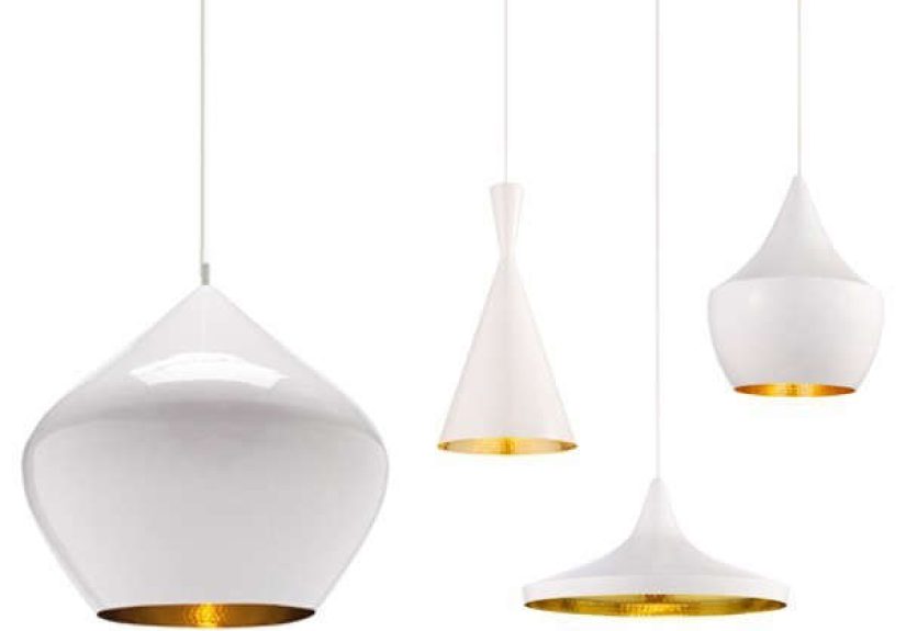
The Beat “family”: shapes, sizes, and why they exist
Beat is best known for its pendants, traditionally offered in four core shapes:
Tall, Fat, Wide, and Stout.
Each one changes the light distribution and the visual weight in the room.
- Tall: Sleek, vertical, and a great “single statement” pendant.
- Fat: Rounded and compact; visually cozy but still bold.
- Wide: Flatter profile; reads like a modern cymbal and spreads light across a surface.
- Stout: Larger, rounder, and more sculpturalthis is the one that says “main character.”
Over the years, the Beat universe has expanded into multi-pendant systems, plus table, floor, and wall versions.
If you love the look but don’t want a ceiling commitment, the family has options.
Why People Love It: The Design Details That Actually Matter
It’s a downlight… with a flattering glow
Beat pendants are generally designed to throw focused light downward, making them especially
good over a kitchen island, a dining table, or a bar top. But unlike a plain metal cone, Beat’s reflective interior
adds warmth and depth, so the light feels softer even when it’s doing “task lighting” work.
Translation: you can chop onions under it without feeling like you’re auditioning for a crime show reenactment.
That golden interior is doing more than looking pretty
The interior finish isn’t just aesthetic; it helps bounce and shape the light. In darker finishes, the exterior
stays clean and graphic while the inside reads golden and luminous. In brass finishes, the overall effect leans
more “jewelry” than “hardware,” especially when grouped.
It’s “statement” without being fussy
Beat plays well with a lot of styles: modern, industrial, Scandinavian, warm minimalism, even classic spaces that
need one contemporary note. The forms are bold, but not complicatedthere’s no fringe, no crystals, no “requires a
weekly emotional support group” maintenance schedule.
Choosing the Right Beat Shape for Your Room
Quick size cheat sheet (popular pendant proportions)
Exact dimensions and specifications can vary by version and market, but the classic Beat pendant proportions are
often referenced like this:
- Stout: roughly 20.5″ diameter and about 19.7″ tall
- Wide: roughly 14.2″ diameter and about 6.3″ tall
- Fat: roughly 9.5″ diameter and about 11.8″ tall
- Tall: roughly 7.5″ diameter and about 14.2″ tall
The practical takeaway: Tall and Fat work well in multiples without visually overwhelming a space,
while Stout can anchor a room on its own. Wide is a great “surface coverage” shape
when you want a broader pool of light.
Best uses by room
-
Kitchen islands: Tall/Fat/Wide in a row (2–3 pendants depending on island length).
Wide is especially nice if you want a flatter visual profile and spread. - Dining tables: One Stout for drama, or two Tall/Fat for balance on longer tables.
- Bar counters: Tall reads elegant and punchy; cluster a few for a restaurant vibe.
- Entryways: A single Tall can be a sculptural welcome that doesn’t eat up headroom visually.
-
Bedrooms: If you’re into hotel energy, consider a pair of smaller Beat pendants as bedside
lights (just make sure your electrician is your friend).
Bulbs, LEDs, and Dimming: How Not to Ruin the Vibe
Two common configurations you’ll see
Beat has existed across different production eras and product updates, so you’ll commonly encounter
two lighting setups:
-
Socket-based versions (often G9): Some specifications list a G9 bulb base with a max wattage.
These versions let you choose your bulb (great for customization), but you must match bulb type and dimmer
compatibility carefully. -
Integrated LED versions (often sold as “Beat LED”): Some current listings describe an integrated,
dimmable LED module with specific lumens and color temperature. These are designed for consistent performance
and can be serviceable depending on the model and supplier.
Before you buy: confirm whether you’re getting a G9 socket or an integrated LED module.
They behave differently, they dim differently, and your future self will thank you for checking now instead of
discovering it after the ladder comes out.
Choosing the right light quality (Kelvin, CRI, brightness)
For most homes, Beat looks best in a warm rangethink 2700K to 3000K. That complements the golden
interior and keeps the glow inviting. If you go too cool, you risk making the brass look a little… orthodontic.
- Best for living spaces: 2700K (cozy) to 3000K (clean-warm)
- Color rendering: Aim for high CRI (90+) if you care about food looking delicious and skin tones looking human.
- Brightness: Over a table or island, you’ll usually want enough output to be useful, but not so much it glares.
Dimming without flicker (a quick reality check)
If you plan to dim, treat compatibility like a first date: assume nothing and ask the important questions early.
LED bulbs and dimmers can be picky. Many “dimmable” LEDs dim, technically, but only down to “still kind of bright.”
If you want that restaurant-level low glow, look for bulbs (or integrated modules) known for smooth dimming and
pair them with a dimmer type that matches the product’s requirements.
Installation & Layout Ideas That Look Designer (Not Accidental)
Hanging height guidelines
The classic rule-of-thumb ranges are popular for a reason:
- Above a dining table: hang the pendant bottom roughly 28–34 inches above the tabletop.
- Above a kitchen island/counter: aim for roughly 30–36 inches above the countertop.
Adjust based on ceiling height, sightlines, and whether tall people live in your house. (Tall people deserve light
too. They’ve suffered enough in airplane seats.)
Spacing multiple Beat pendants
If you’re hanging 2–3 pendants in a row, keep them visually balanced:
- Center the arrangement on the island/table, not on the ceiling junction box “because it’s already there.”
- Give each pendant breathing room so the silhouettes read as separate objects.
- Consider mixing shapes (Tall + Fat + Wide) for a curated clusterlike a band where everyone is talented and nobody fights for the mic.
Single statement vs. cluster drama
A single Beat Stout can be a sculptural hero piece in an entry or over a smaller table. For bigger surfaces, a
cluster is where Beat becomes truly iconic: multiple pendants, slightly varied heights, warm reflections bouncing
around like a soft gold echo.
Care & Maintenance: Keep the Brass Beautiful (Without Overdoing It)
Cleaning lacquered/brass interiors: less is more
Many Beat specifications recommend a simple approach: use a soft, dry cloth and avoid water,
abrasive materials, and polishing agents. In other words, treat it like a fancy jacketspot clean, don’t pressure-wash.
Also: always switch off power before cleaning. Not because we’re dramaticbecause electricity is.
What about scratches and patina?
A little variation is part of the charm. But if you want it looking pristine, be gentle during bulb changes,
especially around the interior finish. Avoid harsh chemical cleaners. If you’re unsure, follow the manufacturer
or retailer care guidance for your specific finish.
Authenticity & Buying Tips (Especially in the U.S.)
Why “inspired by Beat” usually looks… inspired
Beat is heavily copied because it’s popular and the silhouette looks “simple.” But the real magic is in the
craftsmanship: the way the shade is formed, the quality of the metalwork, the interior reflection, the finish
consistency, and the safety certification. Many knockoffs get the outline right and everything else wrong.
The difference shows up fast: harsher glare, thinner metal, awkward seams, cheap coatings, and inconsistent
hardware. If you want the Beat look for a long time (not just until your next “why is it rusting?” moment),
buy from authorized sellers and confirm the model code/specs.
Checklist for buying confidently
- Confirm the light source: G9 socket vs integrated LED module.
- Confirm certification: look for UL/cUL details if you’re installing in the U.S.
- Check cable length: many listings reference a long fabric cable (great for high ceilings).
- Match finishes to your space: black exterior reads graphic; brass reads luminous; white feels airy.
- Plan your dimming: choose compatible bulbs/dimmers for smooth, flicker-free control.
Conclusion
The Tom Dixon Beat Light earns its icon status by doing two things at once: looking like a sculpture
and behaving like a practical downlight. It brings warmth without going “rustic,” drama without going “Vegas,” and
craftsmanship without begging for constant attention.
Choose your shape based on your surface and ceiling height, confirm whether you’re buying a socket-based or LED
version, and give it the gentle-care treatment it prefers. Do that, and Beat will reward you with that signature
golden glownight after nightlike the most dependable mood lighting friend you’ve ever had.
Experiences with Tom Dixon Beat Light (Real-World Moments, 500-ish Words)
People don’t fall for Beat because it’s “a pendant.” They fall for it because it changes how a room feels at night.
In real homes and hospitality spaces, the most common reaction is something like: “Wait… why does this corner look
expensive now?” That’s the Beat effectquiet during the day, cinematic after sunset.
In a kitchen: the island becomes the stage
In open-plan kitchens, Beat pendants often become the visual anchor. During the day, they read as crisp silhouettes,
especially in black. At night, the gold interior kicks in, and the island shifts from “prep zone” to “hangout zone.”
Homeowners frequently describe a funny side effect: people gather under the lights even when there are perfectly
good chairs nearby. It’s like the pendants create an invisible “this is where the conversation happens” sign.
A practical note from real installations: three smaller shapes (like Tall or Fat) across a longer island tends to
feel balanced and functional, while one large Stout can feel more like an art piecegreat if you want drama, less
great if you need even light across a wide workspace. That’s not a flaw; it’s just choosing the right tool for the job.
In dining rooms: it photographs like a celebrity
Beat is famously photogenic. Designers like it because it “reads” instantly in a room shot: clear outline, warm
interior, and a finish that doesn’t look cheap under camera lighting. In dining spaces, a single statement pendant
can make even a simple table feel intentional. And if you use two pendants over a longer table, you get symmetry
without the fuss of a chandelier.
The vibe people mention most is “intimate but not dim.” When paired with warm, high-CRI lighting, meals feel more
flattering, colors feel richer, and the room looks calmer. It’s the opposite of those cold overhead fixtures that
make pasta look like office supplies.
In restaurants and bars: instant mood, predictable performance
In hospitality, Beat’s focused downlight is a workhorse: it lights the table surface without blasting guests in the
face. That’s why you’ll see it over banquettes, bar rails, and communal tables. Operators love that the design has
presence even when the lights are lowbecause “mood” can’t be a single point of failure.
A consistent lesson from commercial use is dimming: when the bulb/module and dimmer are properly matched, Beat can
dial from functional to atmospheric smoothly. When they’re not matched, you get flicker or limited dim range. It’s
the lighting equivalent of a great singer stuck with a cheap microphone.
Living with it long-term: surprisingly low-maintenance if you keep it simple
Owners who stay happiest are the ones who don’t over-clean it. A soft, dry cloth keeps the finish looking sharp.
The interior’s warm reflectivity is the payoff, so people tend to notice quickly if they’ve dulled it with the wrong
cleaner. The funny part is that once Beat is installed, most people stop thinking about ituntil guests point it out,
which happens a lot. It becomes one of those pieces that quietly “defines” the room without demanding daily attention.
In short: Beat feels like a design splurge, but it behaves like a practical everyday lightassuming you buy the
right version for your needs and set it up with the right dimming plan.