Table of Contents >> Show >> Hide
- What a Great School Brochure Actually Does
- Pick the Right Brochure Format (Don’t Let the Fold Pick for You)
- Plan Your Content First (Yes, Before You Choose “Cute Fonts”)
- Tri-Fold Layout Map (So You Don’t Put the Cover in the Wrong Place)
- Formatting Rules That Make Your Brochure Look Professional
- A Panel-by-Panel Example (Tri-Fold School Project)
- Tools to Make a Brochure (Fast, Clean, and Printable)
- Printing & Exporting: Don’t Let Your Final Copy Betray You
- Common Brochure Mistakes (and the Fix in One Sentence)
- Quick Checklist Before You Turn It In
- Real-World Experiences (): What Making a School Brochure Feels Like
- Conclusion
A school-project brochure is basically a tiny, folded stage where your topic has to perform three tricks at once:
look good, teach something real, and make the reader care.
The catch? You’re doing it on six little panels, under a deadline, with a printer that always chooses violence at 11:59 p.m.
The good news: brochure design is not magic. It’s a repeatable process. If you pick the right brochure format,
plan your content before you decorate it, and follow a few proven layout rules, your brochure will look
polishedeven if you made it in your pajamas.
What a Great School Brochure Actually Does
Before you touch fonts, decide what “success” means for this brochure. In plain terms: who is it for, what do they need,
and what should they do or understand after reading it? That simple focus keeps your panels from turning into
a chaotic scrapbook of random facts.
- One clear message: “This is the main idea I want you to remember.”
- Easy skimming: short paragraphs, bullets, headings, and helpful visuals.
- Real information: accurate facts, definitions, and examples that support your main point.
- A logical flow: the reader should know where to look next (without guessing).
- A finish line: a concluding takeaway, call to action, or “why this matters.”
Pick the Right Brochure Format (Don’t Let the Fold Pick for You)
For most school projects, you’ll see three common formats:
Tri-fold (the classic)
A tri-fold brochure (also called a letter fold) gives you six panels and a natural “step-by-step” reading flow.
It’s the default for a reason: you get enough space to explain without writing a novel.
Half-fold (like a mini booklet)
A half-fold gives you four larger panels. Choose it if you have big images, a timeline, or a topic that needs
breathing room instead of lots of sections.
Z-fold (unfolds like an accordion)
Z-fold is great when you want each section to feel equallike stages in a process, a travel itinerary, or a
“Problem → Causes → Solutions” structure.
If your teacher didn’t specify, tri-fold is usually the safest bet for a school project brochure because it’s familiar,
compact, and easy to organize.
Plan Your Content First (Yes, Before You Choose “Cute Fonts”)
Brochures work best when your content fits the panels on purpose. Start with a quick outline and assign content to each panel.
This prevents the classic student mistake: writing everything… and then discovering there is no room for anything.
The “One-Page Brain Dump” Method
- Write your main point in one sentence.
- Pick 3–5 key sections that support that point (not 17 fun facts).
- Choose 1–2 visuals per side: a chart, a labeled photo, a map, or an icon set.
- List your sources (even if your teacher doesn’t require formal citations, you need reliability).
How much text should a brochure have?
Think “snackable,” not “textbook.” A brochure is designed to be skimmed quickly. Use headings and bullets,
and aim for short blocks of text per panel. If you need long explanations, turn them into a mini diagram,
a short Q&A, or a “Top 5” list.
Tri-Fold Layout Map (So You Don’t Put the Cover in the Wrong Place)
Tri-fold printing can be confusing because the “front cover” isn’t always where you think it is when you’re staring at a flat page.
The secret is to label your panels early and do a quick test fold.
Panel map (simple version)
Print one draft on plain paper, fold it, and confirm that your cover, headings, and images land where they should.
That 2-minute test saves you from the dreaded “my conclusion is on the cover” moment.
Formatting Rules That Make Your Brochure Look Professional
1) Make the fold-in panel slightly narrower
In many tri-fold setups, the panel that folds inward is slightly smaller so the paper doesn’t buckle or “dog-ear.”
If you’re using a template, it may handle this automatically. If you’re building from scratch, this is a big reason
to use a print shop’s template or a trusted brochure template from your software.
2) Respect margins, safe zones, and bleed
Three terms matter for print-ready brochure formatting:
- Margins / safe zone: keep important text and logos away from edges and folds.
- Fold safe zone: don’t place critical text directly on a fold line.
- Bleed: if your background color or image goes to the edge, extend it past the cut line so you don’t get white slivers.
For many print workflows, a bleed around 0.125 inches (1/8") is common, but always match the requirements of
wherever you’re printing. If you’re printing at home, your printer may not support true edge-to-edge printing,
so a clean white border is normal.
3) Use readable typography (your grade depends on legibility, not vibes)
Typography is where school brochures often fall apart. Keep it simple:
- Use 1–2 fonts total (one for headings, one for body text).
- Increase hierarchy by changing size and weight, not by using ten different fonts.
- Keep body text comfortable (generally 10–12 pt for print, depending on the font).
- Left-align most body text for easier reading.
4) Apply the “design principles” that do the heavy lifting
You don’t need to be an art major. Just use the principles that make layouts feel intentional:
- Emphasis: make the most important thing look important.
- Alignment: line things up so the page feels organized.
- Contrast: create clear differences (headline vs. body text, section headers, callouts).
- Repetition: reuse colors, icon styles, and heading formats for consistency.
- White space: leave breathing room so your brochure doesn’t look like a cluttered poster.
5) Balance text and visuals like a magazine page
A helpful rule: if a panel looks like a solid rectangle of text, break it up. Add a subheading, a bullet list,
a small diagram, or a highlighted “Key Fact” box. Your reader’s eyes need entry points.
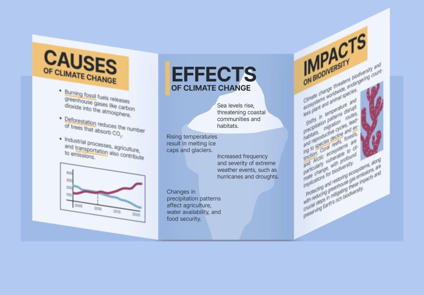
A Panel-by-Panel Example (Tri-Fold School Project)
Let’s say your topic is: “Pollinators and Why They Matter”. Here’s a clean brochure layout that feels academic,
readable, and actually interesting.
Front Cover (Outside Right)
- Title: Pollinators: Tiny Workers, Huge Impact
- Hook line: “One out of every three bites of food depends on pollinators.”
- Visual: a strong photo of a bee on a flower
- Your name/class in small text
Inside Middle (The “Main Info” Panel)
- What is pollination? 2–3 sentence definition
- How it works: a simple 3-step mini diagram
- Key species: bees, butterflies, birds, bats (icons work great here)
Inside Left & Inside Right (Support + Details)
- Why pollinators are declining: habitat loss, pesticides, climate shifts
- Why it matters: food crops, ecosystems, biodiversity
- Local connection: “What pollinators live in our area?” (1 small map or list)
Inside Flap (Outside Middle)
Use this panel as your “bridge.” It’s perfect for a quick timeline, a myth-vs-fact box, or a short list of
“Top 5 Pollinator-Friendly Plants.”
Back Panel (Outside Left)
- Conclusion: 2–3 sentence summary (“Here’s what to remember.”)
- Call to action: “Plant native flowers” / “Skip pesticides” / “Support habitat.”
- Sources: short list of references
Notice what this structure does: it gives you a strong cover, a clear center panel for the “real learning,”
and a back panel that wraps it up like a professional handout.
Tools to Make a Brochure (Fast, Clean, and Printable)
Use what you have access toand what you can export to PDF.
Microsoft Word (templates = speed)
Word brochure templates are a legit shortcut, especially for school projects. They’re already set up with columns,
placeholder images, and panel spacing. Replace the text, swap images, and export to PDF for printing.
Microsoft Publisher (if you have it)
Publisher is built for print layouts and can feel easier than Word for controlling text boxes, image alignment,
and brochure panels.
Adobe InDesign (best control, steepest learning curve)
If you want the most control over bleed, grids, typography, and exporting for print, InDesign is the pro option.
It’s also the “I care about design” flexif that matters to you and your rubric.
Design tip: templates are not cheating
In real life, professionals use templates constantly. The skill is in how you customize: clean hierarchy, accurate content,
consistent visuals, and a layout that reads smoothly.
Printing & Exporting: Don’t Let Your Final Copy Betray You
A brochure can look perfect on screen and still print like a tragedy. Here’s how to avoid that:
Export settings that usually work
- File type: PDF is the safest for printing.
- Images: use high-resolution images when possible (avoid tiny screenshots).
- Color: printing often uses CMYK; colors may shift slightly from your screen.
- Test print: print a draft on plain paper and fold it.
Home printer vs. print shop
- Home printer: expect margins; focus on clean layout and readable text.
- Print shop: you may be able to print full-bleed; confirm bleed/safe-zone requirements before you finalize.
Common Brochure Mistakes (and the Fix in One Sentence)
- Too much text: cut paragraphs into bullets and add subheadings.
- Random fonts: use two fonts max and build hierarchy with size/weight.
- Messy alignment: snap everything to a grid and keep margins consistent.
- Low-quality images: replace blurry visuals with fewer, sharper ones.
- No flow: add headings that guide the reader panel-to-panel.
- Cover is weak: add a clear title + strong visual + one-sentence hook.
Quick Checklist Before You Turn It In
- My brochure has one clear main message.
- Headings and bullets make it easy to skim.
- Images are clear, relevant, and not pixelated.
- Text stays away from folds and edges (safe zones).
- Fonts are consistent and readable.
- I test-folded a printed draft.
- The back panel includes a short conclusion and sources.
Real-World Experiences (): What Making a School Brochure Feels Like
If you’ve never made a brochure before, here’s the most honest heads-up: the hardest part is not “design.”
It’s deciding what to leave out. Students often start with good intentionsresearch notes, full paragraphs,
maybe even a quote that sounded smart at 1 a.m.and then the panels start shrinking like they’re allergic to your content.
That’s when the panic-clicking begins: fonts get smaller, margins disappear, and suddenly your brochure looks like a
legal contract that fell into a box of crayons.
A common “aha” moment happens after the first test print. On screen, everything feels neat. On paper, you discover
that folds are not polite. A fold line will cut through a sentence with zero remorse. A photo that looked centered
now sits awkwardly on the crease like it’s trying to escape. This is why experienced students always do a quick draft print
earlynot because they love wasting paper, but because it’s the fastest way to catch layout problems before they become
permanent and embarrassing.
Another real experience: the cover carries more weight than you think. Many students treat the cover like a label:
“My Topic: Volcanoes.” Done. But the best brochures use the cover as a tiny billboard. A strong title, one great image,
and one hook line can make your project feel high-effort even before someone opens it. Teachers notice this, classmates notice it,
and your grade often benefits from the simple fact that your brochure looks like it was made by a person with a plan.
Then there’s the “image struggle.” People grab the first photo they find, paste it in, and wonder why it prints fuzzy.
The more experienced move is to use fewer images but make them larger and clearer. One sharp visual beats three blurry ones every time.
And if your topic needs data or steps, a simple diagram or mini chart can feel more “academic” than another stock photo.
Finally, the last-minute printing saga: someone always prints too late. The printer jams. The ink runs low. The colors shift.
The paper comes out upside down. The solution isn’t luck; it’s strategy. Export a PDF, print a draft earlier than you think you need to,
and keep your design forgivingclean margins, readable text, and a layout that still looks good even if the printer adds a tiny border.
When you build your brochure to survive real-world printing, you’re not just making something prettyyou’re making something that actually works.
Conclusion
If you want your school project brochure to look professional, focus on three things:
clear content, smart panel planning, and simple design rules.
Choose a format (tri-fold is usually best), map your panels, build strong hierarchy with consistent typography,
and test-fold a draft before you call it done. Do that, and your brochure won’t just “meet requirements”it’ll look like it belongs on a display table.