Table of Contents >> Show >> Hide
- What Is a Bar Graph in Excel?
- When Should You Use a Bar Graph?
- How to Organize Your Data Before Making the Chart
- How to Make a Bar Graph in Excel Step by Step
- How to Customize Your Excel Bar Graph
- Types of Bar Graphs You Can Make in Excel
- Example: Making a Simple Bar Graph in Excel
- Common Mistakes to Avoid
- How to Make Your Bar Graph Look Professional
- Troubleshooting: Why Your Excel Bar Graph May Look Wrong
- Final Thoughts
- Real-World Experiences With Making Bar Graphs in Excel
- SEO Tags
If Excel has ever stared back at you like it knows your secrets, you are not alone. Plenty of people open a spreadsheet with noble intentions, type in some numbers, and then immediately forget how to turn those numbers into something a normal human can understand. That is where a bar graph comes in. It is clean, familiar, and wonderfully dramatic for showing comparisons without making your audience squint.
In this guide, you will learn exactly how to make a bar graph in Excel, how to format it so it looks polished instead of accidental, and how to avoid the classic mistakes that make charts look like they were assembled during a caffeine emergency. Whether you are building a quick school project, a work report, a sales summary, or a simple dashboard, this tutorial will walk you through the process step by step.
What Is a Bar Graph in Excel?
A bar graph is a chart that compares categories using rectangular bars. In Excel, a true bar chart usually displays horizontal bars. That makes it especially helpful when your category labels are long, because horizontal layouts give your text more breathing room. If you use vertical bars, Excel typically calls that a column chart. People mix up the two all the time, so do not worry if you have been calling every rectangle on a chart a bar graph since middle school.
Bar graphs work best when you want to compare values across categories, such as:
- Monthly sales by product
- Survey results by response group
- Website traffic by channel
- Employee counts by department
- Expenses by category
If your goal is to show change over time, a line chart may be a better fit. But if your goal is to compare one set of categories quickly, a bar graph is one of the easiest chart types to read.
When Should You Use a Bar Graph?
Use a bar graph when your data is categorical and you want comparisons to be obvious at a glance. Bar graphs are excellent for rankings, side-by-side comparisons, and highlighting winners, losers, and everything in between.
A bar graph is a smart choice when:
- Your labels are long and would look cramped on the bottom of a vertical chart
- You want to compare separate categories rather than show a trend over time
- You need a chart that is easy for most readers to understand immediately
- You want to add data labels clearly at the end of each bar
It is less useful when you have far too many categories. Once your chart starts looking like a barcode with opinions, it is time to simplify the data or choose another format.
How to Organize Your Data Before Making the Chart
Before you create a bar graph in Excel, set up your worksheet in a simple, clean structure. This matters more than most people think. A chart is only as smart as the data you feed it, and Excel is literal in the way only software can be.
The easiest layout looks like this:
| Category | Value |
|---|---|
| 4200 | |
| Organic Search | 6100 |
| Social Media | 2900 |
| Referral | 1800 |
Keep these best practices in mind:
- Put category names in one column and numbers in the next
- Use a clear header row
- Avoid blank rows inside the data range
- Remove random notes, merged cells, and decorative clutter
- Format numbers consistently before charting
If your table is messy, Excel may guess wrong about what belongs on the axis and what belongs in the bars. And Excel guesses with the confidence of someone who definitely did not read the instructions.
How to Make a Bar Graph in Excel Step by Step
Now for the fun part. Here is how to make a bar graph in Excel in a straightforward way.
Step 1: Enter your data
Open your worksheet and type your data into two columns or more, depending on how many series you want to compare. For a basic bar graph, one category column and one values column are enough.
Step 2: Select the data range
Click and drag to highlight the cells you want Excel to use. Include the headers if you want Excel to use them automatically for labels and legend text.
Step 3: Go to the Insert tab
At the top of Excel, click Insert. In the Charts group, you will see options for different chart types.
Step 4: Choose a bar chart
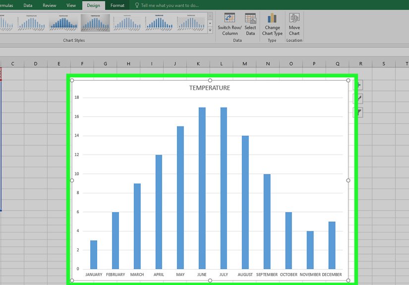
Click the Insert Column or Bar Chart button, then choose the bar chart style you want. For most beginners, 2-D Clustered Bar is the best option. It is simple, readable, and does not try too hard.
Step 5: Let Excel build the chart
Excel will insert the chart into your worksheet. At this point, congratulations: you officially have a bar graph. It may not be beautiful yet, but it exists, and that counts for something.
Step 6: Move and resize the chart
Click the chart and drag it to a better spot if needed. Use the corner handles to resize it. If labels look cramped, make the chart wider or taller before changing anything else.
How to Customize Your Excel Bar Graph
A basic chart is fine. A clear chart is better. A polished chart that looks like you knew what you were doing all along is best. Here is how to improve your graph.
Add a chart title
Click the chart, then use the chart elements options or the Chart Design tools to add a title. Make it specific. “Sales” is vague. “Q1 Online Sales by Channel” is much better.
Add axis titles
Axis titles help readers understand what the bars represent. For example:
- Category axis: Marketing Channel
- Value axis: Visits
Add data labels
Data labels place the actual values on or near the bars. This is incredibly useful when your audience should not have to estimate from the axis. In many cases, labels at the end of each bar make the chart easier to read instantly.
Change the bar colors carefully
Excel gives you plenty of formatting choices, but that does not mean your chart needs to look like a fireworks test. Use simple, consistent colors. If one category is the focus, highlight only that bar and keep the rest neutral.
Adjust the axis scale
If the bars look oddly compressed or stretched, right-click the value axis and choose Format Axis. You can change the minimum, maximum, and units to make the comparisons easier to interpret.
Sort the data
In many cases, bar graphs are easier to read when the values are sorted from largest to smallest. This creates a natural ranking and helps your audience see the pattern faster. The exception is when your categories have a natural order, such as weekdays, months, or stages in a process.
Skip 3-D effects
This deserves its own tiny parade. Avoid 3-D bar charts. They may look flashy for three seconds, but they often distort comparisons and make labels harder to read. A crisp 2-D chart nearly always wins.
Types of Bar Graphs You Can Make in Excel
Excel offers several bar chart styles. Here are the most common ones and when to use them.
Clustered Bar
This is the default favorite. It compares categories side by side and works well for most single-series data and many multi-series comparisons.
Stacked Bar
Use this when you want to show both the total and how each total is divided into parts. It is helpful for showing composition, but individual segment comparisons can become tricky.
100% Stacked Bar
This version emphasizes percentages rather than raw totals. It is useful when each category represents a whole and you want to compare proportions.
Grouped or Multi-Series Bar Graph
If you have more than one set of values for each category, such as revenue in 2024 versus 2025, a clustered bar chart can show multiple bars per category. Just include extra value columns before inserting the chart.
Example: Making a Simple Bar Graph in Excel
Imagine you manage a small online shop and want to compare orders from four traffic sources:
| Traffic Source | Orders |
|---|---|
| Organic Search | 185 |
| 132 | |
| Social Media | 96 |
| Referral | 71 |
To turn this into a graph:
- Highlight the table including the headers
- Click Insert
- Select 2-D Clustered Bar
- Add the title Orders by Traffic Source
- Sort the source data from highest to lowest if needed
- Add data labels to show exact order counts
The result is a simple chart that tells a quick story: Organic Search is doing the heavy lifting, Email is performing well, and Referral could use some love.
Common Mistakes to Avoid
Excel bar graphs are simple, but a few avoidable mistakes can make them less useful.
Using the wrong chart type
If your data shows a timeline, a line chart may communicate the pattern more clearly. Use bar graphs for category comparisons, not everything under the sun.
Including too many categories
If your chart has twenty-seven bars, it may technically be a graph, but it is also a visual endurance test. Consider grouping smaller categories, filtering the data, or splitting the chart.
Writing vague titles
A strong title helps readers understand the takeaway immediately. Think of it as a headline, not a label slapped on at the last second.
Forgetting labels
If readers have to guess what the axis means, the chart is doing half its job. Add clear titles, labels, and units when necessary.
Overdesigning everything
Too many colors, shadows, effects, and gridlines can bury the message. Keep your design focused on readability.
How to Make Your Bar Graph Look Professional
If your chart is headed for a meeting, report, presentation, or website, use these quick polish tips:
- Use sentence-case titles that say something useful
- Keep fonts readable and consistent with the rest of your document
- Use one accent color and avoid rainbow overload
- Remove chart junk like unnecessary borders and heavy gridlines
- Sort values when appropriate to make comparisons faster
- Resize the chart so labels are not crowded
- Use data labels if exact values matter more than visual approximation
A professional chart does not need to be fancy. It needs to be easy to understand in about three seconds, because that is roughly how much patience most people bring to a spreadsheet discussion.
Troubleshooting: Why Your Excel Bar Graph May Look Wrong
The bars are going the wrong way
You may have inserted a column chart instead of a bar chart. Go back to Change Chart Type and pick a bar option.
My labels are on the wrong axis
Use Select Data or Switch Row/Column to correct how Excel is reading your table.
The chart is blank or incomplete
Check for blank cells, text stored as numbers, or a selected range that missed part of your data.
The axis scale looks strange
Right-click the axis, choose Format Axis, and adjust the bounds and units manually.
The chart is hard to read
Make it larger, shorten labels if possible, sort the values, and remove decorative clutter. Most chart problems are not dramatic. They are just tiny readability crimes.
Final Thoughts
Learning how to make a bar graph in Excel is one of those practical skills that pays off immediately. It helps you turn ordinary worksheet data into something visual, clear, and useful. Once you understand the basic workflow, enter data, select it, insert the chart, and clean up the formatting, you can create charts quickly for school, business, marketing, finance, operations, or everyday reporting.
The best Excel bar graphs are not the flashiest ones. They are the ones that make the message obvious. Start simple, use a clean 2-D layout, label things clearly, and let the data do the talking. Excel may not throw confetti when you finish, but your audience might at least stop asking what they are looking at, which is basically the professional version of applause.
Real-World Experiences With Making Bar Graphs in Excel
One of the most common real-world experiences people have with Excel bar graphs is realizing that the graph is easy to create, but the real challenge is making it say something useful. At first, many beginners think the hard part is clicking the right button under the Insert tab. In reality, the harder part is deciding what data belongs in the chart, what should stay out, and what message the chart is supposed to deliver. That moment usually arrives right after Excel creates a graph that is technically correct but emotionally confusing.
For example, a small business owner might build a bar graph to compare monthly product sales. The first version often includes every product, every region, and every weird internal code nobody outside accounting understands. The result looks less like a chart and more like a cry for help. After a bit of trial and error, they learn to simplify the data, shorten labels, sort the bars, and focus on one question at a time. Suddenly, the chart works. That is a very common Excel experience: the first graph is messy, the second is better, and the third makes you feel suspiciously competent.
Students often have a similar journey. They create a bar graph for a class project, only to discover that their labels overlap, their title says something vague like “Results,” and one bright orange bar is shouting for attention with no clear reason. But that trial-and-error process is valuable. It teaches them that charts are not decoration. They are tools for communication. Once they start treating the chart as part of the argument rather than a colorful afterthought, the quality improves fast.
Office workers also run into a classic bar graph problem: Excel chooses a layout that is technically possible but visually awkward. This happens a lot with longer category names like department titles, marketing channels, or survey questions. That is when people discover one of the hidden joys of a horizontal bar graph. Long labels fit better, the data becomes easier to scan, and everyone in the meeting stops tilting their heads at the screen like confused puppies.
Another real experience involves last-minute reporting. Someone asks for “a quick chart” five minutes before a meeting, which is corporate language for “please perform chart wizardry under pressure.” In those moments, knowing how to make a clean bar graph quickly is incredibly useful. A sorted data table, a clustered bar chart, a clear title, and data labels can save the day. It may not fix the entire meeting, but it can at least keep your slide from becoming the most embarrassing object in the room.
Over time, most people learn that Excel bar graphs reward simplicity. The most effective charts are usually not the fanciest ones. They are the ones that answer a clear question fast. That is why bar graphs remain so popular in Excel. They are approachable, flexible, and forgiving once you understand the basics. And honestly, in the wild world of spreadsheets, forgiving is a beautiful quality.