Table of Contents >> Show >> Hide
- The Brief: A London Pied-à-Terre That Could Actually Keep Up With Family Life
- A Layout That Works Like Fine Jewelry: Precise, Layered, and Made to Move
- Private Rooms, Clever Boundaries, and the Quiet Genius of Built-Ins
- Why This Jewelry Designer’s London Home Feels So Fresh
- Design Lessons to Borrow From This Flexible Pied-à-Terre
- What Living in a Flexible London Pied-à-Terre Probably Feels Like
- Final Thoughts
- SEO Tags
Some homes are beautiful. Some homes are practical. And then, every now and then, a home strolls in wearing both traits like a perfectly tailored coat and makes the rest of us reconsider every bad storage decision we have ever made. This London pied-à-terre belongs in that elite category.
Created for a jewelry designer, her husband, and their two children, this apartment was never meant to be a static showpiece. It had to work hard, look polished, host dinner, welcome growing kids, and somehow still feel like a calm retreat in one of the world’s busiest cities. That is a tall order for any home, but especially for a compact family base in central London.
What makes this house tour so compelling is not just the location or the finish palette. It is the way the apartment solves real-life problems with style instead of surrender. This is a family home dressed as a design object, or maybe a design object clever enough to behave like a family home. Either way, it is a master class in flexible apartment design, custom millwork, and modern small-space living.
The Brief: A London Pied-à-Terre That Could Actually Keep Up With Family Life
The apartment sits high above Covent Garden, with views toward the market and the Royal Opera House. On paper, it already seemed to have what the family needed: bedrooms, en suite baths, and an open living-dining-kitchen arrangement. But the original developer-finished interior lacked character, the primary bedroom had no window, and the bathroom layout was awkward enough to make morning routines feel like low-stakes combat.
That tension between decent bones and disappointing execution is what makes this renovation so interesting. The homeowners did not want a generic luxury apartment that looked expensive and lived badly. They wanted more light, more flow, more room for entertaining, and more adaptability for children who would not stay children forever. In other words, they wanted a flexible pied-à-terre in London that could evolve instead of expire.
That goal matters because the best family apartments are rarely the ones with the most square footage. They are the ones that anticipate change. American design coverage has been hammering this point home for years: modular furniture, hidden storage, multifunctional built-ins, and movable boundaries are often the difference between a home that feels generous and one that feels like a beautiful shoebox. This apartment gets that memo and runs with it.
A Layout That Works Like Fine Jewelry: Precise, Layered, and Made to Move
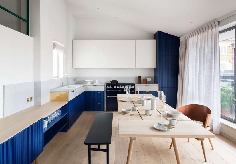
The Kitchen and Dining Area Do the Heavy Lifting
The kitchen immediately sets the tone. Instead of defaulting to glossy minimalism, the design leans into tactility and personality. The cabinetry combines oak interiors, hand-painted wood fronts, unlacquered brass hardware, and gray terrazzo across the lighter cabinet fronts, backsplash, and countertop. The effect is crisp but not cold. It feels crafted, not factory-sealed.
Then comes the color. Blue fluted cabinet fronts add a gentle note of drama without turning the space into a theatrical set. That balance is important. A jewelry designer’s home could easily tumble into sparkle overload, but this one avoids that trap. It understands that glamour is more convincing when it is textured, restrained, and a little surprising.
The dining setup is another smart move. A rotating oak dining table with pull-out extensions can accommodate as many as 12 people, which means the room shifts smoothly from weekday family use to dinner-party mode. That kind of flexibility is the holy grail in a pied-à-terre. One piece of furniture does not just sit there looking handsome; it changes the social capacity of the room. Very few design moves are as satisfying as furniture that earns its keep.
The bench seating and carefully placed furniture help define zones without chopping the room into awkward fragments. That is one of the big lessons from contemporary apartment design: good flow is often more valuable than rigid separation. You want the eye to travel, the light to move, and the room to feel open, even when every inch is being used.
A Staircase That Acts Like Sculpture Without Forgetting Its Job
If the kitchen is the apartment’s calm, tailored face, the staircase is its fabulous earrings. The perforated blue aluminum stair linking the two levels is dramatic, sculptural, and impossible to ignore. Inspired by butterfly wings, Issey Miyake’s pleated forms, and the mechanics of motorbike engines, it brings motion and shimmer into the center of the home.
But this is not art for art’s sake. The staircase also solves a practical design problem: how do you make vertical circulation feel meaningful in a relatively compact apartment? The answer here is to turn it into an event. Instead of hiding movement, the design celebrates it.
Beneath the staircase, a custom light installation made from neon and Jesmonite reinforces that idea. This under-stair zone could have become dead space, but instead it turns into a visual moment. HGTV and other U.S. design outlets often point to under-stair areas as prime real estate for built-ins or storage. This apartment proves the same area can also become a small gallery, a pause, a mood. Utility and delight are not enemies. They are roommates.
Private Rooms, Clever Boundaries, and the Quiet Genius of Built-Ins
The Children’s Rooms Feel Playful Without Being Precious
Downstairs, the children’s rooms are practical, warm, and quietly inventive. One of the best details in the apartment is a hidden desk tucked inside the daughter’s wardrobe. It is the kind of solution that makes design lovers nod approvingly and parents whisper, “Why didn’t we do that?” Hidden workspaces have become a small-space favorite because they let a room switch identities without looking crowded. Bedroom now, study nook later, visual clutter never.
There is also a subtle painted strip on the lower half of the walls in the downstairs rooms and entry hall, corresponding to the rooms’ slightly sunken level relative to the main living space. That detail is both playful and architectural. It acknowledges the layout rather than trying to disguise it. Smart interiors often work best when they collaborate with the quirks of a building instead of pretending those quirks do not exist.
Even the landing gets a job, housing a laundry closet. In a city apartment, this kind of placement is gold. It turns circulation space into working space without making the home feel over-engineered.
The Primary Suite Rewrites the Rules
The most impressive transformation may be the primary suite. The original problem was tricky: the space had only one window, and the design needed to fit a bedroom, shower, toilet, sinks, and entry sequence without making the room feel like a hotel bathroom with a bed awkwardly attached.
The solution is a long wall of cedar slatted joinery, sliding doors, and screens that define the suite while preserving openness and light. By moving the sinks out from the enclosed bathroom area and partially concealing them within the joinery, the design avoids that familiar apartment annoyance where the sleeping zone feels like an afterthought to the plumbing.
This move is brilliant for another reason: it treats privacy as adjustable rather than absolute. The family did not need heavy division everywhere. They needed degrees of separation. Sliding screens, concealed storage, and carefully choreographed sightlines make that possible. It is a lesson echoed across small-home design: boundaries do not always need drywall and a slammed door. Sometimes they just need intelligence.
The material palette in the suite adds another layer of calm. Cedar brings warmth and scent, and the handmade green Moroccan tile behind the terrazzo sink introduces color with depth rather than noise. The references to Japanese onsen design are especially effective here. Instead of creating a bathroom that screams “spa!” like a desperate wellness brochure, the suite quietly borrows the ritual feeling of bathing, privacy, and natural material.
A continuous cedar closet along the back wall and a lacquerware headboard reinforce the feeling that the room is both restful and highly edited. Everything appears intentional. Nothing appears accidental, except perhaps the envy it inspires.
Why This Jewelry Designer’s London Home Feels So Fresh
Plenty of high-end apartments have good finishes. Fewer have a point of view. What makes this jewelry designer home stand out is the way it mixes precision with softness. There is terrazzo, perforated metal, brass, and CNC-fluted cabinetry, but there is also painted wood grain, cedar scent, silk, tile, and handmade detail. The apartment feels engineered and human at the same time.
That balance mirrors the world of jewelry design itself. Fine jewelry lives at the intersection of art, architecture, mechanics, and emotion. It must be technically exact, but it also has to catch light, flatter the body, and make someone feel something. This apartment works the same way. The layout is practical, yet the atmosphere is emotional. The design solves problems, but it also seduces.
It also understands family life without turning into a cliché. There is no syrupy “kid-friendly” look here, no avalanche of pastel bins, no design surrender. Instead, the apartment proves that a family home can be bold, grown-up, and flexible all at once. House Beautiful and Domino regularly highlight this shift in family interiors: people want homes that support real life without looking like life won the fight. This London pied-à-terre is a strong example of that evolution.
Design Lessons to Borrow From This Flexible Pied-à-Terre
- Choose built-ins that can adapt. The smartest millwork is not just custom; it is flexible enough to support changing routines over time.
- Hide function when possible. A desk in a wardrobe, sinks behind screens, and laundry on a landing keep daily life practical without visual chaos.
- Let one piece do two or three jobs. An extendable dining table or a screened bathroom boundary can change how a whole home behaves.
- Use color strategically. Blue cabinetry and the statement stair add identity without overwhelming the apartment.
- Make awkward spaces work harder. Under-stair zones, sunken rooms, and narrow transitions can become some of the most memorable parts of a home.
- Think in degrees of privacy. Screens, joinery, and room dividers often create a more elegant solution than building rigid walls everywhere.
- Prioritize texture over excess. Wood grain, terrazzo, brass, lacquer, and tile bring richness that does not depend on clutter.
What Living in a Flexible London Pied-à-Terre Probably Feels Like
Now for the part that often gets skipped in house tours: the lived experience. Because beyond the beautiful photos and impressive custom details, the success of a pied-à-terre comes down to how it feels on an ordinary Tuesday.
Imagine arriving in London after travel, work, or a chaotic school pickup. The apartment does not ask for a ceremony. It receives you easily. Bags disappear into built-ins. Shoes do not stage a coup by the front door. The kitchen is ready for a quick dinner, but the dining area can just as quickly become a place for homework, jewelry sketches, or a last-minute dinner with friends. That kind of flexibility changes the emotional weather of a home. You stop negotiating with space and start using it naturally.
There is also something deeply comforting about a home that can look polished while still absorbing family life. Kids can retreat to bedrooms that have their own identity. Adults can move upstairs into a suite that feels calmer, more private, more exhale-worthy. The home does not force everyone into the same mood. It offers options, which is often the real definition of luxury.
For a creative professional like a jewelry designer, that matters even more. Creative work rarely happens in one tidy box labeled “studio time.” Ideas arrive during breakfast, in half-finished conversations, while setting the table, while looking at shadows on tile, while noticing how brass ages against painted wood. A home like this supports that kind of thinking. It is orderly enough to focus, tactile enough to inspire, and flexible enough to keep up with unpredictable days.
And then there is London itself. A pied-à-terre in a city like this has to perform a delicate trick. It must feel connected to the energy outside while still offering refuge from it. This apartment seems to manage both. The views remind you exactly where you are, but the cedar, terrazzo, slatted screens, and layered finishes pull the atmosphere inward. It is urban without being hard, elegant without being aloof.
The dinner-party experience is probably one of the home’s real triumphs. The extendable table suggests a room that can grow socially when needed. That is a surprisingly emotional feature. A flexible home does not just store things better; it hosts life better. It makes spontaneity easier. More chairs at the table, more conversation, more people staying longer than planned because the room is working with the evening instead of against it.
Even the hidden details matter in daily use. A desk concealed in a wardrobe means work can appear when needed and disappear when it is done. The suite’s screened sink area means the morning routine feels smoother and less cramped. The laundry closet on the landing saves steps and makes chores less intrusive. These are not headline-grabbing decisions, but they are the ones that make a home lovable over time.
That may be the clearest takeaway from this house tour. The apartment is memorable because it is stylish, yes, but it is persuasive because it understands rhythm: school schedules, work trips, quiet mornings, family dinners, guests, storage, privacy, and the occasional need for a room to do something new without demanding a renovation every six months. In a world full of interiors that look ready for a photo shoot and terrified of a real human, this one feels brave enough to be used.
Final Thoughts
This London pied-à-terre is a reminder that the best homes do not just solve for square footage. They solve for change. They make room for growth, guests, clutter, beauty, routine, and the occasional desire to impress people without pretending anyone actually lives there.
For a jewelry designer and her family, this apartment succeeds because it treats flexibility as a design language, not a compromise. The result is a home with personality, precision, and enough built-in intelligence to stay relevant as family life evolves. It is elegant, yes, but also nimble. And in city living, nimble may be the most luxurious word of all.