Table of Contents >> Show >> Hide
- What Is the Freud Alphabet Mug Range?
- Why This Mug Range Feels Different From Ordinary Alphabet Mugs
- Material, Craft, and Why Fine Bone China Still Matters
- The Design Language: Renaissance Energy in a Modern Kitchen
- How the Range Fits Into Real-Life Use
- Is the Freud Alphabet Mug Range Still Relevant Today?
- A Longer Reflection on the Experience of the Freud Alphabet Mug Range
- Conclusion
If you hear the words Freud Alphabet Mug Range and immediately picture Sigmund Freud sipping espresso while analyzing your attachment style, that is understandable. But in this case, Freud is not about couches, dreams, or suspiciously symbolic bananas. It is a design-led mug collection that turns the everyday coffee cup into something more literary, more decorative, and far more interesting than the lonely office mug that says “World’s Okayest Employee.”
The Freud Alphabet Mug Range stands out because it does not rely on novelty jokes or loud graphics. Instead, it uses historical alphabet forms, fine bone china, and careful decoration to create a mug that feels part kitchen object, part design collectible, and part conversation starter. For anyone who likes their coffee with a side of visual culture, this range has real appeal. It also taps into something enduring in home design: people love objects that feel personal, useful, and a little bit smarter than average.
In a market crowded with basic drinkware, personalized mugs, and endlessly repeated “cute gift” ideas, the Freud Alphabet Mug Range offers a more refined version of the alphabet mug trend. It gives you the charm of an initialed cup without looking like it came from a bargain-bin gift set next to a fuzzy pen and a candle that smells vaguely like ambition.
What Is the Freud Alphabet Mug Range?
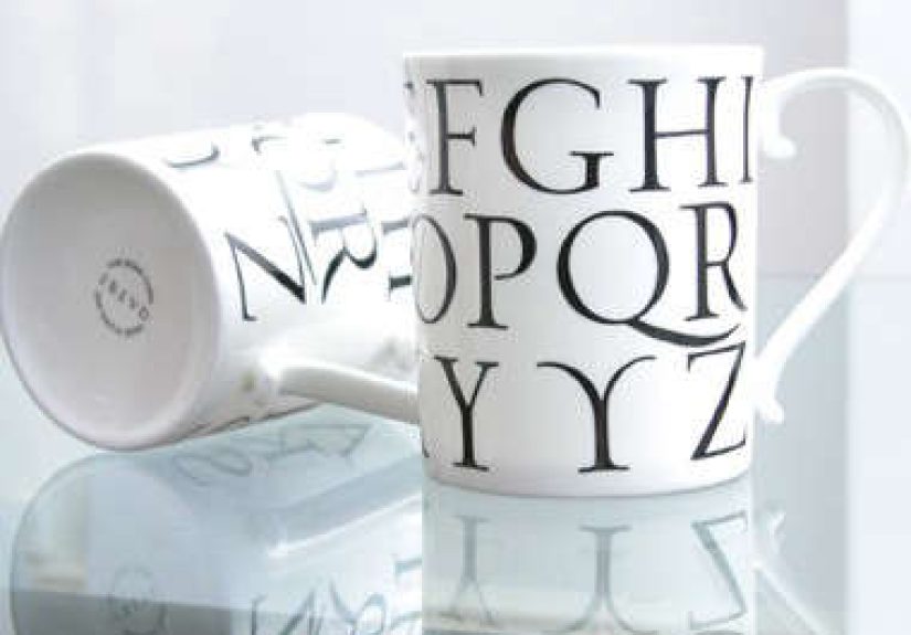
The Freud Alphabet Mug Range was presented as a fine bone china mug collection featuring alphabet-based graphics drawn from historical sources. The line was hand-cast and decorated in Stoke-on-Trent, England, a place with a deep ceramics legacy. It included a straight mug format and a tapered mug format, with the tapered version offered only in the Latin design. The product was also described as discontinued, which only adds to its design-world mystique. Nothing makes a home object feel more glamorous than hearing, “You can’t casually buy it anymore.”
What makes the collection especially distinctive is its use of historical lettering. Rather than slapping a modern sans-serif initial on a white cup and calling it a day, the range leaned into old-world typography. The Latin alphabet graphics were connected to a Venetian woodcut tradition, while other alphabet designs drew from sixteenth-century printed material. That gives the mugs a layered personality: they are practical objects, but they also carry the visual language of books, printing, and graphic history.
Why the alphabet matters
The alphabet is one of the most familiar visual systems in daily life, yet designers keep returning to it because it is endlessly adaptable. Letters can be formal, playful, ornamental, minimal, or deeply historical. On a mug, that matters. You hold the object close, look at it repeatedly, and associate it with ritual. A letter on a mug is not just decoration. It becomes identity, habit, and a tiny badge of ownership.
That helps explain why monogram and alphabet mugs continue to perform so well as home accessories and gifts. They feel personal without being too intimate, decorative without being impractical, and specific without requiring a full custom design process. The Freud Alphabet Mug Range takes that winning formula and gives it more substance by rooting it in typographic history instead of trend-only styling.
Why This Mug Range Feels Different From Ordinary Alphabet Mugs
Many alphabet mugs are designed to be cheerful, giftable, and easy to recognize from across a kitchen shelf. There is nothing wrong with that. In fact, the popularity of monogram mugs proves that people enjoy assigning everyday objects to themselves through letters and symbols. But the Freud range sits in a more design-conscious lane.
First, it has a stronger visual story. Historical woodcut-based alphabets bring texture, authority, and a sense of discovery. The mug becomes more than a label for “whose coffee this is.” It becomes an object that nods to print culture, book history, and decorative lettering traditions.
Second, the material elevates the experience. Fine bone china is associated with a lighter, brighter, more refined feel than many everyday ceramic mugs. The result is a mug that can still be used daily but reads as special. It is not shouting for attention. It is simply sitting there, looking quietly expensive.
Third, the range has built-in gift appeal. Alphabet mugs are already easy gifts because they feel tailored without demanding too much guesswork. Add thoughtful design, historical references, and a crafted English ceramics background, and suddenly you have something that works for housewarmings, birthdays, desk refreshes, hostess gifts, or “I saw this and it looked like you” shopping moments.
Material, Craft, and Why Fine Bone China Still Matters
One reason the Freud Alphabet Mug Range sounds more luxurious than the average mug rack situation is the material itself. Fine bone china has long been associated with translucency, delicacy, and strength. Despite the fancy reputation, good bone china is not merely decorative fluff for cupboards you are not allowed to touch. It can be durable, practical tableware when made well.
That balance is part of its charm. Bone china gives a mug a more refined visual character than thick, chunky stoneware, yet it does not automatically mean the piece is too precious to use. For a product like the Freud range, that matters because the entire point is functional beauty. This is not wall art pretending to be a mug. It is a mug that simply had the good manners to show up overdressed.
Why Stoke-on-Trent adds credibility
Stoke-on-Trent carries serious weight in the history of ceramics. Mentioning that the mugs were hand-cast and decorated there is not just a marketing flourish. It places the range inside a region long associated with pottery innovation, ceramic manufacturing, and decorated tableware. For design-minded shoppers, provenance like that is meaningful. It suggests tradition, expertise, and a level of production care beyond mass anonymous output.
In practical terms, that heritage also reinforces the product’s appeal as a design object. Buyers are not only choosing a letter mug. They are choosing a mug that belongs to a broader material and cultural story. That is a lot of mileage from one cup of coffee.
The Design Language: Renaissance Energy in a Modern Kitchen
The most memorable thing about the Freud Alphabet Mug Range is the way it fuses old visual language with modern domestic use. Historical alphabets can feel intimidating in books or archives. On a mug, they feel approachable. Suddenly, letterforms that once lived in the world of woodcuts, printers, and scholars are hanging out next to your kettle and maybe your slightly judgmental sourdough starter.
This blend of old and new is exactly why the mugs have lasting aesthetic power. Vintage-inspired design continues to resonate because it adds depth to contemporary interiors. People do not only want objects that “match the kitchen.” They want objects that have texture, narrative, and individuality. Personalized design, vintage references, and visually distinctive details continue to shape home decor choices because they make spaces feel more intentional.
The Freud range fits beautifully into that mindset. It works in minimalist spaces because the form is restrained. It works in eclectic spaces because the lettering adds character. It works in bookish homes because it looks like it belongs near a stack of essays and a lamp with excellent taste. It even works in offices, where it can silently communicate, “I appreciate design, and I will judge your novelty mug with the dancing avocado.”
How the Range Fits Into Real-Life Use
The best mug is not always the most expensive, the most famous, or the one with the most dramatic origin story. The best mug is the one you reach for without thinking. It feels right in the hand, suits your drink of choice, and somehow becomes part of your daily rhythm. That is why mug shape, capacity, handle comfort, and finish matter more than people admit.
The Freud Alphabet Mug Range had a straightforward functional appeal here. The straight mug offered a larger capacity, while the tapered mug provided a slightly different profile for those who care deeply about silhouette, balance, and the emotional significance of a good handle. Some people absolutely do care about those things. Those people are often correct.
Because alphabet mugs also help prevent household confusion, they are especially useful in shared kitchens, studios, workspaces, and family homes. An initialed mug quietly solves the universal question of “Whose cup is this?” without requiring a label maker or a passive-aggressive sticky note. The Freud version just happens to solve that problem with more elegance than usual.
Styling ideas
If you were styling a shelf or breakfast nook around the Freud Alphabet Mug Range, the most natural companions would be linen tea towels, neutral ceramics, dark wood, matte metals, and books or paper goods with a graphic edge. The mugs could also work well with a collected rather than perfectly matched approach. Because the lettering is visually strong, a single mug could anchor a mixed arrangement of cups and small serving pieces.
For gifting, the pairing opportunities are easy: a good bag of coffee, artisan tea, a classic tea towel, a handwritten note, a small tin of biscuits, or a design book. That is the magic of a good alphabet mug. It is specific enough to feel thoughtful but flexible enough to suit almost anyone.
Is the Freud Alphabet Mug Range Still Relevant Today?
Yes, and maybe even more than when it first appeared. Today’s buyers often want home goods that do more than function. They want objects that reflect personality, taste, and story. The renewed popularity of personalized decor, collectible kitchenware, and vintage-inspired styling makes the Freud Alphabet Mug Range feel remarkably current, even as a discontinued item.
Its appeal also extends beyond trend cycles because it avoids gimmick overload. The design is rooted in typography, craft, and useful form. That means it can age gracefully. It does not depend on a seasonal slogan or a pop-culture joke that expires faster than oat milk in August.
In that sense, the Freud Alphabet Mug Range represents the sweet spot of good product design: familiar enough to use every day, distinctive enough to remember, and thoughtful enough to make a routine object feel special.
A Longer Reflection on the Experience of the Freud Alphabet Mug Range
What is the experience of a mug like this, really? Not the catalog description. Not the materials list. Not the heroic phrase “hand-cast and decorated,” though that certainly helps. The real experience is quieter and more human.
It begins in the morning, when you reach into a cabinet half-awake and your hand naturally goes to the same cup. That is when a mug becomes part of your routine instead of just part of your kitchen. An alphabet mug adds one subtle emotional layer to that habit: it feels chosen. It feels like yours. In the case of the Freud Alphabet Mug Range, that feeling is sharpened by the lettering itself. The letter is not merely printed on the mug like a name tag at an awkward networking event. It feels integrated into the object’s identity, almost like the mug has a point of view.
Then there is the visual pleasure. A lot of everyday objects disappear into the background because they are designed only to function. This range does function, but it also rewards attention. The historical character of the alphabet graphics makes you notice the mug a little more each time you use it. It has presence. Set it on a desk beside a notebook, and suddenly your workspace looks more intentional. Leave it on a shelf, and it reads less like random kitchen clutter and more like a deliberate piece of domestic styling.
There is also a tactile side to the experience. Fine bone china tends to feel lighter and more refined than the heavy mugs many people keep by default. That changes the rhythm of use in a small but real way. The mug feels elegant without becoming fussy. It says “have a civilized cup of tea” while still understanding that you may be answering emails in sweatpants.
In shared spaces, the experience becomes social. Alphabet mugs help establish small territories in the nicest possible way. One person reaches for A, another for M, another for S, and suddenly the kitchen has a low-key order to it. Nobody needs to ask whose mug is whose. Nobody accidentally steals someone else’s coffee vessel and starts a household debate before breakfast. Design has quietly solved a problem again.
As a gift, the experience is equally strong. Receiving a mug with a letter already feels personal. Receiving one that looks thoughtful, artful, and a bit uncommon feels better. It suggests that the giver did not just grab something convenient on the way to the checkout line. They found an object with character. And that is usually what people remember: not the price, not the product category, but the feeling that the gift had taste.
That is why the Freud Alphabet Mug Range still lingers in the imagination. It transforms an ordinary object into a daily design encounter. You do not need a museum, a rare-books room, or a perfectly styled kitchen to enjoy it. You just need coffee, tea, or whatever keeps you functioning before 10 a.m. The mug does the rest.
Conclusion
The Freud Alphabet Mug Range is a smart example of how good design can elevate something ordinary without making it unusable. By combining historical alphabet graphics, fine bone china, and a well-established ceramics tradition, it turns a simple mug into an object with style, story, and staying power. Its discontinued status only adds to its charm, but the bigger takeaway is not scarcity. It is design clarity.
This range works because it understands the emotional life of everyday objects. We want mugs that feel good to hold, look good on a shelf, and say something about our taste without needing a drumroll. The Freud Alphabet Mug Range does exactly that. It is personal without being cheesy, decorative without being loud, and practical without being boring. That is a rare trick in home goods, and frankly, it deserves a refill.