Table of Contents >> Show >> Hide
- What Makes Persimmon Such a Smart 2024 Color Choice?
- Why This Color Feels So Cozy Instead of Just “Trendy”
- Persimmon vs. the Other 2024 Color Trends
- Where Persimmon Works Best in the Home
- How to Style Persimmon Without Getting It Wrong
- Common Mistakes to Avoid With Persimmon
- Why Persimmon Feels Emotionally Right for Modern Homes
- Extended Experience: What It Feels Like to Live With a Color Like Persimmon
- Conclusion
Every year, paint brands unveil a Color of the Year like they are revealing the winner of a glamorous beauty pageant for walls. There is suspense. There is drama. There is always at least one shade that makes people say, “Pretty, but would I really put that in my kitchen?” HGTV Home by Sherwin-Williams skipped the confusion and went straight for the emotional sweet spot with its 2024 pick: Persimmon.
Warm, earthy, and quietly cheerful, Persimmon is not the kind of color that barges into a room wearing sequins and demanding attention. It is more like the guest who arrives with fresh bread, compliments your throw pillows, and somehow makes everyone feel more relaxed. That is exactly why it works. In a design world still obsessed with comfort, softness, and rooms that feel lived in rather than staged for a catalog, Persimmon lands with perfect timing.
This shade is a lightened terracotta with tangerine energy and grounded undertones, which means it has personality without becoming exhausting. It feels cozy, but not sleepy. It feels fresh, but not cold. And perhaps most importantly, it makes a home look like actual humans with good taste might live there. Imagine that.
What Makes Persimmon Such a Smart 2024 Color Choice?
HGTV Home by Sherwin-Williams selected Persimmon as the hero shade in its 2024 Renewed Comfort collection, and the name of that palette explains a lot. Homeowners are not just chasing trends anymore. They want rooms that restore them. They want color with emotional warmth. They want spaces that feel inviting at 7 a.m. with coffee and equally flattering at 7 p.m. when the lamp light turns everything cinematic.
Persimmon answers that need beautifully. It draws from earthy terracotta tones, but it is softened with a brighter, livelier edge. That balance matters. Traditional orange can feel loud. Brown-heavy terra-cotta can feel too rustic. Peach can drift into overly sweet territory. Persimmon sits in the sweet spot between all three. It is warm enough to create coziness, bright enough to keep a room awake, and grounded enough to work almost like a neutral.
That last part is the real magic trick. The best modern paint colors do not just look good in a swatch; they function well in real homes. Persimmon has enough depth to anchor a room, but enough softness to mix with wood, cream, black, brass, linen, stone, and other finishes people actually use. In other words, it is stylish without being high-maintenance. A rare trait. A noble trait.
Why This Color Feels So Cozy Instead of Just “Trendy”
It has warmth built into its DNA
Warm paint colors naturally create intimacy, and Persimmon does that without making a room feel smaller or heavier. Because it carries earthy undertones, it feels familiar. It has the comforting effect of clay, sunbaked tile, old brick, cinnamon, apricot, and fall light coming through a window at exactly the right angle. Humans are simple creatures. Show us a color that reminds us of warmth, and we will immediately want a blanket and a soup recipe.
It brings energy without harshness
Some cozy colors lean so muted that a room starts to look half asleep. Persimmon avoids that problem. Its tangerine influence gives it brightness and social energy, which is why it makes so much sense in gathering spaces. Living rooms feel friendlier. Kitchens feel more alive. Dining areas feel like places where people might actually linger after dessert instead of standing up the second the forks hit the plate.
It plays nicely with modern design
Coziness today is not all cabin vibes and dark plaid. Modern comfort is lighter, cleaner, and more layered. Persimmon works beautifully in that environment because it can be styled with minimalist shapes, Scandinavian woods, textured fabrics, matte black accents, or classic white trim. It does not force a room into one design identity. It just makes the whole space feel more human.
Persimmon vs. the Other 2024 Color Trends
The 2024 color conversation was full of comfort-driven shades, with many brands leaning into soothing blues, earthy neutrals, grounded greens, and warm peaches. That broader trend says a lot about where design was heading: less sterile perfection, more emotional ease. Persimmon fits that movement, but it also stands out inside it.
While pale blues and soft greens offer calm, Persimmon adds connection. It is the difference between a room that whispers “rest” and a room that says “come in, stay awhile.” That distinction is huge in spaces meant for daily life. Bedrooms can benefit from serenity, sure, but the heart of the home often needs a little pulse. A little warmth. A little “yes, you may absolutely have another coffee and talk for 40 more minutes.”
That is why Persimmon feels especially relevant. It acknowledges the ongoing desire for comfort and wellness while refusing to become bland. It gives homeowners a way to embrace warmth without going muddy and to embrace color without going neon. It is grown-up, but not boring. Cheerful, but not childish. Stylish, but not smug. Frankly, more paint colors should aspire to this kind of emotional maturity.
Where Persimmon Works Best in the Home
Living rooms
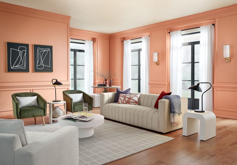
Persimmon shines in living rooms because it flatters both natural light and lamplight. During the day, it reads upbeat and sun-washed. In the evening, it becomes richer and softer, which makes the whole room feel wrapped in warmth. Pair it with creamy upholstery, walnut furniture, woven textures, and brass accents for a space that feels cozy without looking old-fashioned.
Kitchens
This color has enough optimism for a kitchen, which matters because that room can easily become too cold with white cabinets and gray stone. Persimmon adds appetite, warmth, and personality. It works beautifully on an island, a pantry door, lower cabinets, or even a breakfast nook wall. If your kitchen currently looks like it is waiting for a software update, Persimmon can help.
Dining spaces
Warm colors encourage conversation, and Persimmon naturally supports that social energy. In a dining room, it creates intimacy and depth without feeling too formal. Add soft white trim, natural wood tones, and a moody light fixture, and the room suddenly looks like it belongs to people who know how to host with confidence.
Front doors and exteriors
If you are not ready to commit to a full room, a front door is a brilliant place to try Persimmon. Against white, soft beige, charcoal, or greige exteriors, it reads cheerful and confident. It is more unexpected than navy but more approachable than bright red. It says, “Welcome,” without shouting it through a megaphone.
Built-ins and accent moments
Persimmon is also excellent for smaller, intentional applications: bookshelves, mudroom cubbies, bar nooks, furniture refreshes, powder room vanities, and accent walls. These uses let the color add personality while staying contained. It is a great strategy for anyone who loves the shade but would prefer a flirtation before a full relationship.
How to Style Persimmon Without Getting It Wrong
The easiest way to make Persimmon look polished is to treat it like a warm foundational color instead of a novelty color. That means pairing it with materials and finishes that enhance its earthy character.
Best color partners
Soft whites and warm whites keep it fresh. Beige, taupe, tan, and camel bring out its grounded side. Deep charcoal and inky blue give it sophistication. Mossy green adds a natural, layered look. Dusty blue can create a beautiful contrast that feels vintage and current at the same time.
Best textures
Linen, boucle, jute, light oak, walnut, aged brass, terracotta pottery, matte ceramics, and natural stone all make Persimmon look richer. The color loves texture because texture reinforces the idea of comfort. A flat room with no layers will make Persimmon feel less special. Give it tactile company and it rewards you.
Best design styles
This hue works especially well in organic modern, updated traditional, California casual, warm minimalism, eclectic, and even some cottage-inspired interiors. It is flexible enough to shift with the room. That is one reason it feels less like a one-season trend and more like a useful long-term design tool.
Common Mistakes to Avoid With Persimmon
Do not pair it only with cold grays. That can flatten the warmth that makes the color special. If you want contrast, use deeper charcoals, softer greiges, or blue-based darks instead.
Do not overfill the room with competing warm colors. Persimmon already has enough personality. If every accessory is orange, rust, mustard, and red, the room may start to feel like a pumpkin spice convention. Balance is your friend.
Do not ignore lighting. Like every warm shade, Persimmon shifts throughout the day. Test it first, especially in north-facing rooms. In some spaces it may appear softer and more earthy; in others it may lean brighter and peachier.
Do not assume it only works in fall. Yes, the name sounds deliciously autumnal. No, you do not need decorative gourds to justify it. With the right styling, Persimmon works year-round because it is rooted in natural warmth, not seasonal gimmicks.
Why Persimmon Feels Emotionally Right for Modern Homes
People often talk about paint colors as visual decisions, but they are emotional decisions too. Color changes how a home feels to the people living in it. Persimmon succeeds because it reflects what many homeowners want right now: a home that feels welcoming, grounded, optimistic, and personal.
For years, many interiors chased cool minimalism so aggressively that some homes ended up looking like very stylish waiting rooms. Beautiful, yes. Relaxing, not always. Persimmon helps correct that. It brings warmth back into the picture without requiring a full retreat into rustic design. It feels current, but soft. Expressive, but still livable.
That is what makes the HGTV Home by Sherwin-Williams 2024 Color of the Year such a smart pick. It does not just photograph well. It supports the way people actually want to live: gathered, comfortable, relaxed, and just a little more alive inside their own walls.
Extended Experience: What It Feels Like to Live With a Color Like Persimmon
Reading about Persimmon is one thing. Living with it is another, and that is where the shade really earns its reputation. In real life, cozy paint colors are judged less by trend reports and more by ordinary moments. How does the room feel on a rainy Tuesday? What happens when the morning sun hits the wall? Does the color still feel good when the groceries are on the counter, the dog is barking, and someone has left a backpack in the hallway for no reason at all?
Persimmon passes that test because it behaves like a comfort color with manners. In the morning, it can feel cheerful and softly energizing, especially when daylight brings out its brighter tangerine side. It gives kitchens and breakfast corners a gentle glow that makes coffee feel slightly more heroic. In the afternoon, the color settles into its earthy core and starts to feel more grounded, almost clay-like. By evening, under warm lighting, it becomes richer and more intimate. That daily shift is part of its charm. The room does not feel static; it feels alive.
There is also something deeply practical about a warm color that still looks refined. Many people want cozy interiors, but they do not want their homes to feel dark, heavy, or cluttered. Persimmon bridges that gap. It adds emotional warmth even when the furniture is simple. A room with clean lines, neutral upholstery, and only a few well-chosen accessories can still feel full and inviting when a color like this is on the walls or cabinetry.
It is especially effective in homes where people gather naturally. Think about the lived experience of a kitchen island painted in Persimmon. It becomes more than a design feature. It becomes a visual anchor. People lean on it while chatting. Kids do homework there. Guests hover around it because guests always hover around the kitchen no matter how many chairs you set up elsewhere. The color helps that moment feel intentional, as if the space was designed for warmth and conversation rather than simply for storage and appliances.
On a front door, Persimmon creates a different kind of experience. It offers that little mood lift you get before even stepping inside. The home feels welcoming from the sidewalk. That may sound dramatic for a paint color, but anyone who has ever fallen in love with a house because of its front door knows this is very real behavior. We are emotional creatures in shoes.
In bedrooms or reading corners, Persimmon should be used more thoughtfully, but it can still be beautiful. Instead of covering every wall, it may work best as an accent, on millwork, a dresser, or paired with softer companion colors. Used this way, it adds warmth without overstimulating the room. It is less “wake up and conquer” and more “rest here, but with style.”
Another strength of Persimmon is that it adapts to the seasons. In fall and winter, it feels cozy and cocooning. In spring and summer, it reads sun-baked and airy rather than heavy. That flexibility makes it feel like a color you can grow with, not one you will resent by next year. And that may be the biggest compliment a Color of the Year can receive. Plenty of annual picks are exciting in announcement season and exhausting six months later. Persimmon has a better shot at longevity because it is built on timeless ingredients: warmth, balance, and comfort.
So yes, trend watchers can discuss undertones, palette strategy, and market direction all day long. But the real story is simpler. Persimmon makes rooms feel nicer to be in. It brings coziness to life not through gimmicks, but through mood, softness, and a warmth that feels both stylish and sincere. That is not just good branding. That is good design.
Conclusion
The HGTV Home by Sherwin-Williams Color of the Year 2024 pick succeeds because it understands what people want from a home right now. Persimmon is warm, inviting, versatile, and emotionally intelligent. It captures the coziness people crave while still feeling fresh enough for modern interiors.
Whether it appears on a kitchen island, a front door, a living room wall, or a few carefully chosen accents, Persimmon proves that comfort does not have to be beige and personality does not have to be loud. Sometimes the perfect color is the one that makes a room feel softer, friendlier, and more alive the minute you walk in. Persimmon does exactly that. And unlike some design trends, it does not need to yell to be memorable.