Table of Contents >> Show >> Hide
- Why Colorful Buildings Matter More Than We Think
- The World’s Most Colorful Buildings Worth Talking About
- Burano, Italy: The Tiny Island That Refuses to Be Boring
- Chefchaouen, Morocco: A Blue City That Feels Almost Unreal
- Bo-Kaap, Cape Town: Color With Cultural Gravity
- San Miguel de Allende and Guanajuato: Mexico’s Love Letter to Color
- Havana, Cuba: Faded Splendor, Full Personality
- Jaipur and Hawa Mahal: When a City Becomes a Palette
- La Muralla Roja, Spain: A Postmodern Masterclass in Controlled Boldness
- Modern Color Icons: Glass, Metal, and the End of the Beige Era
- What Makes Colorful Architecture Actually Work
- Why Travelers Can’t Resist Them
- How to Experience the World’s Most Colorful Buildings Like a Human, Not a Hashtag
- Extended Experience: Walking Through a World Painted on Purpose
- Conclusion
Some buildings whisper. Others sing. And then there are the world’s most colorful buildings, which practically kick open the door, throw confetti in the air, and announce that beige had a nice run. From candy-bright fishing houses to pink palaces and blue-painted medinas, colorful architecture does more than look pretty in photos. It tells stories about climate, identity, craftsmanship, faith, trade, tourism, memory, and the very human desire to make a street feel alive.
If you have ever stopped mid-walk because a row of painted facades made your brain happier than your morning coffee, you already understand the appeal. Colorful buildings do not simply decorate a destination; they define it. In many places, color is practical. In others, it is symbolic. Sometimes it is political. Sometimes it is deeply local. And sometimes an architect just looks at a blank wall and thinks, “This needs more drama.” Honestly, fair enough.
Why Colorful Buildings Matter More Than We Think
It is easy to treat vibrant architecture like visual dessert, something cute for postcards and social feeds. But the best colorful buildings are not random acts of paint. They are expressions of place. A bright facade can help a home stand out in mist or on water. A uniform city color can become part of civic branding long before the word “branding” showed up in marketing decks. Decorative pigments can signal wealth, spirituality, artistic ambition, or resistance to sameness. In short, color is not fluff. Color is language.
That is why the world’s most colorful buildings tend to feel memorable even when their shapes are simple. A small house in a fishing district can be more unforgettable than a giant steel tower if its color palette feels rooted in local life. Paint, tile, stained glass, plaster, sandstone, and even metal cladding can act like architectural vocabulary. A building may be modest in form, but once color enters the conversation, it suddenly has a point of view.
And let’s be honest: in an age of safe neutrals, gray glass, and copy-paste urban development, a truly colorful building feels rebellious in the best way. It reminds us that cities do not have to look like spreadsheets.
The World’s Most Colorful Buildings Worth Talking About
Burano, Italy: The Tiny Island That Refuses to Be Boring
Burano, in the Venetian lagoon, is one of the clearest examples of color becoming identity. The island is famous for its vividly painted homes, lace-making history, and canals that reflect every saturated shade back at the sky like a mirror with excellent taste. What makes Burano so compelling is not one single landmark building, but the collective effect of the whole streetscape. The facades line up in yellows, pinks, greens, blues, and oranges with a confidence that suggests nobody here has ever been afraid of a paint sample card.
Burano works because the colors are intense but not chaotic. Each house stands apart, yet the street still feels harmonious. That balance is harder than it looks. The lesson for architecture lovers is simple: color becomes powerful when repetition and contrast are managed with care.
Chefchaouen, Morocco: A Blue City That Feels Almost Unreal
Chefchaouen is one of those places that makes people suspect a filter, but no, the blue really is that blue. Walls, doors, alleyways, staircases, and public corners seem dipped in countless shades of sky, denim, indigo, powder, and cobalt. The city’s visual identity is so strong that it blurs the line between architecture and atmosphere. You are not just looking at buildings; you are moving through a color field.
What makes Chefchaouen fascinating is how a limited palette can still create enormous visual depth. This is not rainbow architecture. It is monochromatic storytelling. The result is calm, immersive, and strangely cinematic. It proves that colorful design does not always mean using every hue at once. Sometimes the smartest move is commitment.
Bo-Kaap, Cape Town: Color With Cultural Gravity
Bo-Kaap’s bright houses are among the most photographed in the world, but reducing the neighborhood to “cute colorful homes” misses the point. This area carries deep cultural meaning tied to Cape Malay heritage, layered history, and community identity. The facades are vibrant, yes, but they are also part of a lived neighborhood where color signals continuity, pride, and visibility.
The architecture itself is charming, with compact houses and rhythmic street lines climbing against the dramatic backdrop of Cape Town. But what stays with visitors is the feeling that color here is not surface decoration. It is social texture. That makes Bo-Kaap one of the strongest examples of why colorful buildings should be read not just aesthetically, but culturally.
San Miguel de Allende and Guanajuato: Mexico’s Love Letter to Color
If architecture could flirt, central Mexico would be dangerously good at it. San Miguel de Allende pairs cobblestone streets with colonial facades in ocher, terracotta, paprika, mustard, coral, and warm pink. The city feels sunlit even before sunrise. Its buildings are richly photogenic, but they also feel grounded. Nothing looks accidental. Stucco walls, ironwork, courtyards, and stone details all work together so the color reads as elegant rather than loud.
Guanajuato pushes the experience in a more theatrical direction. Built into hillsides, its colorful buildings stack and tumble across the landscape, creating a kind of urban patchwork quilt. Seen from above, the city feels like a painter tipped over a full set of pigments and somehow improved the skyline. Together, these two Mexican destinations show how color can thrive at both intimate street level and dramatic city scale.
Havana, Cuba: Faded Splendor, Full Personality
Havana’s color story is a little different from the polished prettiness of many tourist favorites. Here the magic often lies in patina. Pastel facades, sun-worn paint, old balconies, and layered architectural styles create a cityscape that feels textured rather than pristine. That is exactly why it works. Havana demonstrates that colorful buildings do not need to look freshly painted to feel vibrant. Age can deepen color instead of diminishing it.
The city’s visual richness comes from contrast: elegant details beside weathered walls, grand avenues beside intimate streets, tropical light falling across facades that have clearly seen things. Havana is proof that colorful architecture is not always cute. Sometimes it is soulful.
Jaipur and Hawa Mahal: When a City Becomes a Palette
Jaipur’s global nickname, the Pink City, tells you almost everything you need to know. The city’s warm terracotta-pink identity gives it one of the most recognizable urban looks on earth. Its most famous color icon is the Hawa Mahal, whose intricate facade turns pigment into performance. The building is ornate, rhythmic, airy, and instantly legible from a distance. It does not merely sit on the street; it stages itself.
What makes Jaipur so important in any conversation about colorful buildings is its consistency. When color becomes part of an entire urban language, individual landmarks feel stronger. The Hawa Mahal shines partly because the city around it already understands the assignment.
La Muralla Roja, Spain: A Postmodern Masterclass in Controlled Boldness
Some colorful buildings charm you. La Muralla Roja, in Spain, ambushes you with geometry. Designed by Ricardo Bofill, the complex uses pink, red, and blue in a way that feels both playful and severe. It looks like a fortress, a sculpture, a maze, and a very stylish dream all at once. Every stair, void, passage, and wall plane turns color into a spatial event.
This building matters because it shows what happens when color is built into the concept from day one. It is not a neutral structure painted later for effect. The color is the architecture. Remove the palette and the entire emotional experience changes. That is the difference between decorative color and design-led color.
Modern Color Icons: Glass, Metal, and the End of the Beige Era
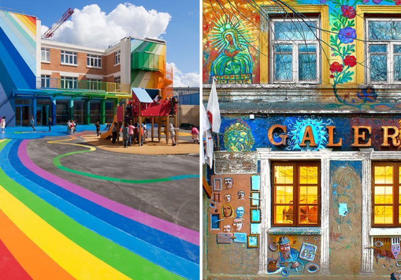
Colorful architecture is not limited to historic districts and old plaster walls. Contemporary designers use tinted glass, reflective metals, ceramic surfaces, and large-scale interventions to create bold visual landmarks. Whether it is a rainbow walkway, a shimmering facade, or a hotel wrapped in expressive metallic ribbons, modern colorful buildings prove that vibrancy can feel futuristic instead of nostalgic.
The smartest contemporary examples do not treat color as a gimmick. They use it to reshape how people move through space, how light behaves, and how a building performs in the public imagination. In other words, color can still be serious architecture, even when it looks like it is having more fun than everything around it.
What Makes Colorful Architecture Actually Work
Not every bright building is a great building. Some are just loud. The world’s most successful colorful buildings share a few traits. First, the palette usually fits the climate or material culture of the place. Sunlit cities can handle warmer and more saturated tones because natural light softens and animates them. Coastal environments often lean into bright contrast because haze, water, and distance change how color reads. Desert tones can glow rather than glare when paired with local stone and dust-filled light.
Second, good colorful architecture uses rhythm. A single bright wall can be striking, but repeated color patterns across doors, windows, arcades, balconies, or whole streets create a stronger visual identity. Third, texture matters. Matte plaster, glazed tile, carved sandstone, oxidized metal, and painted wood all carry color differently. The hue is only half the story; the surface finishes the sentence.
Finally, the best colorful buildings know when to stop. A bold palette needs structure. Without proportion, repetition, and contrast, brightness becomes noise. Great color does not scream all the time. It knows when to sing harmony and when to let one facade take the solo.
Why Travelers Can’t Resist Them
The obvious answer is that colorful buildings are photogenic, and yes, your camera roll agrees. But the deeper reason is emotional. People remember places that feel distinct. Color creates that distinction quickly and powerfully. It can make a neighborhood feel joyful, intimate, theatrical, spiritual, nostalgic, or gently surreal. It changes how we move. We slow down. We look up. We wander one more block. We stop saying “I’m just going to check the map” and start saying “Wait, what is down this street?”
That shift matters. Great travel is often about attention, and colorful architecture rewards attention. A painted facade catches the eye first, then pulls you toward the details: a balcony, a tile border, a carved door, a weathered shutter, a shadow line at late afternoon. Color gets you in the door. Texture, history, and context make you stay.
How to Experience the World’s Most Colorful Buildings Like a Human, Not a Hashtag
Start early. Morning light is kinder, streets are quieter, and your experience is less likely to involve twenty people taking the exact same selfie in front of the exact same wall. Walk slowly. Some places reveal their best color relationships from close up, while others need distance and elevation. Look for how colors change in shade, sunlight, and reflection. A pink wall at noon is not the same pink wall at sunset.
Try not to reduce whole neighborhoods to backdrops. Many of the world’s most colorful places are not open-air sets; they are homes, communities, and living cultural landscapes. Admire them, photograph them respectfully, and pay attention to the stories behind the paint. It turns out that curiosity is a better travel accessory than a ring light.
Extended Experience: Walking Through a World Painted on Purpose
There is a very specific feeling that happens when you enter a place defined by color. At first, you think you are seeing buildings. A few minutes later, it feels more accurate to say the buildings are seeing you. They alter your pace. They sharpen your attention. They make you notice how sunlight moves, how shadow cools a wall, how one doorway can change the entire mood of a street. In a neutral city, you may walk efficiently. In a colorful one, you drift.
That drift is part of the experience. You turn a corner expecting more of the same and instead find a staircase painted in blue so vivid it feels chilled. You pass a coral facade beside a yellow one and suddenly understand that color can create rhythm the way music does. One wall is the beat. The next is the melody. A green shutter interrupts like a cymbal crash. Architecture stops being static and starts behaving like composition.
What people often underestimate is how physical the experience becomes. Warm colors seem to move forward. Cool colors seem to recede. Narrow alleys feel deeper, courtyards feel brighter, and small houses can appear grander simply because their surfaces are alive. Even your memory behaves differently in these places. You do not remember “the third street after the plaza.” You remember “the lane with the saffron wall and the turquoise window.” Color becomes navigation, atmosphere, and emotional shorthand all at once.
There is also something wonderfully democratic about colorful buildings. You do not need a degree in architecture to respond to them. You do not need to memorize styles, dates, or movements. A child understands them. A tired traveler understands them. Someone who claims not to care about design will still stop and say, “Okay, wow.” That accessibility is part of their power. Great colorful architecture meets experts and casual passersby at the same corner and delights both.
Then there is the matter of surprise. Bright buildings can make ordinary urban moments feel cinematic. Laundry overhead looks intentional. A parked scooter suddenly matches a wall as if placed by an art director. A cafe table in the shade becomes the best seat in the city because the view across the street is doing all the work. You realize that color is not just attached to architecture; it spills into daily life and upgrades it.
But the best experiences are rarely just visual. In colorful places, you begin to notice sound, temperature, and smell more vividly too. The clang of dishes from a kitchen, the echo of footsteps on stone, the sweetness of baked bread, the salt in coastal air, the faint coolness near a painted archway at dusk, all of it blends with the buildings into one memory. The place stops being “pretty” and becomes immersive.
That is why the world’s most colorful buildings linger in the imagination long after the trip ends. They are not memorable only because they are bright. They are memorable because they change the quality of attention. They make you look longer, feel more, and move more slowly through the built world. In a time when so much of travel is rushed, optimized, ranked, and over-filtered, that might be their greatest gift. They remind us that a city can still surprise us, a street can still charm us, and a wall can still be enough to make us stop in our tracks and grin like an idiot. Honestly, that is a pretty good reason to keep looking up.
Conclusion
The world’s most colorful buildings are not memorable because they are loud. They are memorable because they are intentional. They turn paint, plaster, glass, stone, and light into identity. They help neighborhoods tell stories, help cities claim personality, and help travelers remember that architecture can be both meaningful and joyful. Whether you are wandering through blue alleyways, pink plazas, rainbow facades, or sun-faded pastel streets, one truth keeps showing up: color is not the finishing touch. In the best buildings, color is the message.