Table of Contents >> Show >> Hide
- What “Palladian” means (and why it instantly reads as fancy)
- Meet Palladian Wallpaper – Blue: the “wall of windows” illusion
- Where Palladian Wallpaper – Blue looks amazing (and where it might struggle)
- Styling the look: how to make it feel intentional, not theme-park
- Installation and materials: how to avoid “why is it bubbling?”
- How much to order: don’t let math ruin your design moment
- Design ideas that feel high-end (without wallpapering your whole life)
- Real-life experiences: what it’s like living with Palladian Wallpaper – Blue (500-ish honest words)
- Final thoughts
Some wallpapers whisper. Palladian Wallpaper – Blue shows up in a tailored blazer, clears its throat, and
quietly turns your plain drywall into “historic architecture” (minus the zoning permits).
If you’ve ever wanted your room to feel like it has grand, classical windowswithout inviting actual weather into your lifethis is the vibe.
In this guide, we’ll break down what “Palladian” really means, why blue makes the whole thing look extra crisp, where this pattern shines,
how to avoid common wallpaper heartbreak, and how to style it so it looks intentional (not like your wall joined a theater troupe).
What “Palladian” means (and why it instantly reads as fancy)
The word Palladian comes from Renaissance-era design ideas associated with the architect Andrea Palladio.
In everyday decorating language, though, “Palladian” usually points to the iconic Palladian window motif:
a tall, arched center opening flanked by two shorter rectangular openings. It’s symmetrical, architectural, and instantly “stately.”
That symmetry is the secret sauce. Humans love balance. Your brain sees the repeated arches and straight lines and thinks:
“This place has good bones.” Even if the bones are… printed.
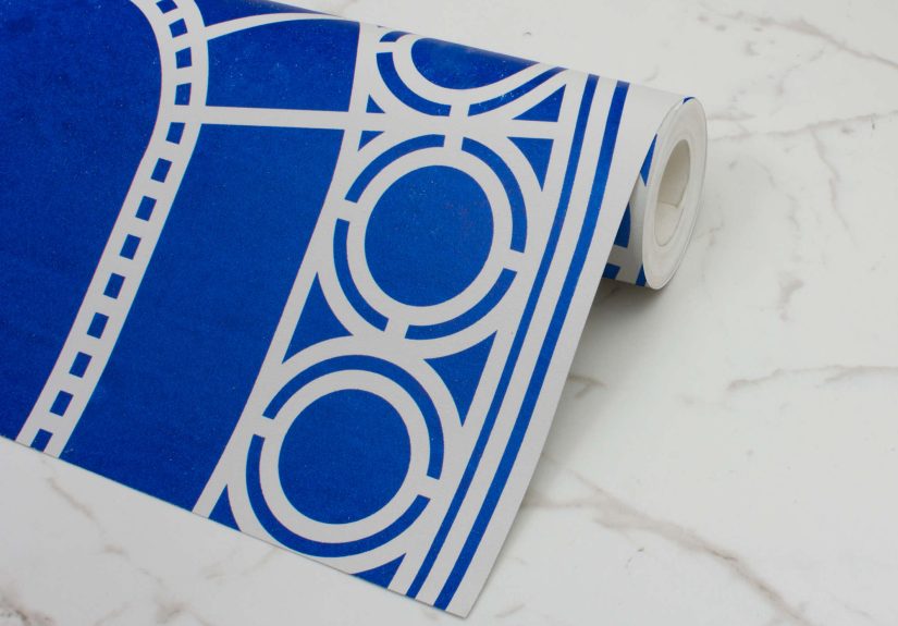
Meet Palladian Wallpaper – Blue: the “wall of windows” illusion
Palladian Wallpaper – Blue is an architectural, graphic take on the Palladian window idea. Instead of a soft, hand-painted mural feel,
it leans sharp and cleanmore “modern classical” than “dusty estate sale.” The design is meant to read like a series of window bays,
creating the illusion that your wall has depth, structure, and a bit of Old World swagger.
The color story: royal blue + soft grey = instant contrast
Blue is doing a lot of work herein a good way. A bold royal blue against a muted off-grey background gives the pattern crisp edges and strong
graphic punch. It’s the same reason navy-and-white stripes never really go away: high contrast reads clean from across a room, and still looks
detailed up close.
The grey background matters, too. It softens the blue so the look stays architectural rather than cartoonish. Think: “ink on stone,” not “marker on notebook.”
It’s the kind of pairing that plays well with both warm and cool paletteswhich is handy when your sofa is beige but your heart is blue.
The visual trick: negative space that feels like real framework
One of the clever design moves in this pattern is how the “frame” can feel like negative space, while the color blocks pull your attention to the shapes
inside the window composition. The result is a trompe l’oeil effect that’s dramatic without needing faux shadows and fake molding.
It’s more graphic illusion than photorealistic muralwhich often makes it easier to decorate around.
Scale and layout: plan it like you’re placing real windows
Architectural wallpaper is less forgiving than ditsy florals. With a window motif, your eye expects straight lines and consistent alignmentbecause that’s how
real architecture behaves (most days). So think about placement the way you’d think about actual windows:
- Center the “hero” window on the most important wall (behind a bed, across from the entry, or the dining room focal wall).
- Watch the cut lines near corners, doors, and big furniture so you don’t slice an arch in half at eye level.
- Consider a chair rail or wainscoting below itarchitectural on architectural is a power move.
Practical detail you’ll want before ordering: this style is often produced in tall “drops” meant to read as full window panels, and each roll can contain
multiple window repeats you cut down to your wall height. That’s great for flexibilityespecially in older homes where the ceiling height is “surprise!”
instead of “standard.”
Where Palladian Wallpaper – Blue looks amazing (and where it might struggle)
1) Hallways and entries: instant “I have my life together” energy
Hallways are basically the runway of your home. They’re transitional spaces, so they can handle a bolder look without feeling like you’re living inside
a pattern 24/7. A Palladian motif also makes a narrow hallway feel more structured and intentionallike it was always meant to be impressive, not just
the place where coats pile up.
2) Dining rooms: formal, but not fussy
This pattern shines in a dining room because architecture-inspired designs already feel “event-ready.” Pair it with a simple table, upholstered chairs,
and one statement light fixture. The wallpaper becomes the room’s built-in backdropperfect for dinner parties, birthday candles, or your extremely serious
Tuesday night pasta.
3) Bedrooms: the best kind of drama (quiet drama)
Use it behind the headboard as a feature wall. It adds structure without adding visual clutter. Blue also tends to feel calming, which is convenient
because you’re trying to sleep, not audition for an opera. Keep bedding simplesolids, subtle stripes, or textures like linenso the arches stay the star.
4) Bathrooms: yes… but choose your battles
Wallpaper in a powder room is usually a green light (less steam, more “wow”). In a full bath with daily hot showers, you need to be smarter:
ventilation, correct material choice, and proper wall prep become non-negotiable. If your bathroom regularly feels like a tropical greenhouse,
you may want to reserve this look for a lower-moisture space or use it away from direct splash zones.
Styling the look: how to make it feel intentional, not theme-park
Trim and paint pairings
This wallpaper already has architecture baked in, so your trim should either (a) support it cleanly, or (b) get out of the way.
A few combinations that typically work:
- Crisp white trim for a classic, gallery-like contrast.
- Soft warm white or greige trim if you want the blue to feel less icy and more “heritage home.”
- Deep blue trim (one shade darker than the print) for a moody, enveloping “modern library” effectbest with good lighting.
Metals and materials
Blue + architecture loves metal. Brass warms it up. Polished nickel keeps it crisp. Matte black makes it sharper and more modern.
For woods, walnut and oak look especially goodnatural grain balances the clean geometry.
Patterns that play nicely
Because the wallpaper is large-scale and structured, choose supporting patterns that are either:
small and quiet (tiny checks, subtle textures) or linear (simple stripes).
Avoid competing arches and big curvy florals unless you’re deliberately going maximalist.
If you do go maximalist, pick a color family and stick to it so the room feels curated, not chaotic.
Installation and materials: how to avoid “why is it bubbling?”
Traditional vs. peel-and-stick
If you’re deciding between traditional wallpaper and peel-and-stick, think about your timeline and your walls:
- Traditional (pasted) wallpaper tends to look more seamless and lasts longergreat for “I’m staying here.”
- Peel-and-stick is easier for quick updates and rentals, but can be less forgiving in humidity or on textured walls.
Palladian-style patterns, with all those straight architectural lines, are the kind of design where a flawless install really pays off.
If you’re a first-timer, you can absolutely DIYjust be honest about your patience level. If you have two hours, one ladder, and a short temper,
consider hiring a pro. Your arches will thank you.
Wall prep: boring, essential, and secretly the whole game
Wallpaper is basically honest. If your wall has dents, texture, dust, or leftover mystery gloss, the wallpaper will broadcast that information
like it’s breaking news.
- Clean and smooth: Fill holes, sand bumps, and remove dust.
- Prime with a wallpaper-appropriate primer: It helps adhesion and makes future removal less tragic.
- Use a plumb line (or laser level): Start straight so the whole pattern stays straight.
Textured walls deserve special attention. Heavy texture can prevent full contact, leading to lift at seams or bubbles. Skim coating is often the
cleanest path to a smooth wallpaper-ready surface.
Pattern alignment: measure twice, cut once, breathe slowly
With an architectural motif, alignment is the difference between “custom European villa” and “funhouse hallway.”
Dry-fit your first drop, step back, and check that the verticals are truly vertical.
Then continue, keeping seams tight and smoothing from the center outward to avoid trapped air.
How much to order: don’t let math ruin your design moment
Wallpaper math is rarely “wall width ÷ roll width = done.” You also have to account for pattern repeat and wasteespecially with big motifs.
A smart approach:
- Measure each wall height and width (and note oddities like soffits, angled ceilings, or giant windows).
- Plan where you want full motifs to land (centered arches matter more than you think).
- Order extra so you don’t get stuck reordering from a different print batch.
For a “wall of windows” look, many people use this pattern as a feature wall rather than wrapping the entire roomless cost, more impact,
and fewer corners where an arch gets awkwardly chopped.
Design ideas that feel high-end (without wallpapering your whole life)
- Framed panels: Install it inside molding frames for a custom, built-in look.
- Behind shelves: Line the back of open shelving or built-ins for a surprise architectural moment.
- Ceiling accent: Only if you’re brave and you enjoy ladders. (Respect.)
- One “gallery wall” zone: Use the wallpaper as a structured backdrop for art with simple frames.
Real-life experiences: what it’s like living with Palladian Wallpaper – Blue (500-ish honest words)
The first experience most people have with a bold architectural wallpaper is the “two-step back.” You put up a sample, you stare at it,
you step back ten feet, and suddenly your regular wall looks like it got promoted. That’s the magic of Palladian Wallpaper – Blue:
it changes the perceived structure of a room, not just the color. In daylight, the off-grey background tends to recede, and the royal blue
reads crispalmost ink-like. At night, under warm bulbs, the blue often deepens and feels moodier, which can be incredibly cozy… or
slightly dramatic in a “why does my hallway feel like a period film set?” way (a compliment, honestly).
Another very real experience: lighting becomes part of the design. If your room has strong side light from windows, the pattern can feel even more dimensional,
because your brain stacks “real light” on top of “printed architecture.” If the room is dim, the wallpaper becomes the main featurewhich means you’ll want to
invest in lighting that flatters it. A simple rule: add at least two light sources (ceiling + lamp or sconce + lamp) so the blue doesn’t go flat.
People also tend to underestimate how much this kind of pattern influences everything else. That throw pillow you loved? Next to a royal-blue arch motif, it might
suddenly look like it’s trying too hard. Many homeowners end up editing the room after installationswapping busy patterns for texture, simplifying art, or upgrading
hardware to something a bit more “architectural.” The wallpaper becomes the room’s strong opinion, and the rest of the décor learns to speak in complete sentences.
Then there’s the “installation personality test.” Architectural wallpaper rewards patience. If your first drop is even slightly off-plumb, you may not notice
immediatelybut by the third or fourth panel, your windows will look like they’ve had a long day. The good news is that careful prep and a laser level make a
huge difference. People who take time to prime, smooth, and mark guidelines usually describe the process as “surprisingly satisfying.” People who skip prep
usually describe it with… more creative vocabulary.
Day-to-day maintenance is refreshingly normal. Most of the time, you’re just dusting like you would any wall. The bigger “living with it” reality is emotional:
you’ll get comments. Guests notice it. Video calls notice it. Your camera roll notices it. It becomes a backdrop that makes ordinary moments look styledlike your
home is always a little bit ready for company. And after the initial honeymoon phase, it tends to settle into something even better than “wow”:
a sense that the room has structure and identity. The wallpaper doesn’t just decorate; it defines.
Finally, there’s the unexpected confidence boost. A pattern like this feels bold when you’re ordering it. But once it’s up, it often reads timelessbecause
classical geometry doesn’t really go out of style. The experience many people report (especially with blue) is that it becomes surprisingly versatile:
it works with modern furniture, vintage pieces, warm woods, and crisp whites. In other words: you chose the dramatic wallpaper, and it turned out to be the
responsible adult in the room. Plot twist.
Final thoughts
Palladian Wallpaper – Blue is for anyone who wants architecture without construction, drama without chaos, and a room that feels designednot just decorated.
Treat it like a feature: plan the placement, prep the walls, keep the surrounding décor calm, and let the windows do the talking.
Your wall is allowed to have a glow-up.