Table of Contents >> Show >> Hide
- Why the Coral Pendant Became a Modern Design Favorite
- The Real Magic of the Colored Versions
- Material, Sustainability, and Why That Still Matters
- Where the Coral Pendant Works Best
- Choosing the Right Size and Color Combination
- Why the Coral Pendant Still Feels Current
- Experiences and Impressions: Living With the Coral Pendant in Color
- Conclusion
- SEO Tags
Some light fixtures illuminate a room. Others arrive like houseguests who immediately start a conversation, steal a little attention, and somehow make the sofa look underdressed. The David Trubridge Coral Pendant belongs firmly in the second category. It is not a shy lamp. It is sculpture, geometry, shadow theater, and color strategy rolled into one airy sphere.
What makes the Coral Pendant so enduring is not just its recognizable shape, though that helps. It is the way the fixture balances opposites without breaking a sweat. It feels organic and mathematical, delicate and architectural, warm and crisp. In its natural bamboo version, it reads calm and elemental. In its colored versions, it becomes more playful, more dramatic, and sometimes a little mischievous in the best possible way.
For anyone exploring statement lighting, modern pendant lights, or designer bamboo lighting, the Coral Pendant is one of those pieces worth understanding beyond the quick product photo. Color changes its entire personality. A natural finish can feel Scandinavian and serene. A black exterior can sharpen the silhouette. A painted interior in aqua, lime, orange, pink, red, or blue can turn the fixture into a small indoor sunrise with better manners.
Why the Coral Pendant Became a Modern Design Favorite
The Coral Pendant is often described as a signature David Trubridge design, and it is easy to see why. Its structure is built from repeating components that lock together into a globe-like form, creating a light that looks complicated without feeling fussy. That repeated geometry is the secret sauce. It gives the pendant a porous, reef-like character while keeping the overall silhouette clean enough for contemporary interiors.
The design draws from nature, but not in the obvious leaf-print-on-a-pillow way. Instead, it borrows the logic of natural forms: coral, crystalline structures, and the kind of patterns you notice when you actually look at the world instead of just taking pictures of your lunch. The result is biomorphic design that still feels disciplined. That is one reason the Coral Pendant works in homes that range from minimalist to eclectic.
Its longevity also comes from construction. Rather than relying on visual bulk, the pendant creates presence through openness. You can see through it, around it, and into it. That keeps it from feeling heavy in a room, even when scaled up. In a dining area, entry, stairwell, or bedroom, it commands attention without behaving like a chandelier that needs applause every five minutes.
Geometry That Feels Alive
A lot of designer lighting talks a big game about “form and function,” then delivers a glorified bowl with wiring. Coral is different. Because of its lattice-like construction, the fixture is visually active from every angle. During the day, it reads as a sculptural object. At night, it earns its keep by projecting patterned shadows that soften walls, ceilings, and corners.
This is one of the biggest reasons people search for the David Trubridge Coral Pendant specifically in colors. The color does not just change the object itself. It changes the glow. A painted interior can tint the visual mood of the fixture, making the center feel deeper, brighter, or warmer while the bamboo exterior keeps the overall piece grounded.
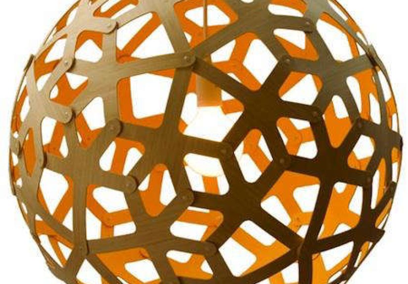
The Real Magic of the Colored Versions
The natural Coral Pendant is beautiful, but the colored editions are where things get especially interesting. Rather than turning the whole fixture into a loud object, many versions use color strategically on the inside or on one side. That means the pendant still preserves the warmth of bamboo while introducing a controlled burst of personality.
This approach is smart for two reasons. First, it keeps the light from looking gimmicky. Second, it allows the fixture to shift depending on your viewpoint. From one angle, it may look almost neutral. From another, a painted interior reveals itself like a secret. It is the lighting equivalent of a blazer with a fabulous lining: sophisticated on the outside, unexpectedly fun when it moves.
How Different Colors Change the Mood
Aqua and blue make the Coral Pendant feel crisp, coastal, and slightly ethereal. These are excellent choices for airy kitchens, breakfast nooks, or rooms with pale woods and white walls. They also play nicely with daylight, making the fixture feel fresh even when it is switched off.
Lime and orange are more energetic. They work best when you want the pendant to animate the room rather than simply decorate it. In a neutral dining room, a lime or orange interior can act like punctuation. Not a scream, just a confident exclamation point.
Pink and red bring warmth and a more emotional quality. Red reads bold and graphic, especially when paired with black accents or darker woods. Pink can soften the geometry and make the pendant feel unexpectedly gentle, particularly in bedrooms or creative spaces.
Black and white take the design in a different direction. Black makes the form look sharper and more architectural. White brightens the object and emphasizes its airy outline. Both are ideal for homeowners who love the Coral shape but want a more restrained palette.
Natural bamboo remains the most timeless option. It highlights the craftsmanship, the material, and the pendant’s connection to nature. If you want versatility, bamboo is the safest choice. If you want personality with restraint, bamboo plus color is the sweet spot.
Material, Sustainability, and Why That Still Matters
The Coral Pendant’s appeal is not just visual. It is also tied to how the light is made. Bamboo plywood and similar sustainably minded wood-based constructions have long been central to the fixture’s identity. The flat-pack concept is another key part of the story. Instead of shipping giant volumes of air, the design can travel more efficiently and be assembled later.
That may sound like a practical footnote, but it actually affects the entire experience. The pendant feels thoughtful before it is even hung. The use of repeated parts, minimal material logic, and compact shipping all reinforce the larger design philosophy. This is not decoration pretending to be ethical. The method and the look are linked.
For modern buyers, that matters. Sustainable lighting is no longer a niche talking point. It is part of how many people assess whether a product deserves a place in their home. The Coral Pendant has stayed relevant because its environmental logic is built into the design instead of taped on later as marketing confetti.
Where the Coral Pendant Works Best
One of the pendant’s greatest strengths is its flexibility. It looks stunning over dining tables, especially in rooms that need a sculptural focal point without visual heaviness. In an entry, it creates immediate drama. In a bedroom, it can replace a conventional ceiling fixture with something softer, stranger, and more memorable.
It also works beautifully in double-height spaces and corners that need vertical interest. Because the form is open rather than solid, it occupies air without swallowing it. That makes it surprisingly effective in rooms where a traditional chandelier might feel too formal or too bulky.
Styling Ideas by Room
Dining room: A bamboo-and-aqua Coral Pendant above a white oak table creates a relaxed, modern look with just enough color to keep things from becoming a beige support group.
Entryway: A black Coral Pendant in a clean-lined foyer makes a strong first impression and pairs beautifully with plaster walls, stone floors, and minimal furniture.
Bedroom: A white or pale pink interior version can soften the room while still providing a strong visual center.
Open-plan living space: Two Coral Pendants in different sizes can define zones without adding walls. One over the dining area and a second near the lounge can create rhythm and cohesion.
Choosing the Right Size and Color Combination
The Coral Pendant has been offered in multiple sizes, from compact versions around 16 inches to oversized statement pieces around 63 inches. That range makes it adaptable, but it also means scale matters. A small pendant can look jewel-like and precise. A large one becomes architectural.
When choosing size, think first about ceiling height and second about visual competition. If the room already has exposed beams, strong art, or busy wallpaper, a natural bamboo or white version may let the shape shine without overwhelming the space. If the room is quiet and neutral, a colored interior can bring the exact amount of life you need.
A good rule is to let the color do one job. Either it adds warmth, contrast, or freshness. Once a pendant is already sculptural, it does not need a dozen extra tricks. The best interiors use the Coral Pendant as a focal point with a clear purpose, not as a dare.
Why the Coral Pendant Still Feels Current
Plenty of iconic designer lights become trapped in the decade that made them famous. The Coral Pendant has avoided that fate because its language is broad enough to evolve. It fits with the ongoing appetite for natural materials, handcrafted details, sustainable design, and statement lighting. At the same time, its geometry keeps it from feeling rustic or nostalgic.
Color has helped extend that relevance. As interiors have moved between minimalism, warm modernism, Japandi, biophilic design, and more expressive contemporary palettes, the Coral Pendant has adapted. Natural bamboo works in calmer schemes. Bold interiors turn it into a playful accent. Black and white versions make it feel almost graphic. Same form, different personality.
That is the hallmark of a lasting design object. It is recognizable, but not fixed. It can be interpreted again and again without losing its identity.
Experiences and Impressions: Living With the Coral Pendant in Color
To understand the appeal of the David Trubridge Coral Pendant in colors, it helps to think beyond a catalog description and imagine the actual lived experience of the fixture. On paper, it is a pendant made from bamboo plywood with a repeating geometric form. In a room, it feels much more emotional. It changes the atmosphere before you even register the mechanics of why.
The first experience people usually notice is the sense of movement. Even when the pendant is still, the open structure makes it seem alive. Walk around it and the form keeps changing. The color flashes differently depending on the angle, daylight, wall tone, and bulb warmth. A bamboo exterior with an aqua interior might look subtle in the morning, then suddenly vivid at dusk. A black version can appear sculptural and sharp during the day, then become moody and dramatic at night. That shifting quality is part of the pleasure. The light never feels static.
The second experience is the shadow play. This is where the Coral Pendant stops being “nice lighting” and starts becoming a room-maker. When lit in the evening, it throws patterned shadows that feel soft rather than harsh. In a dining room, that effect can make an ordinary dinner feel more considered. In a bedroom, it adds texture without clutter. In an entry, it can turn a pass-through space into a moment. People often spend a surprising amount of time looking not at the pendant itself, but at what it does to nearby surfaces.
There is also a tactile, almost craft-forward satisfaction to the design. Even if you are not the one assembling a kitset version, the fixture carries a sense of construction you can read with your eyes. You see how the parts meet. You understand that the object is made, not merely manufactured into bland perfection. That gives the Coral Pendant warmth. It feels intelligent, but not cold.
Color intensifies that emotional side. A natural version is peaceful and grounding. A colored interior introduces surprise. It can make a room feel more personal, more edited, more like someone made a decision instead of buying the first acceptable pendant after scrolling for 11 consecutive hours. Aqua feels breezy. Red feels intentional. Pink feels unexpected and charming. Orange can make a neutral room feel awake.
What is especially memorable is how the Coral Pendant bridges different design moods. In one home, it may feel coastal and relaxed. In another, it may feel gallery-like and sculptural. In a family kitchen, it can be playful. In a minimalist loft, it can look almost architectural. The experience is never one-note. That flexibility is why the fixture continues to show up in editorial interiors and real homes alike.
Ultimately, the Coral Pendant in colors succeeds because it does more than decorate. It creates atmosphere, encourages attention, and gives a room a visual heartbeat. Good lighting helps you see. Great lighting helps you feel something. This one manages both, with a little geometry and a lot of personality.
Conclusion
The David Trubridge Coral Pendant has earned its reputation by doing what many statement lights fail to do: it is memorable without being exhausting. Its shape is rooted in nature, its structure is rigorous, its materials feel thoughtful, and its colored variations open up a wide range of moods for modern interiors. Whether you choose natural bamboo for calm simplicity or a vivid interior finish for a sharper visual kick, the Coral Pendant offers something rarer than trend appeal. It offers staying power.
For homeowners, stylists, and design lovers, that is the real story behind the Coral Pendant in colors. It is not just a light fixture with pretty finishes. It is a lesson in how material, geometry, sustainability, and color can work together to create an object that feels both intelligent and alive.