Table of Contents >> Show >> Hide
- What Does It Mean to Group and Outline Excel Data?
- Before You Start: Prepare Your Excel Data
- Method 1: Manually Group Rows or Columns in Excel
- Method 2: Automatically Outline Excel Data with Subtotals or Formulas
- Best Practices for Grouping and Outlining Excel Data
- Common Problems and How to Fix Them
- Practical Example: Grouping a Monthly Expense Report
- of Real-World Experience: What Grouping Excel Data Teaches You
- Conclusion
- SEO Tags
Big Excel worksheets have a special talent: they start out looking like helpful little tables and somehow grow into scrolling jungles of numbers, categories, monthly totals, regional sales, hidden columns, and that one mysterious row named “Final_Final_USE_THIS.” When your spreadsheet becomes too long to read comfortably, learning how to group and outline Excel data can save your eyes, your patience, and possibly your coffee mug from being thrown across the room.
Excel grouping lets you collapse and expand rows or columns so you can show summary information first and reveal details only when needed. Outlining takes that idea one step further by creating a structured view of your data with levels, plus and minus buttons, and neat brackets along the side or top of the worksheet. In plain English, it turns a crowded spreadsheet into something much easier to scan.
This guide explains two easy methods: manual grouping and automatic outlining with subtotals or formulas. Whether you are managing a budget, tracking sales, comparing departments, organizing project tasks, or building a monthly report, these techniques help you make Excel feel less like a maze and more like a dashboard.
What Does It Mean to Group and Outline Excel Data?
To group Excel data means to select related rows or columns and place them under a collapsible control. Once grouped, Excel displays a small minus button to collapse the section and a plus button to expand it again. You can group rows, group columns, or create multiple outline levels for more complex worksheets.
An outline is the visual structure Excel creates around grouped data. It usually appears as brackets and numbered level buttons near the row numbers or column letters. Level 1 typically shows the highest-level summary, while deeper levels display more detail. Think of it as a table of contents for your spreadsheet, except it actually does something useful when clicked.
When Should You Use Grouping in Excel?
Grouping works best when your worksheet has logical sections. For example, you may have sales data separated by quarter, expenses divided by department, project tasks organized by phase, or monthly numbers grouped under yearly totals. Instead of hiding rows or columns manually, grouping gives you a cleaner and more flexible way to control what people see.
You should use Excel grouping when you want to:
- Collapse detailed rows and show only summary rows.
- Hide supporting calculations without deleting them.
- Create a cleaner report for printing or sharing.
- Compare sections of a worksheet more easily.
- Build a structured view of large data without moving anything.
The best part is that grouping does not remove your data. It simply folds sections away until you need them again. Very tidy. Very civilized. Very unlike most shared spreadsheets.
Before You Start: Prepare Your Excel Data
Before using the Group or Outline tools, take a minute to clean up your worksheet. Excel is powerful, but it is not psychic. If your data has blank rows, random merged cells, inconsistent headings, or totals floating in unpredictable places, the outline may not behave the way you expect.
Use a Clear Structure
Your data should have headings, related rows placed together, and summary rows either above or below the details. For example, if you want to group January, February, and March under “Q1 Total,” those monthly rows should sit directly beside the summary row. Excel outlines work best when the worksheet already has a logical hierarchy.
Avoid Blank Rows and Columns
Blank rows and columns can interrupt Excel’s ability to understand your data range. If you are using automatic outlining or subtotals, remove unnecessary empty rows inside the dataset. You can still use spacing for design later, but when creating the outline, cleaner is better.
Decide Whether Summary Rows Go Above or Below
Excel can work with summary rows above or below grouped details, but your worksheet should be consistent. Many financial statements place summary rows below the details, while some project plans place section headers above. Pick one style and stick with it so the outline buttons make sense.
Method 1: Manually Group Rows or Columns in Excel
Manual grouping is the easiest method when you already know which rows or columns belong together. It is perfect for custom reports, budgets, timelines, department sections, or worksheets where you want total control over the outline.
How to Manually Group Rows
Suppose you have a budget worksheet with rows for office supplies, software subscriptions, training costs, and travel expenses. You want to collapse the detail rows and show only the department total. Here is how to group those rows manually:
- Select the rows you want to group. Click and drag across the row numbers on the left side of the worksheet.
- Go to the Data tab on the Excel ribbon.
- Find the Outline group.
- Click Group.
- If Excel asks whether you want to group rows or columns, choose Rows.
Excel will add an outline bracket beside the selected rows. You will also see a minus button. Click the minus button to collapse the rows. Click the plus button to expand them again. Congratulations: your spreadsheet now has a tiny accordion, and it plays the sweet music of organization.
How to Manually Group Columns
Column grouping works almost the same way. It is useful when you want to hide supporting calculations, monthly breakdowns, or extra fields while keeping summary columns visible.
- Select the columns you want to group by clicking the column letters.
- Open the Data tab.
- Click Group in the Outline section.
- Choose Columns if prompted.
Excel adds outline controls above the worksheet. You can collapse the selected columns and show them again whenever needed. For example, you might collapse monthly sales columns and keep only quarterly totals visible during a presentation.
Create Nested Groups for More Detail
One of Excel’s best outline features is nested grouping. This means you can create groups inside groups. For example, a yearly sales report may have one outline level for the full year, another for each quarter, and another for each month.
To create nested groups, start with the smallest detail group first. Group the monthly rows under each quarter. Then group the quarterly sections under the yearly total. Excel will add outline level numbers such as 1, 2, and 3. Clicking level 1 shows the broadest summary, while level 3 reveals more detail.
Use Keyboard Shortcuts for Faster Grouping
If you work in Excel often, shortcuts can make grouping feel much faster. On many Windows versions of Excel, you can select rows or columns and press Shift + Alt + Right Arrow to group. To ungroup, select the grouped rows or columns and press Shift + Alt + Left Arrow. Shortcut behavior can vary slightly by keyboard layout and operating system, but it is worth trying if you want to speed up your workflow.
How to Ungroup Rows or Columns
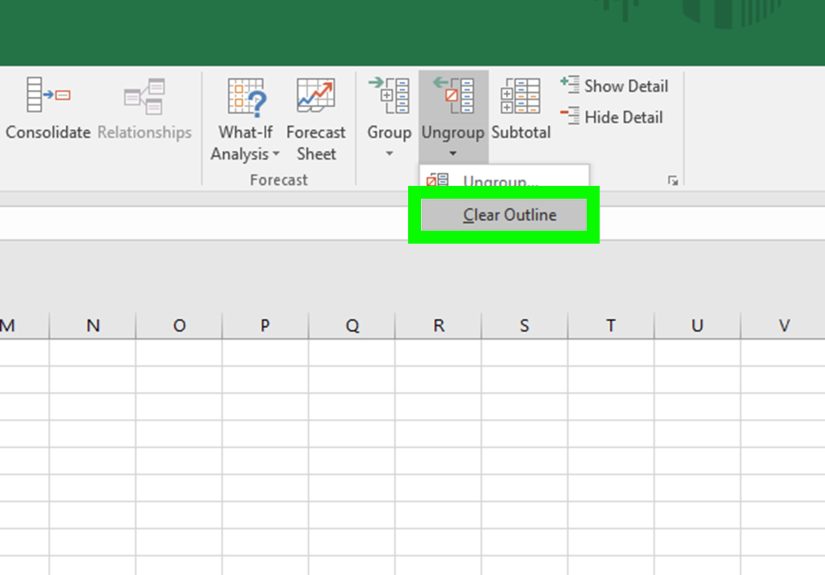
To remove a manual group, select the grouped rows or columns, go to the Data tab, and choose Ungroup. If your worksheet has multiple outline levels and you want to remove everything, use Clear Outline from the Outline options. Just make sure you really want to clear all groups, because Excel will not stop to ask whether your beautiful outline has emotional value.
Method 2: Automatically Outline Excel Data with Subtotals or Formulas
Automatic outlining is the second easy method, and it is ideal when your worksheet already includes totals or when you want Excel to create subtotal rows for you. This method is especially helpful for long lists, such as sales records, expense reports, inventory logs, and department summaries.
Option A: Use the Subtotal Command
The Subtotal command is one of the simplest ways to create an outline automatically. It inserts subtotal rows based on changes in a selected category and creates outline controls at the same time. For example, if your sales data is sorted by region, Excel can insert subtotals for East, West, Midwest, and South, then group the detail rows under each region.
Here is how to use it:
- Make sure your data has column headers.
- Sort the data by the field you want to group by, such as Region, Department, Category, or Month.
- Click any cell inside the data range.
- Go to the Data tab.
- Click Subtotal in the Outline group.
- In the At each change in box, choose the column that defines each group.
- In the Use function box, select a calculation such as Sum, Count, Average, Max, or Min.
- In the Add subtotal to section, choose the numeric columns you want to summarize.
- Click OK.
Excel inserts subtotal rows and adds outline levels. You can now collapse the sheet to show only subtotals or expand it to see all records. This is incredibly handy when you need both a detailed dataset and a polished summary view in the same worksheet.
Example: Group Sales by Region
Imagine your worksheet includes columns for Date, Region, Salesperson, Product, and Revenue. If you sort by Region and then use the Subtotal command, Excel can calculate total revenue for each region. Your outline might show only four regional totals at level 2, while level 3 reveals every individual sale.
This creates a report that works for two audiences at once. Managers can scan the regional totals quickly, while analysts can expand the groups and inspect transaction-level details. Everyone gets what they need, and nobody has to scroll through 900 rows while pretending they are “almost done reviewing it.”
Option B: Use Auto Outline with Existing Summary Formulas
If your worksheet already has formulas that summarize nearby data, you may be able to use Auto Outline. This feature looks for patterns in your formulas and creates groups based on the relationship between detail rows or columns and summary rows or columns.
To try Auto Outline:
- Make sure your worksheet includes summary formulas, such as totals for rows or columns.
- Click inside the data range.
- Go to the Data tab.
- Open the Group drop-down in the Outline group.
- Choose Auto Outline.
If Excel recognizes the structure, it will create outline groups automatically. If nothing happens or the result looks odd, your formulas may not be arranged in a way Excel can interpret. In that case, manual grouping is usually the better choice.
Manual Grouping vs. Automatic Outlining: Which Should You Choose?
Use manual grouping when you want precise control. It is best for custom sections, presentation-ready reports, and worksheets where the structure is not based on repeated categories. Manual grouping is also better when you are grouping columns, hiding helper calculations, or creating a layout that does not follow a strict database format.
Use automatic outlining when your data is already structured and you want Excel to do the heavy lifting. The Subtotal command is especially helpful for sorted lists with categories. Auto Outline is useful when formulas already summarize detail rows or columns in a consistent way.
Best Practices for Grouping and Outlining Excel Data
Keep Summary Rows Visible
The point of grouping is to hide detail while keeping useful summaries visible. Before grouping rows, make sure your total or summary row is outside the group, not trapped inside it. If the total disappears when you collapse the group, the outline will be less helpful.
Label Every Section Clearly
Good labels make grouped worksheets easier to understand. Instead of vague labels like “Total,” use specific labels such as “Q1 Sales Total,” “Marketing Expenses Total,” or “West Region Revenue.” Future you will appreciate it. So will anyone who opens the workbook and does not have access to your brain.
Do Not Use Grouping as a Substitute for Clean Data
Grouping can make a worksheet easier to read, but it cannot fix messy data. If your categories are inconsistent, formulas are broken, or numbers are stored as text, an outline will only make the mess collapsible. Clean the data first, then group it.
Be Careful with Filters
Filters and outlines can work together, but they may create confusing views if you are not careful. If rows are filtered out and groups are collapsed at the same time, users may wonder where the data went. When sharing a workbook, clear unnecessary filters or explain how the view is arranged.
Check Print Settings
If you plan to print a grouped worksheet, collapse the outline to the level you want before printing. Excel generally prints what is visible. This is great for creating summary reports, but not so great if you accidentally print only the collapsed version and leave out the details your boss asked for five minutes ago.
Common Problems and How to Fix Them
The Group Buttons Are Missing
If you do not see the plus and minus buttons, the outline symbols may be hidden. In Excel Options, check the advanced display settings for the worksheet and make sure outline symbols are enabled. Also confirm that the worksheet is not protected in a way that prevents outlining.
Excel Groups the Wrong Rows
This usually happens when the wrong rows were selected or when summary rows are placed inconsistently. Remove the group, check the worksheet structure, and try again. For automatic outlining, make sure formulas are positioned next to the detail data they summarize.
Subtotal Creates Too Many Groups
If the Subtotal command creates more groups than expected, your data may not be sorted correctly. Sort the category column first. For example, if you want subtotals by department, sort by department before running Subtotal. Otherwise, Excel may create a new subtotal every time the department value changes, even if the same department appears again later.
Grouped Rows Do Not Collapse Properly
Check whether rows are already hidden manually, filtered, or included in overlapping groups. Clear the outline and rebuild it if necessary. Sometimes the fastest solution is not detective work; it is starting fresh with a cleaner selection.
Practical Example: Grouping a Monthly Expense Report
Let’s say you manage a yearly expense report. Each month has several detail rows: rent, utilities, payroll, supplies, software, travel, and miscellaneous costs. At the end of each month, you have a monthly total. At the end of each quarter, you have a quarterly total.
You could manually group the detail rows for each month, then group the months inside each quarter. Once complete, level 1 might show only the yearly total, level 2 might show quarterly totals, and level 3 might show monthly totals. Expanding all levels reveals the individual expense lines.
This layout is excellent for financial reviews. Executives can view high-level totals. Department managers can expand the quarter they care about. The accounting team can dig into every line item. One workbook, three levels of detail, and far fewer “Can you send a simpler version?” emails.
of Real-World Experience: What Grouping Excel Data Teaches You
After working with large spreadsheets for a while, you start to notice that the problem is not always the data itself. Often, the problem is how the data is presented. A worksheet with 5,000 rows may contain excellent information, but if every row is visible all the time, the file feels overwhelming. Grouping and outlining help because they respect how people actually read reports: first the big picture, then the details.
One of the most useful experiences with Excel grouping comes from preparing reports for different audiences. Analysts usually want all the details. Managers usually want trends and totals. Clients often want the cleanest possible version, preferably one that does not look like it was assembled during a thunderstorm. By using outline levels, you can serve all three audiences without creating three separate files. Collapse the worksheet for a meeting, expand it for analysis, and keep the structure intact for future updates.
Another lesson is that grouping works best when it is planned early. If you build a worksheet with summary rows in consistent locations, the outline becomes easy to maintain. If you add totals randomly, merge cells for decoration, or leave blank rows everywhere, grouping becomes frustrating. The tool rewards structure. That may sound boring, but in Excel, boring structure is usually what keeps the workbook from turning into a haunted house.
Manual grouping is especially useful for reports that need a human touch. For example, a project manager may group tasks by phase: Planning, Design, Development, Testing, and Launch. Inside each phase, they might group subtasks by owner or deadline. This makes the timeline easier to review in status meetings. Instead of scrolling through every task, the team can collapse completed phases and focus only on current work.
Automatic outlining, on the other hand, shines when you have repeated categories and numeric data. Sales reports, expense logs, inventory sheets, and time-tracking records are great candidates. Once the data is sorted correctly, the Subtotal command can quickly create a professional-looking summary. The biggest trick is remembering to sort first. Many subtotal mistakes happen because the same category appears in multiple places. Excel is obedient, not magical; it groups what it sees in order.
The final experience worth mentioning is how helpful grouping can be when presenting data live. During a meeting, you can start with a collapsed summary and expand only the section people ask about. This keeps the conversation focused. It also makes you look prepared, which is always nice, especially when the spreadsheet itself contains enough formulas to qualify as modern art.
Conclusion
Learning how to group and outline Excel data is one of those skills that feels small until you use it on a large worksheet. Then it feels like someone installed lights in a dark basement. Manual grouping gives you control over rows and columns, while automatic outlining with Subtotal or Auto Outline helps you summarize structured data quickly. Together, these two methods make spreadsheets easier to read, easier to present, and easier to manage.
For the best results, start with clean data, use clear labels, keep summary rows visible, and choose the method that fits your worksheet. Use manual grouping when your structure is custom. Use Subtotal or Auto Outline when Excel can recognize a consistent pattern. Either way, your spreadsheet becomes more organized, more professional, and far less likely to make someone whisper, “Why are there so many rows?”
Note: This article is based on current Microsoft Excel desktop functionality and common spreadsheet training practices. Menu names and shortcut behavior may vary slightly depending on Excel version, operating system, and keyboard layout.