Table of Contents >> Show >> Hide
- What a Customer Success Dashboard Should Actually Do
- Step 1: Start With Decisions (Not Metrics)
- Step 2: Choose KPIs That Predict Retention (Not Just Activity)
- Step 3: Map Your Data Sources (Then Pick a Single Customer ID)
- Step 4: Build a No-Code Data Spine (Sheets, Airtable, or a Simple Table)
- Step 5: Choose a Code-Free Dashboard Tool That Matches Your Reality
- Route 1: Looker Studio (great for sharing + quick builds)
- Route 2: Power BI (great for Microsoft-heavy orgs)
- Route 3: HubSpot dashboards (best if HubSpot is your system of record)
- Route 4: Airtable Interfaces (dashboard + workflow in one place)
- Route 5: Notion dashboards (best for operational visibility)
- Step 6: Build a Simple Health Score That People Will Actually Use
- Step 7: Design the Dashboard Pages Around Real Work
- Step 8: Automate Updates Without Code (So Your Dashboard Doesn’t Rot)
- Step 9: GovernanceThe Unsexy Part That Saves You
- Common Pitfalls (So You Don’t Build the Dashboard Version of a Junk Drawer)
- A Practical “Build This in a Week” Blueprint
- Conclusion: A Dashboard Should Feel Like a Coach, Not a Spreadsheet Costume
- Real-World Lessons From Code-Free Customer Success Dashboards (Extra ~)
A Customer Success dashboard is basically a crystal ball… except it’s powered by data instead of mystical vibes. Done right, it helps you spot churn risk early, prove value to customers, and keep your team aligned. Done wrong, it becomes a “pretty charts museum” where insights go to retire.
The good news: you can build a genuinely useful Customer Success dashboard without writing code. The trick is choosing the right decisions to support, organizing your data so it behaves, and designing the dashboard around actionnot decoration.
What a Customer Success Dashboard Should Actually Do
A code-free dashboard isn’t “less serious.” It’s simply a dashboard built with tools that let you connect data, define metrics, and visualize performance through configuration instead of programming. The goal is still the same: help the business make better decisions faster.
The three jobs your dashboard must handle
- Detect risk early: catch warning signs before renewals become emergencies.
- Prove value clearly: show outcomes, adoption, and ROI in plain English.
- Drive action: turn signals into next steps (who does what, by when).
If a chart doesn’t change a decision, it’s not a KPI. It’s a screensaver.
Step 1: Start With Decisions (Not Metrics)
Before you pick a single chart type, write down the decisions your team needs to make weekly. Dashboards fail when they try to answer “everything.” Dashboards win when they answer the right few things quickly.
Executive decisions your dashboard should support
- Are renewals on track this quarter? Where is the risk concentrated?
- Is expansion happening inside the existing baseor are we leaking revenue?
- Which segments (plan, region, industry) are healthy vs. struggling?
CSM decisions your dashboard should support
- Which accounts need outreach todayand why?
- Which customers are stuck in onboarding or not adopting key features?
- Which accounts are primed for upsell (high adoption + positive sentiment)?
Ops/Enablement decisions your dashboard should support
- Are our playbooks working (onboarding time, ticket trends, health improvements)?
- Do we trust the data (definitions, freshness, missing IDs)?
- What should we improve in the process to reduce churn drivers?
Once decisions are clear, metrics become obvious. It’s like picking ingredients after you decide what you’re cooking. (Otherwise you end up with a casserole made of charts.)
Step 2: Choose KPIs That Predict Retention (Not Just Activity)
Great Customer Success dashboards balance lagging indicators (what already happened) with leading indicators (what’s likely to happen next).
Retention & revenue KPIs
- Customer churn rate: % of customers lost in a period.
- Revenue churn: revenue lost (more sensitive when customers pay different amounts).
- Net Revenue Retention (NRR): how much revenue you keep and expand within your existing base.
- Renewal coverage: renewals at risk vs. renewals confirmed.
A practical way to explain NRR to non-finance humans: “If we froze new sales today, would the current customer base grow, stay flat, or shrink over time?”
Sentiment KPIs (what customers tell you)
- NPS: a loyalty indicator based on “Would you recommend us?”
- CSAT: satisfaction after an interaction (especially support).
- Qualitative notes: executive sponsor changes, complaints, “we’re evaluating alternatives.”
Sentiment is powerful because it’s often the earliest signal. Usage can drop quietly. A frustrated customer will sometimes gift-wrap the warning and hand it to you in a survey response.
Adoption KPIs (what customers do)
- Active users: weekly/monthly active users relative to licenses.
- License utilization: seats used vs. purchased.
- Feature adoption: usage of the features tied to value outcomes.
- Stickiness: how consistently users return and engage.
Adoption metrics become meaningful when you connect them to outcomes. “Logged in” is not value. “Used the feature that prevents mistakes / saves time / generates revenue” is value.
Onboarding KPIs (how fast customers reach ‘aha’)
- Time to First Value (TTFV): time from start to a defined first success moment.
- Onboarding completion: % of accounts completing the key steps.
- Implementation milestones: integrations connected, workflows launched, training completed.
Support & friction KPIs
- Ticket volume trend: rising tickets can signal confusion or product issues.
- First response time and resolution time: operational speed impacts satisfaction.
- Top categories: what problems repeat (and should be prevented with enablement/product fixes).
The best dashboards don’t treat support data as “someone else’s department.” Support is often where churn writes its first draft.
Step 3: Map Your Data Sources (Then Pick a Single Customer ID)
Customer Success data usually lives in multiple places: CRM for account details, billing for revenue, product analytics for usage, and support tools for friction. Your dashboard becomes dramatically easier once you decide what field ties everything together.
Common Customer Success data sources
- CRM: account owner, renewal date, ARR/MRR, segment, lifecycle stage.
- Support: ticket count, backlog, CSAT, response/resolution times, top categories.
- Product analytics: active users, feature adoption, retention, key event completion.
- CS platform (optional): health score frameworks, playbooks, outreach tracking.
- Surveys: NPS, onboarding surveys, QBR feedback.
- Finance/billing: invoices, payments, downgrades, expansion, cancellations.
Pick a “Customer Key” that everything shares
Your dashboard needs one consistent identifier. Examples: Account ID (best), CRM Company ID, Billing Customer ID, or a normalized domain name. If you skip this step, you’ll spend your life doing spreadsheet matchmaking like it’s a reality show.
Step 4: Build a No-Code Data Spine (Sheets, Airtable, or a Simple Table)
Code-free dashboards work best when your underlying data is tidy and predictable. You don’t need a data warehouse to startyou need a dependable “spine” that merges your key account-level signals.
Option A: Google Sheets as the staging layer (fastest to start)
Use one “Accounts” tab as your master list, then add supporting tabs like “Usage,” “Tickets,” “Surveys,” and “Revenue.” Keep each tab structured like a table (one row per account per time period).
Option B: Airtable as the staging layer (better structure + friendly UI)
Airtable is great when you want relationships (Accounts ↔ Contacts ↔ Renewals ↔ Tickets) without building a database. You can also build dashboard-style interfaces directly on top of the base.
Option C: Notion as the staging layer (lightweight + team visibility)
Notion databases can work if your dashboard is more operational (playbooks, tasks, QBR notes) than analytics-heavy. It’s especially handy for linked views filtered by owner, segment, or renewal month.
What to store in your “Accounts” table
- Account ID (your master key)
- Account name, segment, plan/tier, region, industry
- CSM owner, renewal date, contract ARR/MRR
- Health score (overall + components)
- Adoption signals (active users %, feature adoption, key event completion)
- Support signals (open tickets, ticket trend, CSAT)
- Sentiment signals (NPS, last QBR rating, exec sponsor status)
- Lifecycle stage (onboarding, steady-state, renewal window)
Pro tip: define each field in a tiny data dictionary. If “Active User” means one thing to CS and another thing to Product, your dashboard will accidentally become a debate club.
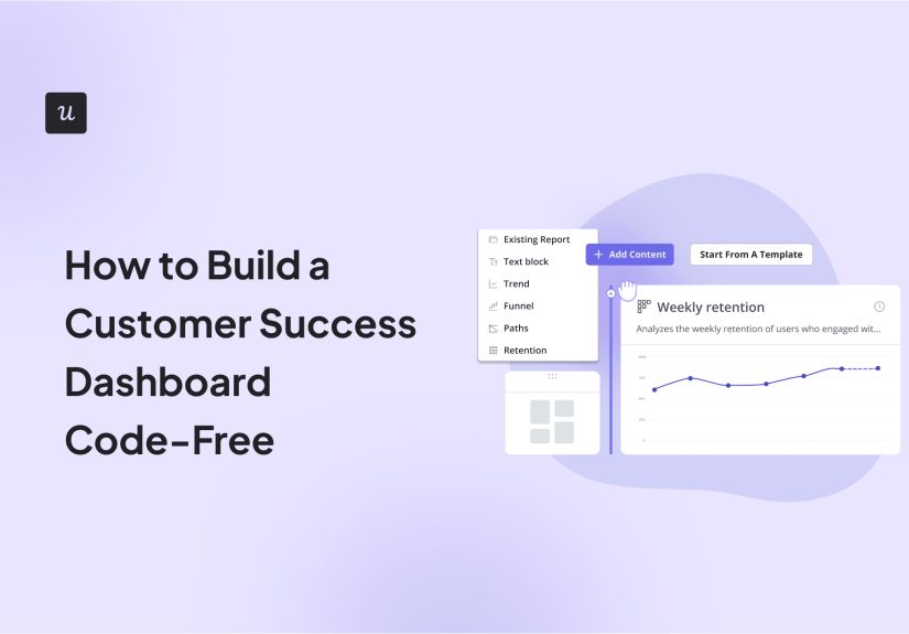
Step 5: Choose a Code-Free Dashboard Tool That Matches Your Reality
“Best tool” depends on your stack, your audience, and how much time you want to spend maintaining connections. Here are common code-free routes that work well for Customer Success teams.
Route 1: Looker Studio (great for sharing + quick builds)
- Best for: teams that live in Google Workspace, want easy sharing, and prefer lightweight reporting.
- Strengths: quick charts, filters, scorecards, and blending multiple sources in a single report.
- Watch-outs: you’ll still need clean keys and consistent date fields for reliable blends.
Route 2: Power BI (great for Microsoft-heavy orgs)
- Best for: organizations already using Microsoft 365 and wanting strong dashboard distribution.
- Strengths: pin visuals from reports into dashboards; strong interactivity and governance options.
- Watch-outs: keep your model simple earlydon’t build a spaceship to deliver a pizza.
Route 3: HubSpot dashboards (best if HubSpot is your system of record)
- Best for: CS teams tracking support and account activity inside HubSpot.
- Strengths: custom reports + dashboards without exporting data everywhere.
- Watch-outs: usage/product analytics may still live elsewhere, so plan how you’ll incorporate them.
Route 4: Airtable Interfaces (dashboard + workflow in one place)
- Best for: CS ops teams who want operational dashboards (renewals, tasks, playbooks) plus rollups.
- Strengths: build visual interfaces over structured data; great for day-to-day execution.
- Watch-outs: heavy analytics may still benefit from a BI layer for advanced visualizations.
Route 5: Notion dashboards (best for operational visibility)
- Best for: playbooks, QBR tracking, renewal prep checklists, and “who’s doing what.”
- Strengths: linked databases and filtered views make personalized dashboards easy.
- Watch-outs: Notion isn’t a BI tool; use it where narrative + workflow matter most.
Step 6: Build a Simple Health Score That People Will Actually Use
Health scores are useful when they’re understandable, consistent, and tied to action. They’re useless when they’re mysterious, overly complex, or treated like destiny. (A health score is a signal, not a prophecy.)
Start with 4–6 signals, not 40
A practical starter model uses a few weighted components:
- Adoption (40%): active users %, key feature usage, license utilization
- Support (25%): open ticket backlog, escalation flags, CSAT trend
- Sentiment (20%): NPS band, QBR feedback, customer tone
- Engagement (15%): meeting attendance, champion activity, training completion
Use thresholds that match segments
Your enterprise customers and your self-serve SMB customers may show “health” differently. Segment your health score rules by tier so you don’t punish customers who are behaving normally for their profile.
Make health score outputs actionable
- Green: steady value + adoption → monitor and explore expansion.
- Yellow: early warning signs → follow a playbook (outreach, enablement, success plan refresh).
- Red: urgent risk → escalation path, executive alignment, recovery plan, renewal strategy.
If your dashboard stops at “Red account exists,” it’s not finished. It should also explain why it’s red and what the next best action is.
Step 7: Design the Dashboard Pages Around Real Work
One dashboard page can’t serve everyone well. Build a small set of views, each with a specific job.
Page 1: Executive snapshot
- NRR trend, churn trend, renewal risk coverage
- Risk by segment (ARR-weighted)
- Top churn drivers (support spikes, adoption drop, sentiment dip)
Page 2: CSM portfolio (“my book of business”)
- Sortable table: accounts by health score, renewal date, ARR, recent changes
- Filters: CSM owner, segment, renewal window
- “Reason codes”: which component pulled health down (usage, tickets, NPS)
Page 3: Adoption & outcomes
- Feature adoption trends for value-driving features
- License utilization and active usage patterns
- Onboarding funnel: milestone completion + TTFV
Page 4: Support & friction
- Ticket volume trends, backlog, top categories
- CSAT trend, response/resolution time trends
- Escalations and chronic issue tracking
Use filters that make the dashboard feel “alive”
Add a date range selector and dropdown filters (segment, plan, CSM, region). It’s the difference between “static poster” and “interactive decision tool.”
Step 8: Automate Updates Without Code (So Your Dashboard Doesn’t Rot)
Dashboards don’t fail because people hate data. They fail because the data is stale, incomplete, or annoying to update. The fix: automate your refresh pipelines using no-code integrations.
Simple automation patterns that work
- App → Sheet/Airtable: push new tickets, account changes, survey results into your staging layer.
- Scheduled exports: weekly/monthly exports from billing or CRM into a single table.
- Alerts: notify a channel when health drops, tickets spike, or usage falls below a threshold.
Treat automation like brushing your teeth: not glamorous, extremely effective, and regrettable to skip.
Step 9: GovernanceThe Unsexy Part That Saves You
“Code-free” does not mean “rules-free.” Dashboards become trusted when you manage definitions, ownership, and change control. This is the difference between a tool people rely on and a tool people politely ignore.
A lightweight governance checklist
- Owner: one person (often CS Ops) responsible for metric definitions and changes.
- Freshness: each metric has a refresh cadence (daily for health, weekly for NPS, monthly for NRR).
- Definitions: a short data dictionary and “source of truth” for each KPI.
- Access: role-based views (exec, managers, CSMs) to prevent confusion and oversharing.
- Feedback loop: monthly review: what people used, what they ignored, what needs improvement.
Common Pitfalls (So You Don’t Build the Dashboard Version of a Junk Drawer)
Pitfall 1: Vanity metrics everywhere
“Total logins” can look impressive while customers quietly churn. Tie adoption to meaningful milestones and key features.
Pitfall 2: Conflicting definitions
If Product counts “active user” as any session and CS counts it as a meaningful action, your charts will disagree, and your meetings will become interpretive dance.
Pitfall 3: One mega-dashboard for every audience
Different roles need different views. Keep the executive view punchy. Keep the CSM view actionable. Keep the Ops view diagnostic.
Pitfall 4: Health scores that no one trusts
If the score feels random, it will be ignored. Keep it simple, explainable, and tied to playbooks. Adjust weights over time based on what actually predicts churn or expansion in your business.
A Practical “Build This in a Week” Blueprint
- Day 1: define decisions + KPIs (limit to 10–15 top metrics).
- Day 2: map data sources + choose your Customer Key.
- Day 3: build the data spine (Accounts table + weekly snapshots).
- Day 4: create v1 dashboard pages (exec + CSM portfolio).
- Day 5: add health score, filters, and “reason codes.”
- Day 6: validate with 3–5 users; fix confusing parts; add missing context.
- Day 7: set refresh cadence + ownership; roll out with a 15-minute training.
Conclusion: A Dashboard Should Feel Like a Coach, Not a Spreadsheet Costume
Building a Customer Success dashboard code-free is absolutely doableand often faster to iterate than a heavily engineered approach. Focus on decisions first, build a clean data spine, keep your KPIs honest, and design pages around how your team actually works.
The best dashboard isn’t the one with the most charts. It’s the one your team checks instinctively because it helps them prevent churn, create expansion, and deliver value without guesswork.
Real-World Lessons From Code-Free Customer Success Dashboards (Extra ~)
In real Customer Success teams, the biggest challenge usually isn’t building the dashboardit’s getting people to believe it and use it. A code-free setup can actually help here because it’s easier to iterate in public. When stakeholders can see changes quickly, the dashboard feels less like a mysterious black box and more like a shared tool. But it also means you’ll learn (sometimes the hard way) which shortcuts are harmless and which ones come back to haunt you.
One common lesson: “Health score” is a product, not a metric. Teams often launch a single score and expect magic. Then someone points out a “red” account that just renewed, or a “green” account that churned, and confidence drops fast. The best fix isn’t to make the model more complex. It’s to make it more explainable. Add “reason codes” that clearly show what drove the score (usage drop, ticket spike, poor CSAT, renewal window). When a CSM can look at a score and say, “Yep, that matches what I’m seeing,” adoption jumps.
Another lesson: freshness beats perfection. A weekly-updated dashboard that the team trusts is often more valuable than a “perfect” dashboard that’s updated whenever someone remembers to export a CSV. Early on, it’s totally fine to use a simple weekly snapshot tablejust label it clearly and be consistent. As the dashboard proves value, you can automate ingestion and increase the refresh cadence. People are surprisingly forgiving about early-stage dashboards as long as the definitions are clear and the data isn’t randomly missing.
Teams also learn that context wins arguments. For example, “tickets increased” can mean either “product is broken” or “the customer is deploying more widely (and asking more questions).” Without contextlike adoption trends, plan changes, or onboarding milestonessupport metrics can be misread. A simple addition like a “lifecycle stage” field (onboarding vs. steady-state vs. renewal window) prevents a ton of false alarms and helps leaders ask better questions.
A surprisingly practical move is to build a dashboard section called “Next Best Actions”. It can be simple: a table that filters to accounts where health dropped week-over-week, accounts entering the renewal window, or accounts with low license utilization. When dashboards include “what to do next,” they become part of the operating rhythm instead of a once-a-month report. This is where code-free tools shine: it’s easy to create filtered views, highlight exceptions, and share role-based pages.
Finally, a real-world truth: dashboards don’t replace conversationsthey improve them. The best teams use dashboards to prepare for QBRs, focus 1:1s, and guide account planning. The dashboard becomes the shared “starting point” so meetings aren’t spent debating the numbers. If you build your dashboard around decisions, definitions, and action, you’ll feel the difference immediately: fewer surprises at renewal, faster alignment internally, and customers who can actually see the value you’re deliveringwithout you having to juggle five tools and a prayer.