Table of Contents >> Show >> Hide
- Why a Colorful White Kitchen Works So Well
- Step One: Pick the Right White First
- Step Two: Choose a Color Strategy Instead of Random Color Moments
- Best Color Pairings for a White Kitchen
- Use Materials to Keep the Space Warm
- Lighting Can Make or Break the Look
- How to Style the Kitchen Without Overcrowding It
- Budget-Friendly Ways to Get the Look
- Mistakes to Avoid
- How to Make the Look Match Your Style
- The Real Secret: Make It Look Lived In, Not Just Styled
- Extra Experience Section: What It Is Really Like to Live With a Colorful White Kitchen
- Conclusion
A white kitchen has been the safe black dress of home design for years. It is crisp, flexible, bright, and almost impossible to completely mess up. But there is one small problem: when every surface is white, a kitchen can drift from “fresh and timeless” into “this room looks like it is afraid of commitment.” That is where color comes in.
A colorful white kitchen gives you the best of both worlds. White keeps the room open, airy, and easy to style. Color adds personality, warmth, and the kind of visual spark that makes people pause mid-snack and say, “Wait, this is cute.” Whether you love soft blue islands, green tile, brass accents, red stools, or patterned runners that look like they have stories to tell, the goal is not to bury the kitchen in color. The goal is to use color strategically so the white backdrop feels intentional, lively, and polished.
If you want to recreate this look in your own home, the good news is that you do not need a luxury renovation budget, a celebrity designer, or the emotional strength to choose from 847 paint swatches without losing your mind. You just need a plan. Here is how to build a colorful white kitchen that feels layered, welcoming, and surprisingly practical.
Why a Colorful White Kitchen Works So Well
White kitchens remain popular for a reason. They reflect light, help smaller rooms feel bigger, and create a neutral shell that works with everything from traditional millwork to modern flat-front cabinets. White also highlights the shape of the room. It lets your hardware, lighting, stools, tile, and countertops do more of the talking.
Adding color to that clean foundation solves the biggest weakness of an all-white kitchen: blandness. A colorful white kitchen feels less clinical and more lived in. It gives the eye a place to land. It can also make a space feel custom without requiring a full gut renovation. A coat of paint on an island, a patterned tile backsplash, or a few saturated accessories can shift the mood of the entire room.
The magic lies in contrast. White brings clarity. Color brings character. Texture brings warmth. When those three elements work together, the kitchen feels bright but not flat, cheerful but not chaotic, and stylish without looking like it is trying too hard.
Step One: Pick the Right White First
Not all whites are created equal, and this is the part many homeowners underestimate. Some whites are warm and creamy. Others lean cool, crisp, or even a little gray. The white you choose will affect everything around it, especially your color accents.
Warm White
Warm whites pair beautifully with earthy greens, dusty blues, terracotta, soft peach, muted mustard, and natural wood. If you want a kitchen that feels cozy, welcoming, and a little bit European-farmhouse-meets-modern, warm white is a strong choice.
Cool White
Cool whites work better with sharper contrast and cleaner color pairings such as navy, emerald, charcoal, black, or true primary accents. These tones create a fresher, crisper look that can feel more contemporary.
Before committing, test your white paint in morning light, afternoon light, and artificial light. A white that looks soft and lovely at noon can look icy at night. Kitchens are used all day, so your paint needs to hold up in every lighting condition, not just during one flattering hour when the sun feels generous.
Step Two: Choose a Color Strategy Instead of Random Color Moments
The easiest way to make a colorful white kitchen look elevated is to use a controlled palette. That means choosing two or three main supporting colors and repeating them in different ways throughout the room. Random color can feel accidental. Repeated color feels designed.
Option 1: A Painted Island
If the perimeter cabinets are white, a painted island is one of the simplest ways to add contrast. Navy, sage green, muted teal, charcoal blue, and deep olive are all reliable favorites. A colored island grounds the room and gives it a focal point without overwhelming the space.
Example: white shaker cabinets, pale quartz countertops, a dusty blue island, brass hardware, and woven counter stools. That combination feels classic, colorful, and still highly market-friendly if resale is on your mind.
Option 2: Color Through the Backsplash
Tile is where personality loves to show off. A backsplash in sea-glass green, handmade-looking blue, pale blush, or patterned cement tile can transform a plain white kitchen into a space with real depth. Glossy tile reflects light and adds movement. Matte tile feels softer and more grounded.
If you are nervous about going too bold, start with a color that has a little gray mixed in. Those softened shades tend to age better than loud, highly saturated hues that can feel trendy too quickly.
Option 3: Color Through Decor and Soft Finishes
Not ready to paint cabinets or install new tile? You can still get the look with runner rugs, Roman shades, dishware, art, bar stools, pendant lights, and small appliances. This approach is especially smart for renters or anyone who changes their mind the way some people change streaming subscriptions.
A striped runner in blue and rust, green glass pendants, or a collection of colorful cookware on open shelving can make a white kitchen feel energetic without any major construction.
Best Color Pairings for a White Kitchen
If you want the room to feel current but lasting, these combinations tend to work especially well:
White + Sage Green
Fresh, soft, and calm. Sage works beautifully with brass, oak, and warm white paint. It feels nature-inspired and easy to live with.
White + Navy Blue
A classic choice that adds depth and polish. Navy brings enough contrast to feel dramatic, but it still reads timeless rather than gimmicky.
White + Terracotta
This pairing warms up a kitchen fast. Terracotta tiles, clay-toned accessories, or rusty-red textiles add earthiness and prevent a white kitchen from feeling sterile.
White + Soft Blue
Airy and cheerful. Soft blues create a breezy, approachable look that fits coastal, cottage, transitional, and family-friendly kitchens.
White + Black + One Accent Color
If you like a sharper look, use black for hardware or lighting, then add one strong accent color such as green, mustard, or cobalt. This keeps the room graphic and modern while still feeling playful.
Use Materials to Keep the Space Warm
Color is only part of the story. A successful colorful white kitchen also relies on material contrast. If everything is white and shiny, the room can feel hard. If you layer in natural materials, it instantly becomes more inviting.
Wood Tones
Wood is the hero ingredient in many white kitchens. Think oak floating shelves, walnut stools, butcher-block accents, cutting boards leaned against the backsplash, or wood-framed art. Even small doses of wood can soften the room and make the white feel less stark.
Metals
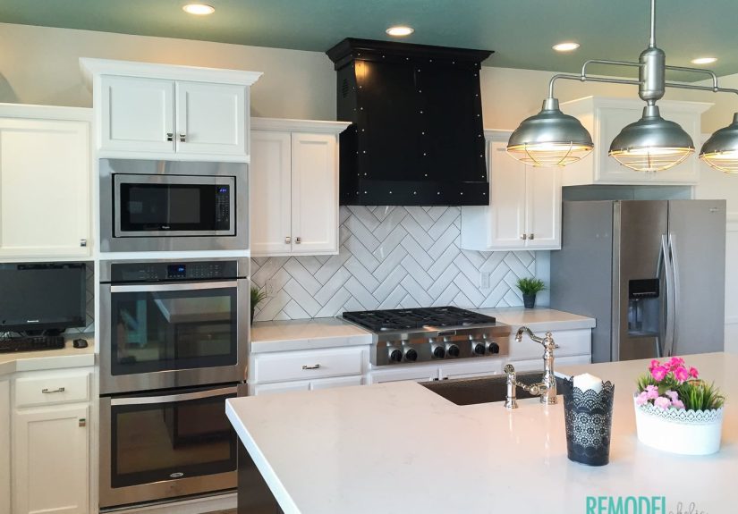
Hardware and lighting matter more than most people expect. Brass adds warmth and a slightly dressed-up feel. Matte black creates definition. Polished nickel is versatile and classic. Choose one main metal and repeat it so the kitchen feels coherent rather than like a hardware aisle exploded.
Stone and Texture
Quartz with subtle veining, honed soapstone, handmade tile, woven shades, cane details, linen towels, and ceramic bowls all add character. Texture is especially important in a mostly white room because it creates dimension even when the color palette is restrained.
Lighting Can Make or Break the Look
A colorful white kitchen should feel bright, but “bright” does not mean “blinding.” Good lighting is layered. You need overhead light for function, task lighting for prep zones, and decorative lighting that adds beauty and mood.
Pendants
Pendants over an island or peninsula are one of the best places to introduce color or shape. Try painted metal, milk glass, hand-blown glass, or woven fixtures for added texture.
Under-Cabinet Lighting
This is the unsung hero of kitchen design. It improves visibility, highlights your backsplash, and makes the kitchen feel more custom. It is not glamorous, but neither is tripping over bad prep lighting while slicing a tomato.
Bulb Temperature
Use bulbs that feel soft and natural, not harsh blue-white light that makes your kitchen resemble a medical lab with snack privileges. Warmer light often flatters white cabinetry and makes accent colors feel richer.
How to Style the Kitchen Without Overcrowding It
The difference between “designed” and “busy” is editing. A colorful white kitchen still needs breathing room. Do not fill every inch of countertop just because you own a cute bowl and a candle with excellent branding.
Keep Counters Mostly Clear
Let functional items do double duty as decor. A wooden tray with olive oil, salt, and a small plant looks intentional. Twelve unrelated gadgets do not.
Use Color in Repeating Touches
If your accent color is green, repeat it in the island paint, a runner, a vase, and a few dishes. This creates rhythm. The kitchen feels collected instead of cluttered.
Add One or Two Vintage Elements
A vintage rug, antique cutting board, old art, or inherited pottery can keep a white kitchen from looking too showroom-perfect. Real homes need a little soul.
Budget-Friendly Ways to Get the Look
You do not need to renovate everything at once. In fact, the most successful kitchens often evolve over time. Here are smart ways to get the look without torching your savings account:
- Paint just the island instead of all the cabinets.
- Swap hardware for a warmer or more modern finish.
- Add a washable runner with color and pattern.
- Replace builder-grade pendants with statement lighting.
- Style open shelves with colorful everyday dishes.
- Use peel-and-stick backsplash tile if you need a lower-commitment update.
- Bring in wood through stools, trays, and cutting boards.
- Paint walls a soft warm white if the existing tone feels cold or dingy.
These smaller updates can dramatically change how a white kitchen feels. Sometimes a room does not need a total makeover. It just needs better decisions.
Mistakes to Avoid
Using Too Many Whites
If your cabinets, walls, trim, counters, and backsplash are all different whites, the room can feel off even if you cannot immediately explain why. Keep undertones aligned.
Adding Color Without a Plan
Five different bold colors fighting for attention will make the kitchen feel chaotic. Pick a palette and stick to it.
Ignoring Warmth
If you skip wood, texture, or warmer accents, the kitchen may look clean but not comfortable. Beauty matters. So does feeling like you want to sit down and drink coffee there.
Overdecorating
A colorful white kitchen should feel layered, not crowded. Leave some quiet space so the colors you chose can actually stand out.
How to Make the Look Match Your Style
Modern
Use flat-front white cabinetry, a bold island color, minimal hardware, and sculptural pendant lights. Keep accessories streamlined.
Farmhouse or Cottage
Choose warm white cabinets, beadboard details, vintage-inspired lighting, soft green or blue accents, and lots of natural wood.
Traditional
Try inset-style white cabinetry, polished nickel hardware, marble-look countertops, and rich accent colors like navy or forest green.
Eclectic
Keep the cabinets white, then go expressive with patterned tile, colorful art, mixed seating, and collected accessories. White becomes the calm backdrop that allows personality to shine.
The Real Secret: Make It Look Lived In, Not Just Styled
The most appealing colorful white kitchens do not feel frozen in time. They feel used in the best possible way. There is a bowl of citrus on the counter. A beautiful pan is hanging where it belongs. A cookbook is open. A runner softens the floor. The colors are not there just to impress guests. They support the rhythm of actual life.
That is what makes this look so effective. It is bright and practical enough for daily cooking, but warm and expressive enough to feel personal. White gives you flexibility. Color gives you identity. Together, they create a kitchen that looks polished on photo day and still feels great on ordinary Tuesday nights when dinner is late and somebody cannot find the spatula.
Extra Experience Section: What It Is Really Like to Live With a Colorful White Kitchen
There is a big difference between admiring a kitchen in a photo and living with one every day. A colorful white kitchen works so well because it changes with the rhythm of real life. In the morning, the white surfaces catch natural light and make the room feel awake before you are. Even a small kitchen can seem more open when sunlight bounces off white cabinets and walls. Then the color accents begin to show their value. A blue island looks richer in early light. Green tile feels calmer. Warm wood stools and brass pulls keep the room from feeling cold when the coffee has not kicked in yet.
By afternoon, a white kitchen also proves its practical side. It is easier to notice crumbs, spills, and general evidence of lunch, which sounds annoying until you realize it encourages quicker cleanup. That is one reason many people keep returning to white as a base. It is not just pretty. It pushes the kitchen toward order. The color, meanwhile, keeps that sense of order from becoming sterile. A striped runner, fruit in a ceramic bowl, or colorful backsplash adds enough softness that the room still feels human.
In homes with kids, guests, or just a lot of everyday chaos, this balance matters. A totally dark or heavily saturated kitchen can feel moody but may show dust, fingerprints, and visual clutter in a different way. A totally white kitchen can feel bright but a little emotionally distant. A colorful white kitchen lands in the middle. It says, “Yes, I care how this room looks,” but it also says, “Please sit down and have a snack.” That is a very powerful design message.
It is also a flexible look over time. If your taste changes, you do not have to replace the whole kitchen. You can update paint, pendants, stools, artwork, textiles, or decor while keeping the white framework intact. Maybe you start with soft blue accents because you want something airy and calm. Two years later, you swap in terracotta, olive, and warmer woods for a more collected feel. The kitchen evolves without requiring demolition, dust storms, or the kind of budgeting spreadsheet that ruins a weekend.
Another underrated experience is how inviting this style feels when people gather. Kitchens are social spaces now. They are homework stations, coffee bars, holiday prep zones, and late-night conversation corners. When the room has color layered into a white backdrop, it tends to photograph well, but more important, it feels good in person. It has energy without shouting. Guests notice the details. Family members naturally drift toward the island. Even simple meals feel a little nicer in a room that has warmth, contrast, and visual life.
That is why this look continues to resonate. It is not only about trend appeal. It is about creating a kitchen that feels bright, adaptable, and genuinely pleasant to use. The white keeps things open. The color keeps things memorable. And together they create a room that can handle daily life while still making you feel like you did something very right.
Conclusion
If you love the freshness of a white kitchen but want more charm, depth, and individuality, color is your answer. Start with the right white, choose a clear palette, layer in wood and texture, and use lighting and styling to make the room feel finished. You do not need to be loud to be memorable. Even subtle color can transform a white kitchen from safe to stunning.
The best version of this look is the one that reflects how you actually live. Maybe that means a navy island and polished brass. Maybe it means sage tile, oak shelves, and a vintage runner that makes the whole room smile a little. However you build it, a colorful white kitchen is proof that practical spaces do not have to be boring. They can be bright, functional, and full of personality at the same time.