Table of Contents >> Show >> Hide
- Quick Snapshot: The 2024 Color Story in One Glance
- Every 2024 Color of the Year We Know So Far
- The “Why” Behind the Colors: What 2024 Is Trying to Fix
- The Headliners: 2024 Colors You’ll See Everywhere
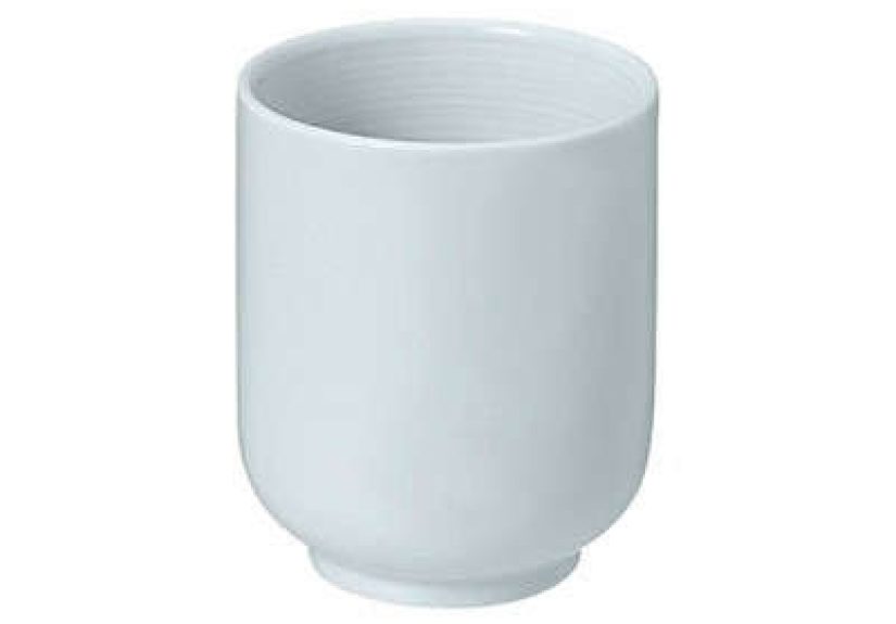
- Pantone Color of the Year 2024: Peach Fuzz
- Sherwin-Williams Color of the Year 2024: Upward (SW 6239)
- Benjamin Moore Color of the Year 2024: Blue Nova (825)
- Behr Color of the Year 2024: Cracked Pepper
- PPG / Glidden Color of the Year 2024: Limitless (PPG1091-3)
- Valspar Color of the Year 2024: Renew Blue (8003-37D)
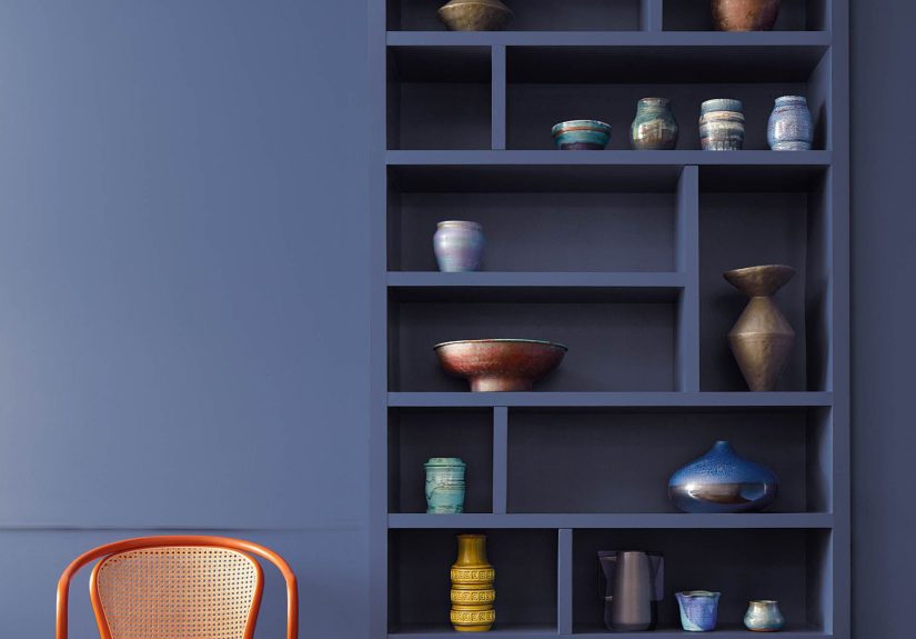
- The “Designer Favorites”: Calm Blues and Grounded Greens
- Not Just Walls: Spray Paint and Stain Colors of the Year
- Honorable Mentions That Still Absolutely Count
- How to Pick “Your” 2024 Color Without Regret
- Room-by-Room Ideas Using 2024 Colors of the Year
- FAQ (Because Your Group Chat Will Ask)
- Experiences: What It’s Like to Actually Live With 2024’s Colors
Every year, a bunch of very confident color experts politely (and sometimes loudly) tell the rest of us what we’re about to love.
And every year, we all pretend we weren’t already painting everything “some kind of warm white” since 2017.
For 2024, though, the Color of the Year crowd didn’t just pick one moodthey picked a whole emotional playlist:
soothing blues for your nervous system, grounded greens for your inner forest creature, warm peaches for your “soft life” era,
and at least one near-black that whispers, “Yes, I own a label maker.”
This guide rounds up the major 2024 Color of the Year announcements (paint, stain, spray paint, wallcoverings, and even exteriors),
explains what each shade is really “saying,” and shows you how to use them without turning your home into a themed escape room.
If you’re looking for 2024 paint color trends, interior design color inspiration, or a home decor color palette that feels current but livablewelcome.
Quick Snapshot: The 2024 Color Story in One Glance
- Blue is the headline act. Not icy “office carpet” bluemore sea-glass, sky-washed, and daydreamy.
- Warm comfort colors are back. Think honeyed neutrals and peachy skin tones that feel human, not sterile.
- Deep anchors matter. Soft blacks, olives, and browns show up to keep the soothing shades from floating away.
- Nature is the co-designer. Fog, stone, moss, clay, and fruit are doing the creative direction.
Every 2024 Color of the Year We Know So Far
Here’s the roundup. Consider it your “who’s who” of 2024 color picksbecause the only thing more powerful than a trend is
several different brands independently agreeing that your walls deserve peace.
| Brand / Authority | 2024 Color of the Year | Vibe in Plain English | Best “Starter” Use |
|---|---|---|---|
| Pantone | Peach Fuzz (PANTONE 13-1023) | Soft warmth, gentle optimism, cozy connection | Bedroom textiles, powder room, accent wall |
| Sherwin-Williams | Upward (SW 6239) | Calm blue-gray that feels like an exhale | Ceilings, bathrooms, light-filled living rooms |
| Benjamin Moore | Blue Nova (825) | Blue-violet “twilight” with a little drama | Dining room, library nook, statement cabinetry |
| Behr | Cracked Pepper (PPU18-01) | Soft black that grounds everything | Interior doors, trim, built-ins, one bold wall |
| PPG / Glidden | Limitless (PPG1091-3) | Warm honey-beige “new neutral” | Whole-home wall color, open-plan spaces |
| Valspar | Renew Blue (8003-37D) | Blue with a sea-green hush | Spa bathroom, entryway, exterior accents |
| Dunn-Edwards | Skipping Stones (DET567) | Steely coastal blue with depth | Bedroom cocoon, kitchen cabinets, front door |
| C2 Paint | Thermal (#752) | Fresh sky-and-water blue, uplifting | Ceilings, kids’ rooms, creative studios |
| Dutch Boy | Ironside (422-7DB) | Deep olive neutral with quiet confidence | Den, office, built-ins, moody hallway |
| HGTV Home by Sherwin-Williams | Persimmon (HGSW6339) | Cheerful orange with a grounded base | Kitchen island, breakfast nook, energizing accent |
| Rust-Oleum (Wall Paint) | Chocolate Cherry (SC152) | Red-brown luxury, cozy and intimate | Dining room, den, “grown-up” accent wall |
| Rust-Oleum (Spray Paint) | Satin French Blue | Classic blue with a creative edge | Furniture flips, frames, planters, hardware |
| Krylon | Bluebird | Pastel blue that still has personality | DIY décor refreshes, craft projects, small pops |
| Minwax | Bay Blue | Wood stain in a coastal-modern lane | Side tables, shelves, doors, feature furniture |
| York Wallcoverings | Bay Brown | Earthy brown that feels rich, not heavy | Wallpaper moments, layered neutrals, cozy rooms |
| James Hardie | Mountain Sage | Exterior green that blends with nature | Siding, trim pairings, curb appeal upgrades |
| Graham & Brown | Viridis | Muted green that reads “wellness” | Entryways, entertaining spaces, accent zones |
The “Why” Behind the Colors: What 2024 Is Trying to Fix
If 2023 had “statement color energy,” 2024 is more like: “Can we all just take one deep breath?”
Across brands, you’ll notice two big motivations: rest (blues, soft greens, gentle warmth) and grounding
(deep olives, browns, soft blacks). Translation: we want homes that soothe our brains and look intentional on Zoom.
The Headliners: 2024 Colors You’ll See Everywhere
Pantone Color of the Year 2024: Peach Fuzz
Peach Fuzz is that velvety peach tone that lives between blush and apricotwarm, friendly, and very much in its “text me when you get home” era.
It’s less “nursery pink” and more “sunset glow on good skin.” Pantone’s pick tends to spill into fashion, beauty, packaging, and interiors, which means you’ll
see Peach Fuzz influences even when no one calls it by name.
How to use it: Try it where you want softness without sweetness overloadguest rooms, powder rooms, reading corners, or as a tonal companion
to warm neutrals. Pair it with creamy whites, warm taupes, brushed brass, and walnut wood. If you want it to feel modern, add one crisp contrast:
charcoal accents or a black metal detail.
Sherwin-Williams Color of the Year 2024: Upward (SW 6239)
Upward is a breezy blue-gray that reads like daylight through a clean window. It’s calm without being cold, and it plays especially nicely
with the current “warm neutral” wavethink beige, greige, oat, and soft clay tones.
Where it shines: Bathrooms, bedrooms, and any room where you want “peaceful” without committing to full coastal theme.
Pro move: use Upward on the ceiling or upper walls to create a “sky effect,” then keep the rest of the room grounded with warm whites and natural textures.
Benjamin Moore Color of the Year 2024: Blue Nova (825)
Blue Nova is what happens when blue and violet decide to split the bill and both look fabulous doing it.
It’s deeper and richer than your average “safe blue,” which makes it great for adding sophistication without going full midnight cave.
Best uses: Dining rooms, libraries, home offices, or cabinetryanywhere you want a bit of “evening glamour.”
Pair it with soft whites, mushroomy neutrals, and warm metals. For a bold, modern look, add touches of saffron, rust, or terracotta in art and textiles.
Behr Color of the Year 2024: Cracked Pepper
Cracked Pepper is a soft blackmoody, grounding, and shockingly versatile. This is the shade for people who want drama
but also want to sleep at night. It’s less “void of despair” and more “tailored blazer.”
How to make it livable: Use it on interior doors, trim, built-ins, or one feature wall behind a bed or sofa.
Then warm it up with creamy whites, tan leathers, natural wood, and layered lighting. If your room lacks sunlight, keep Cracked Pepper to accents and let
warmer neutrals do the heavy lifting.
PPG / Glidden Color of the Year 2024: Limitless (PPG1091-3)
If 2024 had an official “everyone relax” neutral, it would be Limitless: a warm honey-beige that behaves like a neutral
but still feels like a color choice. It’s cozy, optimistic, and flexiblegreat for people who want warmth without going full yellow.
Where it works hardest: Open-plan spaces, hallways, and living roomsespecially if you’re trying to unify rooms without painting everything
stark white. Pair with off-whites, muted greens, and soft blues for an easy, updated palette.
Valspar Color of the Year 2024: Renew Blue (8003-37D)
Renew Blue is a calm, nature-inspired blue with a sea-green undertonelike fog rolling over a lake when you’re not late for anything.
It’s soothing enough for a bedroom, but clean enough for an entryway.
Best pairings: Warm taupes, pale grays, light woods, linen textures, and plants (yes, plants count as décor and emotional support).
Use it for spa bathrooms, nursery calm, or an exterior accent that won’t look trendy for five minutes and then betray you.
The “Designer Favorites”: Calm Blues and Grounded Greens
Dunn-Edwards Color of the Year 2024: Skipping Stones (DET567)
Skipping Stones leans steely, coastal, and a little atmosphericblue with hints of green and gray that keeps it mature.
It’s the kind of color that makes a room feel curated even when your bookshelf is half novels and half “important mail.”
Use it like this: Color-drench a bedroom (walls + trim) for a boutique-hotel vibe, or paint kitchen cabinets for a fresh alternative to navy.
It also makes a strong front door color when paired with warm whites and natural stone.
C2 Paint Color of the Year 2024: Thermal (#752)
Thermal is a fresh, vivid blue inspired by sky and waterenergizing but still calming. It’s the “morning playlist” of blues:
bright enough to lift a space, gentle enough to live with.
Easy wins: Ceilings (seriously), kids’ rooms, creative studios, or a light-filled kitchen.
Pair it with warm whites and a grounding neutral (sand, oat, or light wood) to keep it from feeling too candy-coated.
Dutch Boy Color of the Year 2024: Ironside (422-7DB)
Ironside is a deep olive neutralearthy, sophisticated, and quietly bold. It doesn’t shout “green,”
it murmurs “I have a favorite museum.”
Where it belongs: Dens, offices, moody hallways, and built-ins. Pair it with warm whites, caramel leather, aged brass,
and natural textures like jute or linen. If you love dark academia but also enjoy joy, this is your compromise color.
HGTV Home by Sherwin-Williams Color of the Year 2024: Persimmon (HGSW6339)
Persimmon is a lively orange with enough neutral grounding to keep it wearable. It’s cheerful, social, and made for
“people are actually in this room talking” spaces.
Try it here: Kitchen island, breakfast nook, entryway accent, or a small room where bold color feels intentional (powder rooms love confidence).
Balance it with warm whites, light woods, and a deep counter-color like charcoal or a dark olive.
Not Just Walls: Spray Paint and Stain Colors of the Year
Some brands crown a Color of the Year for how we actually live: refinishing furniture, updating hardware, flipping thrift finds,
staining wood, and turning “old” into “I meant to do that.”
Minwax Color of the Year 2024: Bay Blue
Bay Blue brings the blue-and-green calm into the wood world. It’s a stain color designed to feel grounded and modern,
which makes it perfect for furniture updates that still let the grain show.
Project ideas: A side table, floating shelves, a console, or even interior doors if you want a subtle coastal-modern statement.
Pair with creamy walls and matte black or aged brass hardware for a clean, elevated look.
Krylon Color of the Year 2024: Bluebird
Bluebird is a pastel blue with a confident twistsweet, but not shy. In spray paint form, it’s basically a permission slip
to update anything you’re tired of looking at.
Small-dose magic: Picture frames, planters, lamp bases, a tired metal chair, or storage bins that want to look “curated” instead of “miscellaneous.”
Keep it feeling grown-up by pairing with warm woods, soft creams, and a darker anchor color (charcoal, navy, or olive).
Rust-Oleum: Chocolate Cherry (Wall Paint) and Satin French Blue (Spray Paint)
Rust-Oleum gives us two very different 2024 moods, depending on the product line:
Chocolate Cherry (for wall paint) is a luxe red-brown that feels intimate and cozy, while Satin French Blue (spray paint)
leans classic and creativeideal for DIY transformations.
How to choose: If you want a room to feel like a warm, candlelit conversation, Chocolate Cherry is your color.
If you want to refresh objects, furniture, and décor with a crisp, timeless blue, Satin French Blue is your shortcut.
Honorable Mentions That Still Absolutely Count
York Wallcoverings Color of the Year 2024: Bay Brown
Bay Brown is proof that brown can be stylish, rich, and modernnot just “the sofa we inherited.”
It’s an earthy anchor color meant to play well with bold accents while adding softness and depth.
Where it’s especially smart: Wallpaper moments, layered neutral rooms, or anywhere you want the cozy vibe of wood and soil tones
without making the room feel heavy. Pair with warm whites, brass, and deep greens for a naturally luxurious look.
James Hardie Color of the Year 2024: Mountain Sage
Mountain Sage brings the 2024 green trend outdoors. It’s a versatile exterior green designed to feel harmonious with natural surroundings,
which makes it a strong choice for curb appeal that doesn’t scream “trend alert.”
Exterior pairing ideas: Off-white trim for classic charm, warm black accents for modern contrast, and natural stone or wood elements to keep it organic.
If your neighborhood has lots of trees, Mountain Sage tends to look especially at home.
Graham & Brown Color of the Year 2024: Viridis
Viridis is a muted green designed to feel welcoming and calminggreat for entryways and entertaining spaces where you want the room to feel alive
but not loud. It also pairs beautifully with earthy tones and natural materials.
How to Pick “Your” 2024 Color Without Regret
- Decide the job: Do you want calm (blues/greens), warmth (peach/honey), or structure (soft black/brown/olive)?
- Check your light: North light cools colors; warm bulbs warm them. Sample on multiple walls and look morning vs. night.
- Use the 60-30-10 rule: One main color, one supporting neutral, one accent. Easy, classic, hard to mess up.
- Anchor with texture: Natural wood, linen, wool, matte metalstexture makes trendy colors feel timeless.
- Start small if you’re nervous: Doors, trim, cabinets, a powder room, or furniture flips are low-commitment and high-impact.
Room-by-Room Ideas Using 2024 Colors of the Year
Living Room
- Limitless on walls + Cracked Pepper on built-ins for a warm, grounded look.
- Renew Blue as a soft main color with cream textiles and light wood for “calm but not boring.”
Kitchen
- Skipping Stones on cabinets + warm white walls + brass pulls = modern classic.
- Persimmon on an island or pantry door when you want energy where people gather.
Bedroom
- Upward for a light, airy calm (especially with warm whites and linen bedding).
- Peach Fuzz in textiles or an accent wall for softness that feels personal.
Bathroom
- Renew Blue + white tile + natural wood = instant spa vibes.
- Cracked Pepper on a vanity or door for boutique-hotel contrast.
Exterior / Entry
- Mountain Sage for siding or major exterior surfaces.
- Ironside or Skipping Stones for a front door that feels modern and grounded.
FAQ (Because Your Group Chat Will Ask)
Are 2024 Colors of the Year mostly blue?
A lot of them areespecially among paint brands. But the bigger theme is “restorative color”: blues, greens, warm peaches, and grounding dark neutrals.
What’s the safest whole-home choice?
Limitless is a strong candidate if you want warmth and flexibility. For a cooler whole-home option, Upward can work well
in bright spaces when paired with warm whites and wood.
What’s the boldest pick that still feels timeless?
Cracked Pepperbecause soft black functions like a neutral, but it adds instant structure and polish.
Experiences: What It’s Like to Actually Live With 2024’s Colors
Let’s talk about the part no paint announcement can capture: the lived-in reality. The moment you paint a wall, you don’t just “choose a color”
you adopt a tiny roommate that changes personality depending on time of day, weather, and whether you’ve turned on the overhead light (don’t).
The 2024 Colors of the Year are especially dramatic in this way because so many of them sit in that “quietly complex” zoneblue-grays, green-blues,
olives, and honeyed neutrals that shift like mood rings for adults.
Start with the blues. Colors like Upward, Renew Blue, Skipping Stones, and Thermal tend to feel
different in the morning than they do at night. In crisp daylight, they read fresh and airylike the room just drank water and took a walk.
But once evening arrives and your lighting warms up, they can slide toward cozy gray, sea-glass green, or even a slightly smoky tone.
That’s not a problem; it’s a feature. These are the colors that make a home feel calm when you need calm, and warm when you want comfort.
Warm picks like Peach Fuzz and Limitless are the opposite kind of chameleon. In sunlight, they can glowfriendly, flattering,
and almost “sunlit skin” warm. At night, they often deepen, turning into a soft, candlelit warmth that makes rooms feel more intimate.
If you’ve ever walked into a space and felt your shoulders drop without knowing why, it’s usually because the colors and lighting are quietly cooperating.
These warm shades are excellent at that kind of emotional design: they don’t demand attention, but they make spaces feel lived-in and welcoming.
Then there are the anchors: Cracked Pepper, Ironside, and Bay Brown. Living with deep colors is an experience
in confidence. They make everything around them look more intentionalart looks crisper, wood looks richer, and even inexpensive décor can feel “chosen”
instead of “acquired.” The trick is that dark colors also reveal your lighting habits. If your room relies on one harsh ceiling fixture, a soft black or deep olive
will absolutely expose that like a detective. Add layered lighting (a lamp, a sconce, a warm bulb), and suddenly the dark color looks expensive and cozy,
not heavy.
The most relatable experience of all? The sample phase. You’ll paint a swatch, love it at 2 p.m., panic at 8 p.m., and then adore it again the next morning
after coffee. That emotional roller coaster is normalespecially with 2024’s nuanced shades. The good news is that these Colors of the Year are built for
real life: they’re meant to soothe, ground, and flex with changing light. If you take your time sampling, pair them with warm neutrals and natural textures,
and avoid judging them under one sad overhead bulb, you’ll end up with a color story that feels current and comfortableaka the best kind of trend.