Table of Contents >> Show >> Hide
- What Is Chimichurri CSP-810 Paint, Exactly?
- Undertones and Personality: The “Sauce” in the Green
- Where Chimichurri CSP-810 Looks Incredible
- Color Pairings: What Goes With Chimichurri CSP-810?
- How to Paint Chimichurri CSP-810 Like a Pro
- Common Mistakes (and How to Avoid Them)
- FAQ: Quick Answers Before You Break Out the Roller
- Field Notes: of Real-World Experiences With Chimichurri CSP-810
- Conclusion
Some paint colors whisper. Chimichurri CSP-810 walks into the room carrying a mortar and pestle and says, “We’re seasoning this space today.” If you’ve been hunting for a deep, herb-forward green that feels bold without turning your home into a haunted Victorian submarine, welcome. This is your friendly, slightly nosy guide to what Chimichurri CSP-810 is, how it behaves in real light, where it looks amazing, and how to paint it without regretting your life choices halfway through coat one.
What Is Chimichurri CSP-810 Paint, Exactly?
Chimichurri CSP-810 is a Benjamin Moore color from the Color Stories collection. Translation: it’s designed to be rich, complex, and a little dramaticin the good way, like a movie soundtrack that makes your hallway feel important. It’s a deep green with an earthy, savory vibe (yes, paint can be savory; we live in exciting times).
One of the first things designers look at is LRV (Light Reflectance Value), which tells you how much light the color reflects. Chimichurri CSP-810 sits low on the scale, meaning it absorbs a lot of light and reads as a moodier greenthink “cozy depth,” not “minty smoothie.”
Why People Love It
- It’s grounding: Great for calming busy rooms (or busy brains).
- It looks expensive: Deep greens tend to read tailored and intentional, especially with the right trim and lighting.
- It’s flexible: Works across stylesmodern organic, traditional, eclectic, even sleek contemporary when paired with clean lines.
A Quick Reality Check
Chimichurri CSP-810 isn’t the color you pick because you want “safe.” It’s the color you pick because you want character. If your goal is bright and airy everywhere, use it strategicallyan accent wall, cabinetry, built-ins, or a room where you want a wrapped-in-velvet feeling.
Undertones and Personality: The “Sauce” in the Green
Here’s the deal with deep greens: they can swing warm, cool, gray, brown, or even nearly black depending on light and surroundings. Chimichurri CSP-810 leans earthy, with undertones that can read slightly olive or moss-like in some settings. That’s why it feels natural and sophisticated instead of neon or “holiday wreath.”
How Lighting Changes Chimichurri CSP-810
If you only remember one thing, make it this: lighting is the boss. The same gallon of paint can look like three different colors depending on direction and time of day.
- North-facing rooms: Often cooler, which can make deep greens feel a touch grayer or more subdued.
- South-facing rooms: Lots of warm lightgreens can look richer, slightly warmer, and more “herby.”
- Evening + warm bulbs: Deep greens can cozy up fast and feel more intimate (or more dramatic, depending on your furniture).
Pro Tip: Pair It With the Right White
Whites and off-whites aren’t interchangeable. A bright, icy white can make Chimichurri feel cooler and sharper. A warmer white can make it feel more organic and inviting. If you’re painting trim, test at least two whites next to Chimichurri before you commit.
Where Chimichurri CSP-810 Looks Incredible
This is the fun part: choosing where the color gets to be the main character. Deep greens are having a moment for a reasonthey’re dramatic, calming, and surprisingly livable when balanced with the right materials.
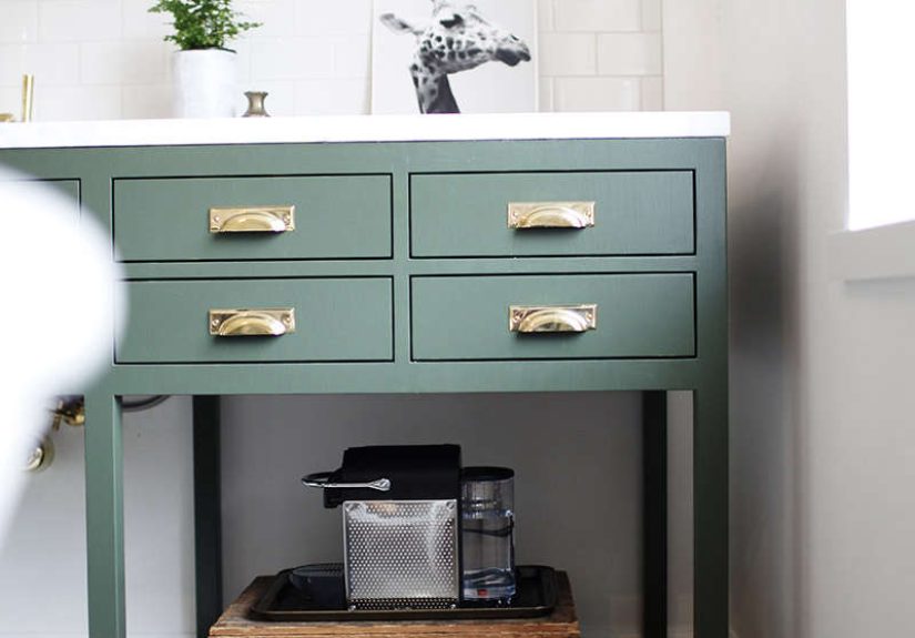
1) Kitchen Cabinets That Don’t Try Too Hard
Green kitchens have surged in popularity because they play nicely with wood, brass, marble, and warm neutrals. Chimichurri CSP-810 is especially good if you want cabinets that feel timeless but not bland.
Style match ideas:
- Modern: Chimichurri lowers + warm white uppers + minimal hardware.
- Classic: Full cabinetry in Chimichurri + polished nickel or aged brass pulls.
- Organic: Chimichurri + oak shelves + linen textures + matte black accents.
2) Moody Accent Walls (Without the “Cave” Problem)
Dark green accent walls can make a room feel curated and cozyespecially behind a sofa, bed, or dining buffet. If you want the color to feel intentional (not like you ran out of paint halfway through), consider extending it onto the trim on that same wall for a richer, architectural look.
3) Dining Rooms, Libraries, and “Grown-Up” Spaces
Chimichurri CSP-810 shines in rooms where you want depth: dining rooms that feel like a good restaurant booth, offices that make you feel productive even when you’re mostly reorganizing pens, and libraries (or “the room with the books you swear you’ll read”).
4) Bathrooms and Powder Rooms With Personality
In small spaces, deep colors can feel intentional and boutique. Pair Chimichurri with warm lighting, a great mirror, and one statement finish (brass, black, or polished nickel) and it becomes the chicest room in your house per square foot.
Color Pairings: What Goes With Chimichurri CSP-810?
Deep green is a team playerif you cast the supporting colors wisely. The easiest way to make Chimichurri look high-end is to combine it with quiet neutrals and natural textures, then add one or two accents with confidence.
Best Neutral Partners
- Warm whites and creams: Keep the green from feeling too heavy.
- Greige and soft taupe: Elegant and flexible, especially in transitional homes.
- Soft gray: Works if you prefer cooler palettesjust test to avoid a “muddy” combo.
Bold Accent Colors That Work (When You’re Feeling Brave)
- Terracotta / clay: Earthy warmth that makes the green feel even richer.
- Blush / dusty pink: Surprisingly sophisticatedsoftens the moodiness without turning sweet.
- Mustard / ochre: Adds punch and a vintage vibe (in a good way).
- Navy: A classic “tailored” pairinggreat for preppy or coastal-leaning spaces.
Materials That Make It Sing
- Brass: Warm, classic, and instantly elevating.
- Natural wood: Oak, walnut, or even bamboo tones keep it grounded.
- Stone and marble: Especially white marble with soft veiningcrisp contrast.
- Black accents: Great for modern spaces, but don’t overdo it unless you want full noir.
How to Paint Chimichurri CSP-810 Like a Pro
Deep colors reward patience. They also punish shortcuts. Let’s keep you in the “reward” lane.
Step 1: Sample It (Yes, Really)
Screen colors lie. They are charming little liars. Get a real sample, paint a decent-sized patch, and watch it through a full day: morning, afternoon, and night with your actual bulbs. If you can, sample on multiple wallslighting can change across the same room.
Step 2: Pick the Right Sheen
Sheen changes everything: durability, glare, and how much wall texture you’ll suddenly notice.
- Walls: Eggshell or satin are popular choices for cleanability without excessive shine.
- Trim and doors: Satin or semi-gloss for durability and easier wiping.
- Cabinets: Typically semi-gloss or higher for frequent cleaning and wear resistance.
Step 3: Prep Like You Mean It
Deep green is not the moment for “eh, good enough.” Clean the surface, patch holes, sand where needed, and use the right primerespecially if you’re covering a glossy finish or jumping from very light to very dark.
Step 4: Two Coats (Minimum) and Respect the Cure Time
Many people confuse “dry” with “cured.” Dry means you can touch it. Cured means it can take real lifewiping, bumping, cabinet doors, and the occasional chaos of humans existing. Give it time before heavy cleaning or installing hardware.
Common Mistakes (and How to Avoid Them)
Mistake #1: Testing a Tiny Swatch
A postage-stamp swatch will not tell you what a deep color does across a whole wall. Go bigger, or you’ll be surprised later and not in a fun “confetti cannon” way.
Mistake #2: Forgetting Undertones in Fixed Elements
Countertops, flooring, tile, and large furniture pieces don’t care about your paint dreams. Hold your sample next to these elements in natural and artificial light to make sure the undertones play nicely.
Mistake #3: Choosing a High Sheen on Imperfect Walls
The shinier the paint, the more it spotlights bumps and patches. If your walls have texture or repairs, a more forgiving sheen can keep the finish looking smoother.
Mistake #4: Going Too Dark Without a Lighting Plan
Deep greens thrive with layered lighting: overhead, task, and ambient. Add a lamp, a sconce, or under-cabinet lighting, and suddenly Chimichurri feels luxe instead of heavy.
FAQ: Quick Answers Before You Break Out the Roller
Is Chimichurri CSP-810 good for exteriors?
Chimichurri CSP-810 is generally positioned for interior use and is commonly noted as not being offered for exterior recommendations. If you’re trying to match the vibe outside, ask your local paint retailer about an exterior-safe alternative in a similar tone.
What trim color works best?
Most people succeed with a warm white or soft off-white trim to keep the look fresh. If your space is cooler (gray floors, cool stone), you may prefer a cleaner whitebut test it to avoid a harsh contrast.
Will it make my room look smaller?
Dark colors can visually “pull in” walls, but they also add depth. In many rooms, the result feels cozy and intentional, especially with good lighting and lighter accents.
Field Notes: of Real-World Experiences With Chimichurri CSP-810
Let’s talk about what tends to happen when Chimichurri CSP-810 moves from “pretty on a screen” to “hello, I live here now.” Across homeowner stories, contractor chatter, and design-makeover writeups, a few repeatable patterns show uplike a dependable recipe.
First: people underestimate how moody this color is until it’s on a full wall. That low-reflectance depth is the point, but it means your room can feel dramatically different at 8 a.m. than it does at 8 p.m. In brighter daylight, Chimichurri reads like a grounded herb greenfresh, natural, confident. At night, especially under warm bulbs, it often shifts into a deeper, cozier tone that can feel almost “velvety.” Homeowners who love it usually describe that shift as romantic and relaxing. Homeowners who don’t? They usually skipped sampling, had weak lighting, or expected “olive but lighter.”
Second: hardware and finishes matter more than you think, especially on cabinets. Chimichurri on kitchen cabinetry paired with aged brass pulls is a classic crowd-pleaser; the warmth makes the green feel intentional and expensive. Matte black hardware can look stunning too, but it reads more modern and graphicgreat if that’s your style, less great if your home is traditional and you want soft edges. Stainless or polished nickel tends to cool the look slightly and can make the green feel sharper, which is perfect in contemporary kitchens with crisp white countertops.
Third: this color loves texture. Smooth walls look sleek, surebut Chimichurri becomes unforgettable with natural materials: oak shelving, linen curtains, woven rugs, stoneware pottery, even a slightly imperfect plaster finish if you’re into that old-world vibe. Designers often lean on texture to keep deep greens from feeling “flat.” A room can be monochromatic and still feel lively if you mix matte and soft-sheen surfaces, nubby textiles, and warm wood.
Fourth: paint finish can make or break your happiness. On walls, many people prefer eggshell or satin because it’s cleanable but not mirror-shiny. On cabinets and doors, higher sheens usually win for durabilitybut the tradeoff is that prep has to be excellent, because gloss is honest to a fault. The happiest cabinet painters tend to do the boring stuff: degrease thoroughly, sand properly, prime wisely, and wait for cure time before slamming doors like they’re auditioning for a soap opera.
Finally: Chimichurri rewards commitment. If you only dabble with it in a dim corner, it can look serious. When you support it with layered lighting, balanced neutrals, and a few warm accents, it becomes the starbold, elegant, and surprisingly soothing. It’s less “random green” and more “this person has taste.” And honestly, that’s what most of us want our walls to whisper about us when guests come over.
Conclusion
Chimichurri CSP-810 is a deep, earthy green that brings instant sophisticationespecially when you respect its love of light, its fondness for warm neutrals, and its talent for making brass and wood look ridiculously good. Sample it like a responsible adult, pick the right sheen for the job, and give it the lighting support it deserves. Do that, and you’ll get a space that feels grounded, elevated, and just spicy enough to be memorable.