Table of Contents >> Show >> Hide
- Why Charlie Day’s HD Comment Landed So Hard
- The Gritty Look Was Never an Accident
- The HD Debate Is Really About Tone, Not Technology
- Charlie Day’s Taste Has Been Telling Us This All Along
- And Yet, Here’s the Twist: The Show Still Works
- Why Fans Keep Coming Back to This Complaint
- Specific Examples of Why the Old Visual Style Mattered
- What Watching Sunny in SD and HD Actually Feels Like
- Final Takeaway
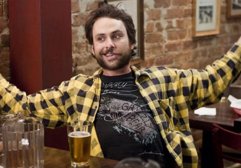
There are TV opinions, and then there are TV opinions that make longtime fans sit up like someone just yelled “Wildcard!” in a crowded bar. Charlie Day saying he also hates It’s Always Sunny in Philadelphia’s HD look absolutely belongs in the second category. It is the kind of comment that immediately makes old-school viewers nod, point at the screen, and say, “Thank you. Finally. Someone said it out loud.”
Because this debate has never really been about pixels. Nobody is standing in front of a television crying because the image is too clear, too crisp, or too capable of revealing every stain in Paddy’s Pub. Well, actually, that is exactly what people are crying about. But underneath the jokes, the complaint is about something bigger: vibe. Sunny was built on a dingy, low-budget, morally bankrupt aesthetic that fit the show so perfectly it almost felt accidental. Then the image got cleaner, the lighting got brighter, the edges got sharper, and some fans felt like the show lost a little of its grease-stained soul.
Charlie Day’s recent remark matters because he is not some random nostalgic fan posting from a couch fortress built out of reruns and resentment. He is one of the show’s creators, stars, writers, and essential tonal architects. If he says the HD look bugs him too, that tells us something important: the complaint is not just fandom being fandom. It is a real creative tension sitting right inside the show’s DNA.
Why Charlie Day’s HD Comment Landed So Hard
Day’s complaint hit a nerve because it confirmed what a lot of Sunny fans have been feeling for years. He explained that the show still uses those original-style cameras, but the HD version is the part he “can’t stand.” That is a tiny quote with a huge aftershock. For one thing, it is funny in the most Sunny way possible. The show has lasted two decades, outlived trends, crossed over with other series, and become one of the most durable comedies in modern television, yet one of its own creators is still beefing with the way it looks on your TV. Very on-brand. Very petty. Very beautiful.
But it also clarifies that this is not just a matter of fans romanticizing the past. The old visual texture was part of the joke. It helped sell the show’s grubby universe, where people lived in apartments that felt one clogged sink away from public condemnation and ran a bar that looked like it failed a health inspection sometime during the Bush administration. The roughness was a feature, not a flaw. Sunny looked like trouble. That was the point.
And when that roughness gets polished, even slightly, the chemistry changes. It is like serving gas-station coffee in fine china. You can still drink it. It may even be the same coffee. But spiritually? Something has gone very wrong.
The Gritty Look Was Never an Accident
A shoestring beginning gave the show its personality
It’s Always Sunny in Philadelphia began as an aggressively scrappy idea. The original pilot has become comedy folklore because of how little money went into it. Depending on which retelling you hear, it cost less than 200 bucks, or even less than that if you trust the creators’ habit of downplaying the legend. Either way, it was a camcorder-born experiment made by hungry performers who were not waiting around for permission.
That origin story matters because it shaped how the show felt. The grainy image, the flat lighting, the almost improvised ugliness of the frame none of that made Sunny feel cheap in a bad way. It made it feel dangerous, fast, and weirdly intimate. You were not watching a sleek network sitcom. You were peeking into a morally compromised ecosystem where every person on screen looked like they smelled faintly of beer, bad ideas, and impulsive fraud.
Even as the writing got tighter and the performances got more precise, the early seasons kept that basement-made energy. The visual roughness became inseparable from the characters. Dennis looked more alarming in low-resolution. Charlie looked more feral. Dee looked more trapped. Mac looked more confident in exactly the wrong ways. The image quality did not just record the joke. It joined the joke.
Paddy’s Pub should not look too nice
There is also a very basic truth here: Paddy’s Pub is not supposed to look good. It is supposed to look sticky. It is supposed to feel a little dim, a little sad, and just one sneeze away from a lawsuit. The older visual style helped create that illusion. It made the world feel worn down. The bar looked like a place where a scam would hatch naturally, like mold on drywall.
HD, on the other hand, has no chill. HD snitches. HD says, “Here is every wall texture, every makeup choice, every carefully dressed set detail.” That can be great for prestige dramas and giant fantasy sagas. It is less ideal for a comedy about people who should never appear this visible to the human eye. The cleaner the image gets, the more the show risks looking produced instead of discovered.
The HD Debate Is Really About Tone, Not Technology
When fans say they miss the old look, they are usually not making a technical argument. They are making a tonal one. The earlier seasons of Sunny had a visual looseness that matched the gang’s social decay. It felt like the camera had wandered into the scene by mistake and decided to keep filming. That energy supported the show’s fundamental premise: these people are disasters, and the universe has made the terrible choice to keep following them.
Once the image becomes brighter and more precise, a subtle mismatch can appear. The gang are still monsters. The schemes are still deranged. The jokes are still vicious. But the show can look a little more expensive than the characters deserve. And that matters, because comedy is often about invisible agreements between style and material. A grimy premise benefits from a grimy wrapper.
Think about how many classic Sunny moments rely on atmosphere as much as punch lines. Charlie writing nonsensical songs in a filthy apartment. The gang spiraling in a cramped back office. Dennis unraveling in spaces that feel a little too small for his ego. Frank emerging from somewhere no human should be. These scenes work because the environment feels claustrophobic, sweaty, and vaguely cursed. When everything gets visually cleaner, the show can still be funny, but it loses a bit of the smell. And yes, on this show, smell is an artistic category.
Charlie Day’s Taste Has Been Telling Us This All Along
If you zoom out, Day’s dislike of the HD look fits something he has already said about the show’s creative instincts. In interviews about Season 17, he admitted that he tends to prefer Sunny when it is not leaning too hard on pop-culture references. He also talked about loving scenes set in Charlie and Frank’s apartment and in the bar’s cramped little back office because those spaces have a certain magic.
That is not a contradiction. It is a philosophy. Day seems drawn to the version of Sunny that feels sealed inside its own disgusting snow globe. He likes the intimate, character-first version of the show, where the gang are bouncing off each other in narrow rooms instead of stepping out into TV-event territory. That does not mean he hates experimentation. It means he appears most protective of the show’s internal rhythm its shabby little heartbeat.
Once you understand that, the HD complaint makes perfect sense. It is not really about resisting progress. It is about protecting atmosphere. It is about preserving the texture that made Sunny feel unlike every other comedy around it. The show never became a hit because it looked polished. It became a hit because it felt like a terrible idea executed with fearless commitment.
And Yet, Here’s the Twist: The Show Still Works
Now for the fair point, because every good argument needs one. It’s Always Sunny in Philadelphia has continued to work, even in its cleaner visual era. Season 17 arrived with strong reviews, renewed energy, and proof that the gang can still weaponize selfishness better than almost anyone on television. The show’s comic engine remains absurdly strong. The rhythm is still there. The cast still knows how to turn a simple argument into total societal collapse.
Episodes like “Charlie Work” have already shown that the series can become more technically ambitious without losing its soul. That episode is polished, tightly choreographed, and formally impressive, but it still feels sweaty, frantic, and deeply unstable. So the issue is not that HD automatically ruins Sunny. It is that HD can expose the seams when the show drifts too far from its grimiest instincts.
In other words, Charlie Day is not arguing that the show became bad the moment the image sharpened. He is pointing to a real creative trade-off. The clearer the show looks, the more carefully it has to protect the chaos that made it special in the first place.
Why Fans Keep Coming Back to This Complaint
People do not obsess over the HD debate because they are bored. They obsess over it because Sunny is one of those rare comedies where form and content fused early and powerfully. The show’s visual grime, moral grime, and emotional grime arrived as one ugly little package. So when one piece changes, fans feel it.
There is also something weirdly comforting about the old look. Early Sunny feels like a time capsule from a more reckless era of television, when a show could be cheap, nasty, and gloriously unconcerned with pleasing everyone. In an age when so much comedy gets sanded down or over-lit into sameness, those early seasons still feel like contraband.
That is why Day’s comment resonated. It reassured fans that the people who built the show understand what was special about it. They are not blind to the shift. They feel it too.
Specific Examples of Why the Old Visual Style Mattered
- “The Gang Gets Racist”: the rawness helps the pilot feel like a dare, not a product.
- Charlie and Frank’s apartment scenes: the grime is half the joke, because the environment looks like it may be actively winning.
- The back office at Paddy’s: Day has talked about how funny those cramped spaces are, and he is right. The tension gets funnier when the room feels too small for the scheme.
- “Charlie Work”: this is the counter-example that proves the rule. The show can get more polished, but only when the panic, filth, and character logic remain intact.
- Later crossover-era episodes: still funny, often very funny, but they work best when the gang feel like invaders, not when the show itself starts looking too civilized.
What Watching Sunny in SD and HD Actually Feels Like
Rewatching early It’s Always Sunny in Philadelphia now is a weirdly physical experience. You do not just notice the jokes. You notice the air in the room. The early seasons feel humid. The image is softer, murkier, and somehow more judgmental. It is like the show is daring you to spend time in this world and then acting offended when you happily do.
Those older episodes feel like hanging out in a bar where the floor is permanently tacky, the bathroom light flickers for emotional reasons, and the guy next to you is definitely lying about owning a boat. The look of the show does a massive amount of invisible work. It convinces you that these people belong here. Of course Charlie lives like this. Of course Dennis stares into the middle distance in a room with terrible lighting. Of course Frank crawls out of someplace he should never have entered. The image itself makes the insanity easier to believe.
Then you jump to the HD years and the sensation changes. Suddenly, the show feels less like a cursed local-access miracle and more like a very smart long-running comedy that knows exactly what it is doing. That is not inherently bad. In fact, some viewers may prefer it. The performances are easier to read. The staging is cleaner. The show’s craftsmanship becomes more obvious. But that clarity comes with a small cost. The gang no longer look like they emerged from the same darkness as the bar. They look a little more separated from it, a little more aware of being on television.
That is probably the best way to describe the difference. Early Sunny feels accidental in the best possible sense. Later Sunny feels controlled. Early Sunny feels like somebody found a cursed tape and passed it around. Later Sunny feels like a veteran comedy machine that still knows how to spin chaos into gold. Both versions can be funny. Only one of them feels like it might give you tetanus.
And for this particular series, tetanus is part of the charm.
There is also a nostalgia trap here, of course. Fans tend to attach meaning to whatever version of a show they first loved. If you came into Sunny during the early DVD years, the lower-resolution grime probably feels essential because it arrived bundled with your first exposure to “The Nightman Cometh,” “Dennis and Dee Go on Welfare,” or Charlie’s many acts of illiterate brilliance. Memory and aesthetics start holding hands. That is just how fandom works.
Still, this conversation has lasted because it is not only nostalgia. It is recognition. People can tell when a show’s surface texture supports its comic worldview. On Sunny, the old ugliness made the social ugliness feel sharper and funnier. The HD era did not erase the show’s brilliance, but it did make some viewers more aware of the gap between the gang’s rotten lives and the cleaner frame containing them. That gap is exactly what Charlie Day seems to be reacting to. And honestly? He is not wrong.
Final Takeaway
Charlie Day also hating It’s Always Sunny in Philadelphia’s HD look is not some trivial behind-the-scenes quirk. It is a revealing little window into what made the show work from the beginning. Sunny was never supposed to look pristine. It was supposed to look like a bad idea that kept surviving. Its older, rougher visual style helped sell the sleaze, the claustrophobia, and the comic hopelessness of life around Paddy’s Pub.
The good news is that the show is strong enough to survive even the visual upgrades it may not entirely want. Two decades in, it is still funny, still nasty, and still capable of making selfishness look like high art. But Day’s comment reminds us that television style is never just decoration. On a comedy this specific, the look is part of the laugh.
So yes, the HD debate may sound petty on paper. But this is It’s Always Sunny in Philadelphia. Petty is sacred here. And if one of the creators says the cleaner image still feels wrong, that is not just fan discourse fuel. That is a small but meaningful clue about why this gloriously filthy sitcom became such a classic in the first place.