Table of Contents >> Show >> Hide
- Why Blue Works So Well in Bedrooms
- Pick Your Blue: A Quick Shade Map
- Light Blue Bedroom Ideas (Soft, Airy, and “I Sleep Eight Hours Now” Energy)
- Mid-Tone Blue Bedroom Ideas (Denim, Dusty, Slate, and Everything Cozy)
- Deep Navy Bedroom Ideas (Moody, Luxe, and Surprisingly Cozy)
- 11) Color-drench with navy for a boutique-hotel vibe
- 12) Paint just the trim or doors blue for subtle sophistication
- 13) Pair navy with warm metals and wood to keep it inviting
- 14) Use navy as an accent wall when you want drama on a budget
- 15) Choose your navy personality: “classic maritime” vs. “inky modern”
- Color Pairings That Make Blue Bedrooms Look Intentional
- Where to Put the Blue (So It Looks Like a Plan, Not an Accident)
- Finish, Lighting, and Texture: The Stuff That Makes Blue Look Expensive
- Common Blue Bedroom Mistakes (And How to Avoid Them)
- Experience Add-On (About ): What It’s Like to Actually Live With Blue
- Conclusion
If your bedroom were a movie, blue would be the soundtrack: calming, classic, and somehow flattering on everybody.
From barely-there sky tints that feel like fresh sheets on a Saturday morning to deep navy that makes your room feel
like a boutique hotel (the kind with the good water pressure), blue is the rare color that can be both soothing and
dramaticsometimes in the same room.
This guide walks you through blue bedroom ideas across the whole spectrumlight blue to deep navy and all the delicious
in-between shadesso you can pick a direction, avoid rookie mistakes, and end up with a space that feels intentional
(not “I panic-bought a comforter at 11:48 p.m.”).
Why Blue Works So Well in Bedrooms
Blue has a reputation for being restful, and designers love it because it’s versatile: it can read coastal, traditional,
modern, rustic, preppy, romantic, minimal, or maximaldepending on the shade and what you pair it with. In other words,
blue is the “good jeans” of bedroom design: it goes with everything and makes the rest of your choices look more put-together.
The key is temperature (cool vs. warm undertones), depth (light vs. dark), and placement
(walls, ceiling, trim, textiles, or a single showpiece). Choose those three wisely, and blue basically does half the decorating for you.
Pick Your Blue: A Quick Shade Map
- Light blues (powder, sky, pale blue-gray): airy, gentle, great for smaller rooms and low-stress vibes.
- Mid-tone blues (denim, slate, cornflower, dusty blue): balanced, cozy without feeling heavy, super flexible with decor.
- Deep blues (ink, midnight, deep navy): moody, cocooning, hotel-luxeespecially with warm lighting and texture.
Pro tip: don’t judge a blue by its tiny paint chip. Blues shift dramatically with daylight, bulbs, and what’s nearby
(white bedding, warm wood floors, green plants, that neon alarm clock you refuse to replace…).
Always sample on multiple walls and look at it morning, afternoon, and night.
Light Blue Bedroom Ideas (Soft, Airy, and “I Sleep Eight Hours Now” Energy)
1) Keep it cool and neutral for a crisp, calm base
Light blue loves friends with cool undertones: clean whites, soft grays, pale greige, and silvery metals. This combo feels
fresh and quietespecially if you keep patterns subtle (think thin stripes, micro-checks, or a gentle botanical print).
- Walls: pale blue or blue-gray
- Bedding: white + a light blue quilt or trim
- Furniture: light oak, painted white, or matte black accents for contrast
2) Paint the “fifth wall” (aka the ceiling) for instant charm
If you want a light blue bedroom that feels designedwithout adding a bunch of stufftake blue to the ceiling.
A soft sky-blue ceiling can make the room feel taller and more open, like your bedroom just got a deep breath.
Keep the walls lighter (white, warm-white, or the palest blue) so the ceiling reads like a gentle canopy, not a storm cloud.
3) Try light blue wainscoting or paneling for structure
Light blue looks especially sophisticated when it has “architecture.” Paint wainscoting, beadboard, picture-frame molding,
or a half-wall in light blue, then keep the upper wall a warm white. It’s classic, tailored, and works in everything from
coastal cottages to modern apartments that wish they were coastal cottages.
4) Use patterns to keep light blue from feeling juvenile
Light blue can sometimes lean “kids’ room” if it’s too flat. The fix is pattern and texture: a blue patterned wallpaper,
a block-printed duvet, a striped rug, or a quilt with visible stitching. Patterns make pale blue feel grown-up fast.
5) Do the “blue thread” trick: weave it through the room
Don’t want to paint? No problem. Repeat light blue in 3–5 places and the room reads cohesive:
curtains, a rug, throw pillows, art, a ceramic lamp base, and maybe one upholstered piece. Keep the shades in the same family
(all airy, all slightly gray, etc.) so it feels curated.
Mid-Tone Blue Bedroom Ideas (Denim, Dusty, Slate, and Everything Cozy)
6) Go denim-blue for “casual but pulled together”
Denim blues are the sweet spot: deeper than sky blue, softer than navy. They’re great for bedrooms that need warmth without
going beige. Pair denim walls with creamy whites and natural textures (linen, cane, jute) and you get relaxed sophistication.
7) Use “dusty blue” to soften modern rooms
Dusty blue (a muted blue with gray in it) is excellent when your bedroom has sharp linesplatform beds, minimal nightstands,
modern lighting. It rounds out the edges visually and makes the room feel less like a showroom and more like a place where
a human being actually reads before bed.
8) Add depth with layered blues (yes, you can mix blues)
Mixing blues works when you vary value (lightness/darkness) and texture. For example:
slate-blue walls, navy velvet pillows, and a pale blue throw. The different depths create dimension without needing more colors.
If you want extra energy, add one accent color (like warm tan, brass, or a small hit of terracotta).
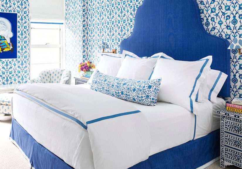
9) Make your headboard the hero
Mid-tone blue is perfect for upholstered headboardsespecially in velvet, bouclé, or linen blends. A blue headboard anchors
the bed and gives you that “designed” look even if your nightstands are currently… mismatched and emotionally complicated.
10) Try a blue wallpaper feature wall (big impact, fewer decisions)
One wall of blue wallpaper behind the bed can do what four painted walls dowithout committing the entire room.
Look for patterns that echo your style:
- Traditional: damask, toile, fine stripes
- Modern: geometric, abstract, oversized florals
- Coastal: subtle waves, grasscloth in blue tones, simple block prints
Deep Navy Bedroom Ideas (Moody, Luxe, and Surprisingly Cozy)
11) Color-drench with navy for a boutique-hotel vibe
Painting the walls (and sometimes the ceiling) in a deep navy creates a cocoon effect. It’s dramatic, but it can also be
incredibly restfulespecially when you balance it with warm, layered lighting and soft textiles. If you go full drench,
bring in contrast with crisp bedding and lighter art or mirrors.
12) Paint just the trim or doors blue for subtle sophistication
Want navy without the “I live in a midnight cave” fear? Paint trim, baseboards, window casings, or a bedroom door in a
deep blue. It adds polish and definition, and it’s a clever way to introduce a strong color while keeping the room bright.
13) Pair navy with warm metals and wood to keep it inviting
Navy can go cold if everything else is cool. Warm it up with:
- Brass or aged gold (sconces, mirror frames, drawer pulls)
- Walnut or medium oak furniture
- Warm white bulbs (avoid harsh blue-white lighting)
- Textiles with warmth: camel throws, cream rugs, tan leather accents
14) Use navy as an accent wall when you want drama on a budget
A single navy wall behind the bed adds depth and makes art pop. Keep the other walls a soft white or a very pale blue-gray,
then echo navy in two or three smaller places (pillows, a bench, lamp shades, art). The room will feel balanced, not busy.
15) Choose your navy personality: “classic maritime” vs. “inky modern”
Not all navies are the same. Some have classic, straightforward maritime energy; others lean smoky, inky, or slightly green-gray.
If you want a time-tested navy, paint brands highlight options like Benjamin Moore Hale Navy and Sherwin-Williams Naval.
If you want something between denim and navy, Behr’s Blueprint is often described as a steel-blue that sits in that middle zone.
Color Pairings That Make Blue Bedrooms Look Intentional
Blue plays well with a lot of colorsbut the best pairings depend on the mood you want.
Blue + White (timeless, clean, coastal-to-classic)
- Light blue walls + crisp white bedding = airy and fresh
- Navy walls + bright white bedding = high contrast and hotel-like
Blue + Warm Neutrals (cozy, sophisticated, never fussy)
- Blue + cream, oatmeal, camel, tan
- Works especially well with linen, wool, and natural wood
Blue + Green (natural, layered, “designer did this”)
Blue with mossy or olive greens adds life and warmthespecially in moody rooms. Think: deep blue walls, green pillows,
plants, and maybe a small hit of golden yellow to keep it lively.
Blue + Orange (bold contrast that still feels warm)
If your blue bedroom looks a little too serious, orange and blue are opposites on the color wheelmeaning they naturally
energize each other. You don’t need neon. Try rust, terracotta, cognac leather, or a soft burnt orange throw.
Blue + Blush or Soft Pink (unexpected, soft, and modern)
This combo can read romantic or contemporary depending on the shades. Navy with dusty blush feels elegant; pale blue with
warm pink feels cheerful. Keep the pink subtle if you want the room to stay calm.
Where to Put the Blue (So It Looks Like a Plan, Not an Accident)
Walls
The biggest impact. Light blues open a room up; deep blues create intimacy. If your room is small, don’t automatically avoid
dark paintjust commit to good lighting and contrast.
Ceiling
Perfect for light blues. For deep blues, a matching ceiling can be stunning, especially if you want a cocoon effect.
Trim, doors, and built-ins
A “secret weapon” move. Blue trim in a mostly neutral bedroom feels custom and high-end without dominating the space.
Bedding
The easiest way to experiment. Try a blue quilt, a navy duvet, or patterned shams before painting anything. If you fall in love,
then you can consider the walls.
Furniture
A blue dresser, nightstand, or upholstered bench adds character. Mid-tone blues are especially forgiving on furniture because
they hide daily life better than bright whites (translation: fewer visible scuffs).
Finish, Lighting, and Texture: The Stuff That Makes Blue Look Expensive
Choose the right sheen
- Matte/flat: hides wall imperfections, feels soft and cozy (great for bedrooms)
- Eggshell/satin: slightly more durable, gentle glow (great for most bedrooms)
- High-gloss: bold and dramatic, best for trim/doors or a very intentional statement
Warm up the lighting
Blue + harsh cool bulbs can look icy. Use warm, layered lighting:
bedside lamps, wall sconces, and a ceiling fixture on a dimmer if possible. A dark blue room with warm light feels luxe, not gloomy.
Layer texture like you mean it
Blues look richer when surrounded by texture: linen bedding, a nubby rug, velvet pillows, woven baskets, wood grain, and a knit throw.
Texture prevents blue from looking flatespecially in darker shades.
Common Blue Bedroom Mistakes (And How to Avoid Them)
- Choosing a blue that fights your floors: warm wood wants warmer or balanced blues; cool gray floors want cooler blues.
- Going dark without enough lighting: if you pick navy, plan for warm bulbs and multiple light sources.
- Matching everything perfectly: a room where every blue is identical can look like a catalog pagenice, but a little lifeless. Mix shades.
- Ignoring undertones: some blues lean green, purple, or gray. Sample before you commit.
- Forgetting contrast: deep blue needs light elements (bedding, art, rugs) to keep it crisp, not murky.
Experience Add-On (About ): What It’s Like to Actually Live With Blue
Decorating advice is cute in theory, but bedrooms are where we live our least photogenic livessleepy scrolling,
laundry piles that “don’t count because they’re clean,” and the occasional dramatic stare at the ceiling at 2:17 a.m.
So here’s what blue is like when the camera crew leaves.
Light blue is the easiest to love day-to-day. In the morning, it feels clean without being sterile, especially when sunlight
hits it and the room shifts from “quiet” to “gently awake.” If you’ve ever walked into a room and immediately felt your shoulders
drop, that’s the light-blue effect when it’s paired with simple bedding and not too many busy patterns. It’s forgiving, too:
wrinkled linen sheets look charming instead of tragic, and your nightstand clutter somehow reads as “collected” rather than “chaos.”
Mid-tone bluesdenim and dusty slateare where many people land after the first paint-sample rodeo. They feel like a neutral,
but with personality. What’s surprising is how much these blues change with the day: they can read brighter and more energetic
at noon, then cozy and soft at night. That makes them great for real bedrooms that double as “I need to sit somewhere that isn’t
my kitchen” spaces. A denim wall behind the bed also has a magical ability to make your headboard look more expensive than it was,
which is a very fun scam to run on your own eyes.
Deep navy is the most emotionally dramaticin the best wayif you set it up right. The first night in a navy room with warm lamps
is a “wow” moment. The darkness makes the room feel quieter, even if you live somewhere noisy. But navy is also honest: it will
highlight bad lighting choices immediately. A single bright, cool bulb can make the whole room feel like an aquarium exhibit.
The fix is warm, layered light and some soft contrastcreamy bedding, a lighter rug, maybe a brass sconce. Then navy stops feeling
heavy and starts feeling like a deliberate retreat. It’s the difference between “dark room” and “luxury cave.”
The biggest real-life lesson: blue doesn’t need perfection. The most comfortable blue bedrooms usually have a mixone strong blue
statement (walls, headboard, or bedding) and supporting blues in smaller hits. Add a little wood, a little texture, and a little
warm light, and suddenly your bedroom feels like it has a point of view. Also, you may find yourself going to bed five minutes earlier
because the room just feels nicer. That’s not guaranteed, but it’s a strong possibilityand frankly, we take wins where we can get them.
Conclusion
Whether you’re flirting with pale blue, committed to denim, or ready to go full navy, the winning formula is the same:
pick a shade that suits your light, balance it with contrast, and add texture and warm lighting so the space feels human.
Blue is flexible enough to meet you where you areminimalist, traditional, eclectic, or “I just want this room to feel better.”
Start small if you need to (bedding, a rug, an accent wall), and if you fall in love, let blue take the lead.