Table of Contents >> Show >> Hide
- 1. Blush Pink for a Warm, Polished Glow
- 2. Lavender Gray for Soft Drama
- 3. Mint Green for a Fresh, Spa-Like Mood
- 4. Powder Blue for an Airy, Light-Filled Feel
- 5. Butter Yellow for Instant Cheer
- 6. Peach for a Friendly, Glowy Interior
- 7. Pale Sage for a Soft Nature-Inspired Neutral
- 8. Soft Coral for a Playful Accent
- 9. Barely-There Aqua for Breezy Brightness
- How to Make Pastel Walls Look Elevated, Not Overdone
- Final Thoughts
- Real-Life Experiences With Pastel Walls: What Homeowners Usually Learn After the Paint Dries
- SEO Tags
Pastel walls have pulled off one of the greatest tricks in decorating: they feel cheerful without shouting, stylish without trying too hard, and airy without turning your home into a sterile white box that looks like it is waiting for a dentist appointment. When used well, pastel paint colors can brighten a room, soften harsh lines, and make everyday spaces feel a little more welcoming.
If you are looking for pastel wall color ideas that feel fresh, grown-up, and easy to live with, the good news is that soft color no longer belongs only in nurseries, vintage bathrooms, or springtime mood boards. Today’s best pastel paint colors are layered, nuanced, and surprisingly versatile. A dusty blush can act almost like a neutral. A pale mint can make a bathroom feel like a spa. A soft powder blue can calm a room down faster than your group chat can start drama.
Below, you will find nine pastel wall color ideas to brighten your home, plus practical advice on where each shade works best, what to pair it with, and how to keep the result chic instead of sugary. Because nobody wants their living room to look like a cupcake unless that is very specifically the brief.
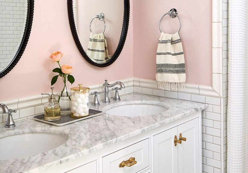
1. Blush Pink for a Warm, Polished Glow
Blush pink is one of the easiest pastel wall colors to use because it brings warmth without overwhelming a room. In natural light, it can feel soft and flattering. In the evening, it often takes on a cozy, cocoon-like quality that works beautifully in bedrooms, home offices, reading corners, and powder rooms.
The secret is choosing a blush that looks muted rather than bubblegum. Think of pink with a whisper of beige, peach, or gray. This kind of shade pairs especially well with crisp white trim, light oak furniture, antique brass, black accents, and textured fabrics like linen or boucle. If you want a room to feel brighter but not cold, blush is a smart move.
For a sophisticated look, layer blush walls with cream upholstery, walnut wood, and one or two darker accents for contrast. A blush office, for example, can feel energizing and elegant at the same time. It says, “I have excellent taste,” not, “I still own three glitter lava lamps.”
2. Lavender Gray for Soft Drama
Lavender is often misunderstood. People hear the word and imagine a room that smells vaguely like potpourri and life choices from 1997. But modern lavender walls are far more refined. The most livable versions usually lean gray, which gives them a gentle, dusty quality that feels calm, upscale, and surprisingly flexible.
Lavender gray works especially well in dining rooms, bedrooms, and guest rooms where you want softness with a little personality. It can highlight molding beautifully, add dimension to historic spaces, and provide a cooler counterpoint to warm woods and brass fixtures. In a bedroom, it creates a restful backdrop that feels more interesting than beige but just as easy on the eyes.
Pair this pastel shade with charcoal, ivory, muted navy, black-framed art, or deep indigo textiles. The result is balanced and grown-up. It is pastel, yes, but with excellent boundaries.
3. Mint Green for a Fresh, Spa-Like Mood
Mint green is one of the best pastel paint colors for bathrooms, bedrooms, and laundry rooms because it instantly feels clean, light, and restorative. It brings color into a space without making the room feel visually busy. If white walls feel too flat and sage feels too earthy, mint is a great in-between choice.
In a bathroom, mint green can bounce light around beautifully and make white tile, chrome, and polished nickel look extra crisp. In a bedroom, it brings the kind of soft calm that helps a room exhale. It also works nicely in kitchens, especially when paired with cream cabinets, butcher block counters, or vintage-inspired details.
To keep mint from going too sweet, use structured shapes and grounded materials. Matte black hardware, marble surfaces, woven baskets, and pale woods all help balance the pastel tone. Add a small shot of coral, terracotta, or pale pink if you want the palette to feel a little more layered.
4. Powder Blue for an Airy, Light-Filled Feel
Powder blue has long been a favorite for rooms that need a little visual lift. It reflects light gently, feels open and airy, and has a calming quality that works in living rooms, bedrooms, bathrooms, and even hallways. If you want a space to feel brighter without defaulting to plain white, this is one of the strongest options.
The best powder blues usually have soft gray or green undertones rather than an icy, overly bright cast. That subtle complexity makes the shade easier to live with and easier to coordinate. In warm light, powder blue can feel soothing and fresh. In cooler light, it can read crisp and clean.
Pair powder blue with warm whites, sandy beiges, pale woods, woven textures, and touches of navy for depth. It is also wonderful with vintage pieces, coastal-inspired decor, and rooms that need a relaxed, breathable look. A light blue wall is basically the decorating equivalent of opening a window on a nice day.
5. Butter Yellow for Instant Cheer
Butter yellow is sunshine without the glare. It is one of the best pastel wall color ideas for dark kitchens, small breakfast nooks, laundry rooms, mudrooms, and entryways because it adds warmth and brightness in one move. A pale yellow can wake up a room that feels dingy, especially if the existing wall color is a muddy beige or cool gray.
This color works best when it is creamy and softened, not neon and not overly saturated. A good butter yellow plays well with white cabinetry, natural wood, soft gray, pale blue, and brushed brass. It is especially charming in rooms that need a little optimism, like the kind of laundry room where unmatched socks go to test your patience.
If you are worried yellow will feel too theme-y, keep the furnishings simple and let the wall color do the heavy lifting. Clean lines, white trim, woven shades, and understated hardware help butter yellow feel classic rather than cartoonish.
6. Peach for a Friendly, Glowy Interior
Peach sits in a sweet spot between pink, orange, and beige, which makes it one of the most inviting pastel paint colors for shared spaces. It can feel lively and warm while still reading soft. That makes it a strong choice for living rooms, breakfast areas, guest bedrooms, or conversation-friendly spaces where you want a little energy without visual chaos.
A muted peach wall often flatters skin tones and adds a subtle glow to a room, especially in homes that get warm afternoon light. It also pairs beautifully with cream, warm white, soft green, terracotta, caramel leather, and natural fibers. If blush pink feels too delicate and beige feels too sleepy, peach is a happy middle ground.
Choose a toned-down peach with a dusty or clay-like quality for the most versatile result. The color should feel like fruit at a fancy farmers market, not the inside of a candy wrapper.
7. Pale Sage for a Soft Nature-Inspired Neutral
Sage green is often treated like a neutral now, and for good reason. The palest versions of sage bring color into a room while still feeling grounded, calm, and easy to decorate around. If you want pastel walls that do not read as overtly sweet, pale sage is one of the smartest options on the board.
This shade works in almost every room: bedrooms, living rooms, kitchens, mudrooms, offices, and even cabinetry. It pairs naturally with white, cream, stone, wood, brass, black, and other greens. It also helps bridge modern and traditional styles, which makes it ideal if your furniture is a mix of old, new, inherited, and “I bought this at 1:00 a.m. and stand by it.”
Pale sage feels especially good in rooms where you want softness without too much color commitment. It can brighten a home while keeping the mood relaxed and organic. In open-plan homes, it also flows beautifully from room to room when you want subtle color continuity.
8. Soft Coral for a Playful Accent
Soft coral is the bolder cousin in the pastel family. It has warmth, charm, and a little bit of swagger, which makes it perfect for accent walls, powder rooms, entryways, and creative spaces. Used in moderation, it can energize a room without overwhelming it.
Coral usually leans warm, but undertones matter. Some shades skew pinker, while others head toward apricot or orange. The gentlest pastel corals look great with ivory, warm white, rattan, brass, walnut, and leafy greens. They also pair beautifully with art-heavy interiors where the walls need a touch of personality.
If you love color but are not ready to commit to a full room, try soft coral on a single wall, a nook, or a ceiling. It can bring a cheerful glow to small spaces and make plain architecture feel more intentional. Think of it as the color equivalent of good lighting and a better attitude.
9. Barely-There Aqua for Breezy Brightness
Barely-there aqua, sometimes called robin’s egg or pale sea glass, gives you the freshness of blue and the softness of green in one shade. It is a terrific choice for bathrooms, sunrooms, guest rooms, and smaller living spaces because it reads bright, clean, and uplifting.
This color shines in rooms with white trim, beadboard, light woods, woven textures, and soft metallic finishes. It can support coastal style, cottage style, vintage style, and even a more modern look when paired with simple furnishings and crisp lines. The trick is to choose an aqua with enough gray or softness to avoid that overly tropical “hotel lobby near the pool” effect.
Used thoughtfully, pale aqua makes a room feel breezy and optimistic. It is a wonderful alternative if powder blue feels too expected or mint green feels too cool.
How to Make Pastel Walls Look Elevated, Not Overdone
Watch the undertones
Pastels are deceptively tricky because they are subtle. A pink with peach undertones feels warmer than a pink with gray undertones. A blue with green undertones reads softer than a blue with violet undertones. Always compare samples next to flooring, countertops, trim, and upholstery before you commit.
Test paint in real lighting
Morning light, afternoon sun, lamp light, and cloudy weather can all change how a pastel looks. Paint large sample swatches on more than one wall and check them throughout the day. A color that seems dreamy at 10:00 a.m. can turn unexpectedly chilly or sugary by dinner.
Pair soft walls with grounded materials
Pastel walls look best when they are anchored by stronger elements like wood, stone, black accents, warm metals, tailored furniture, or layered textiles. Contrast gives the palette maturity.
Use white strategically
Crisp white trim can make a pastel wall feel cleaner and brighter. A softer off-white can make it feel warmer and more relaxed. There is no universal right answer, only the one that works with the undertones in your chosen shade.
Final Thoughts
The best pastel wall color ideas do not just add color. They change the mood of a home. They make dark spaces feel friendlier, small rooms feel airier, and everyday routines feel a little less blah. Whether you love the warmth of blush, the serenity of powder blue, the freshness of mint, or the quiet flexibility of pale sage, the right pastel can brighten your home without overpowering it.
The key is choosing a shade with the right undertone, testing it carefully, and balancing it with materials and decor that keep the room grounded. Do that, and pastel walls stop feeling precious or trendy. They start feeling timeless, personal, and easy to live with. Which, frankly, is the whole point of good design.
Real-Life Experiences With Pastel Walls: What Homeowners Usually Learn After the Paint Dries
One of the biggest surprises people have after using pastel wall colors is how different the room feels once they actually live in it for a few weeks. In photos, pastel paint often looks like a simple style choice. In real life, it can change the whole rhythm of a room. A once-bland guest bedroom becomes the room everyone suddenly wants to nap in. A dark hallway starts looking less like a tunnel and more like part of the house. Even a small home office can feel less boxed in when the walls stop absorbing every ounce of light.
Blush pink is a good example. Many homeowners are nervous before painting with pink because they worry it will feel too sweet or too trendy. Then the walls go up, the white trim snaps into focus, and the room suddenly feels warm, polished, and flattering. It is often the color people resist first and compliment most later. The same thing happens with butter yellow. It sounds risky in theory, but in practice, a soft yellow can rescue a dim laundry room or breakfast nook with very little effort.
Mint green and pale aqua tend to be favorites in bathrooms because they make everyday routines feel just a little more relaxing. A morning shower in a room with soft mint walls genuinely feels different from a morning shower in a room painted flat gray. The toothpaste is still on the counter, of course, because paint is powerful but not magical. Still, these colors can bring a cleaner, calmer mood to practical spaces.
Another common experience is learning that undertones matter far more than people expect. Someone might swear they chose a light blue, only to discover it turns slightly icy in north-facing light or surprisingly green in the afternoon. That is why sample testing matters so much. Most regret does not come from choosing pastel paint. It comes from choosing it too quickly. The people happiest with their final result are usually the ones who taped up swatches, looked at them in daylight and lamplight, and took their sweet time.
Homeowners also learn that pastels work best when the rest of the room is not trying to steal the show. Soft wall colors tend to shine when furniture, art, rugs, and finishes create balance rather than competition. A pale sage wall with warm wood and cream upholstery feels calm and layered. A soft coral wall with black metal, woven textures, and white trim feels playful but controlled. Pastels do not need a room full of matching accessories to make sense. In fact, they usually look better when the styling is simpler.
Perhaps the most interesting experience is how quickly pastel walls stop feeling like a “color choice” and start feeling like part of the home’s personality. At first, people notice the pink, blue, green, or lavender. After a while, they just notice that the room feels brighter, lighter, or more peaceful. That is when you know the color is doing its job. Good paint does not beg for attention every second. It quietly improves the room while you go on with your life, drink your coffee, answer your emails, fold your laundry, and pretend you are finally done decorating.