Table of Contents >> Show >> Hide
- What Makes a Design Fail So Spectacularly Bad?
- 7 Types of Hilariously Bad Designs You See Everywhere
- 1. Death-Defying Architecture and Interior Layouts
- 2. Cursed Bathrooms: Where Privacy Goes to Die
- 3. Graphic Design That Accidentally Says the Worst Possible Thing
- 4. Products Nobody Can Actually Use
- 5. Digital Interfaces That Make You Feel Lost
- 6. Trendy Design Ideas That Completely Fail in Real Life
- 7. Branding and Logos That Miss the Point
- Why Do Terrible Designs Get Approved?
- Lessons Good Designers Can Steal from Truly Bad Design
- How to Spot a Bad Design in the Wild: A Quick Checklist
- Real-Life Experiences with So-Bad-It’s-Good Design (Extra Stories & Takeaways)
- Final Thoughts
There’s good design, there’s forgettable design, and then there are the
design fails so catastrophically bad you have to stop, stare, and whisper,
“How did this get approved?” Those are the glorious disasters that fill
viral Bored Panda galleries and entire subreddits dedicated to “crappy
design.” They’re funny, frustrating, sometimes unsafe, and always
unforgettable.
From confusing staircases and cursed bathrooms to graphic design that
accidentally spells something wildly inappropriate, bad design pops up
everywhere. And while we love to laugh at it, these fails also reveal
important truths about what happens when aesthetics, function, and real
human beings stop talking to each other.
In this article, we’ll unpack the patterns behind these so-bad-they’re-good
design moments, walk through common categories of design fails, and extract
the real lessons that professional designers, DIY enthusiasts, and anyone
who’s ever rearranged their living room can use. Consider this your guided
tour through the Museum of “Who Thought This Was a Good Idea?”
What Makes a Design Fail So Spectacularly Bad?
Not every imperfect choice counts as a “design fail.” A truly epic bad
design usually checks at least one of these boxes:
- It ignores basic usability. People can’t figure out how to use it, where to go, or what it means.
- It confuses safety with style. A staircase looks cool in a photo but is a lawsuit in real life.
- It sabotages communication. Typography, color, or layout make the message unreadableor unintentionally hilarious.
- It forgets the real user. The design is built for a portfolio shot, not for the messy, busy, distracted humans who will actually live with it.
UX and product design experts have been saying the same thing for years:
when design leans too hard into looks and not enough into function, users
get confused, frustrated, or even hurt. Poor typography, cluttered layouts,
bad contrast, broken flows, and ignored accessibility needs are classic
markers of bad designno matter whether we’re talking about an app, a
bathroom, or a billboard.
7 Types of Hilariously Bad Designs You See Everywhere
Scroll any Bored Panda “design fails” list and you’ll start to notice
patterns. The details change, but the core problems repeat like a badly
tiled backsplash. Let’s break down the greatest hits.
1. Death-Defying Architecture and Interior Layouts
These are the designs that make building inspectors cry: floating stairs
with no railings, steps hidden in the middle of a hallway, or a random
single stair inside the bathroom just waiting for a sleepy person
at 3 a.m.
Interior design fail compilations are full of:
- Irregular stair heights and depths that trip you up because your brain expects rhythm and gets chaos instead.
- Doors that open into stairs, so the first step is a surprise and possibly your last.
- Balconies with no safe railing, or railings spaced wide enough that a child could slide right through.
None of this is funny in real lifebut in a gallery of “what not to do,”
they become darkly comic warnings about what happens when aesthetics or
speed trump basic building codes and common sense.
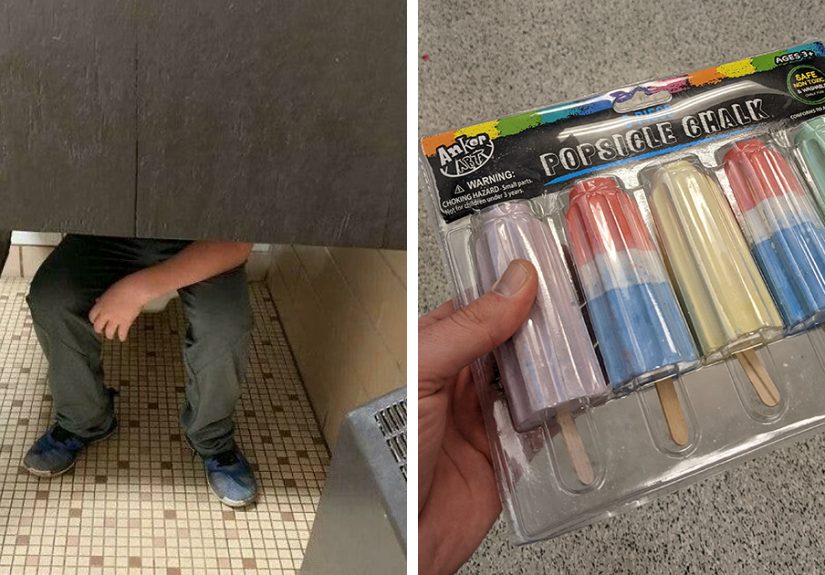
2. Cursed Bathrooms: Where Privacy Goes to Die
There’s a special place in design-fail history for terrible bathrooms.
Think:
- Toilet stalls with translucent or glass doors.
- Half-height partitions where you make uncomfortable eye contact at all times.
- Bathrooms where the sink or toilet is at the top of a random step.
- Showers with no curb, no slope, and absolutely no plan for where the water will go.
These aren’t just awkward; they’re often unsafe and unhygienic. Yet they
show up again and again because someone prioritized “minimalist” or “open
concept” over “Can people actually use this without embarrassment or
injury?”
3. Graphic Design That Accidentally Says the Worst Possible Thing
Graphic design fails are a gold mine of unintentional comedy. The classic
offender is bad kerning and spacing: a harmless phrase becomes wildly
inappropriate because letters or words run together in the worst possible
way. One famous example involves a “Kids Exchange” sign where the spacing
makes it read like something much darker.
Other common problems include:
- Too many fonts, all shouting for attention.
- Low contrast text (like light gray on white) that basically disappears.
- Busy backgrounds that fight with the message instead of supporting it.
- Center-aligned walls of text that are almost impossible to read comfortably.
Good typography quietly supports a message. Bad typography hijacks it and
becomes the entire story. That’s great for memes, terrible for brands.
4. Products Nobody Can Actually Use
Some designs seem built for a product photo, not a human hand. Common
product design fails include:
- Mugs where the printed logo is upside down when you actually drink from them.
- Handles positioned where you naturally grab the dangerous part instead of the safe part.
- Packaging that looks like one flavor or product but contains something completely different.
- Gadgets overloaded with tiny, identical buttons that no one can operate without the manual.
Product design experts regularly warn about skipping user research and
real-world testing. When teams design for the brief, the marketing image,
or the investor pitch instead of for everyday reality, you end up with
things that look clever and feel completely wrong in use.
5. Digital Interfaces That Make You Feel Lost
Bad app and website design deserves its own gallery of shame. UX research
firms have documented the same mistakes for decades: unlabeled icons, weak
feedback, confusing navigation, and interaction patterns that bury simple
tasks under layers of clicks.
Classic interface fails include:
- Mystery meat navigation where icons have no labels and no obvious meaning.
- Overuse of pop-ups and modals that interrupt the user before they can do anything.
- Hard-to-tap targets on mobile, like tiny buttons next to destructive actions.
- Desktop layouts clearly designed only for phones, leaving huge amounts of wasted space.
The result? Users rage-quit, leave bad reviews, or bounce to a competitor
that doesn’t make them solve a puzzle just to log in.
6. Trendy Design Ideas That Completely Fail in Real Life
Social media loves certain design trendsuntil people have to live with
them:
- All-white, high-gloss kitchens that show every fingerprint and coffee splash.
- Open shelving everywhere, which looks great in a styled shoot and awful in a real family kitchen.
- Glass stair treads that terrify anyone wearing a skirt or heels.
- Extreme minimalism that eliminates storage and forces clutter onto every surface.
Designers and builders regularly point out that trends should be filtered
through context: climate, lifestyle, maintenance, accessibility, and
budget. When that context disappears, you get homes that photograph well
and function badly.
7. Branding and Logos That Miss the Point
Bad branding isn’t just ugly; it actively damages trust. Common examples
include:
- Logos that look unintentionally suggestive when shrunk or rotated.
- Brand marks that disappear at small sizes or on dark backgrounds.
- Typography choices (like notorious overused novelty fonts) that feel cheap or dated.
- Color schemes that clash with the brand’s message or make text unreadable.
When businesses hesitate to show their own website or business card because
they’re embarrassed by the design, that’s a loud signal that something has
gone wrong. Good graphic design builds confidence; bad design makes people
wonder if the company itself is careless.
Why Do Terrible Designs Get Approved?
It’s easy to laugh at a disastrous design and assume the creators were
clueless. In reality, most design failures come from very human pressures
and very familiar mistakes:
- Rushing to meet a deadline. There’s no time for user testing, mockups, or a second opinion, so problems stay invisible until it’s too late.
- Designing in a bubble. Teams design for themselves or the client, not for the real people who will use the space, product, or interface.
- Overvaluing aesthetics. Designers or decision-makers chase a dramatic photo or “wow” factor and downplay safety, readability, or comfort.
- Poor communication. Architects, builders, marketers, and product teams misinterpret each other’s plans, so the final result doesn’t match anyone’s original intention.
- Cost cutting at the wrong moment. Cheaper materials, fewer revisions, or skipped expert reviews save money upfront and create expensive, embarrassing problems later.
Bad designs often slip through because no one is responsible for asking the
most important questions: “How will this actually feel to use?” and “What
could go wrong here?”
Lessons Good Designers Can Steal from Truly Bad Design
The silver lining of all these fails? They’re phenomenal teaching tools.
Every cursed staircase or unreadable poster can make your own work better
if you treat it like a case study.
1. Always Test with Real Users
The one thing every epic fail has in common is the lack of honest feedback
before launch. Even a quick round of user testingwatching a few people
walk through a space, use a prototype, or try a screencan reveal problems
you’ve gone blind to.
2. Put Safety and Accessibility First
Handrails, proper lighting, non-slip surfaces, readable fonts, sufficient
contrast, and logical layouts are not “nice extras.” They are the
foundation of good design. Accessibility guidelines in digital and physical
design aren’t just for compliance; they are cheat sheets for avoiding
disasters.
3. Respect Typography and Layout
If your message can be misunderstood because of spacing, font choice, or
color, assume that at some point it will be misunderstood. Use
clear hierarchy, generous white space, and enough contrast that someone can
read your design at a glanceon a small screen, from across a room, or in
bad lighting.
4. Design for Context, Not Just for Photos
Ask where and how your design will live: Who uses this? What are they
doing? Are they carrying groceries, watching kids, scrolling while tired,
or rushing through a train station? The more specific your mental picture,
the better your design choices will be.
5. Invite Critique Early and Often
Many of the worst design fails would’ve died in a meeting if someone felt
safe saying, “This seems dangerous,” or “This reads wrong.” Build teams and
processes where critique is normal and expected. A tiny bruise to your ego
in the design phase beats going viral for all the wrong reasons.
How to Spot a Bad Design in the Wild: A Quick Checklist
Next time you’re scrolling through a Bored Panda design listor just
walking through your neighborhoodtry grading what you see:
- Can you tell what to do in three seconds? If not, it’s probably confusing.
- Could someone get hurt? If a small change could prevent an accident, that’s a fail.
- Is the message clear at a glance? If you need to squint or re-read, typography and layout may be to blame.
- Does it work for more than one kind of person? Think kids, older adults, people with disabilities, or anyone distracted or in a hurry.
- Would you be proud to own or share it? If you’re cringing, the design needs help.
You don’t have to be a professional designer to recognize bad design. Once
you know what to look for, you’ll start seeing the patterns everywhere
from your local grocery store signage to the apps on your phone.
Real-Life Experiences with So-Bad-It’s-Good Design (Extra Stories & Takeaways)
It’s one thing to laugh at internet-famous design fails. It’s another to
notice how often similar issues sneak into everyday life. Think about the
last time a design made your day harder instead of easier.
Maybe you’ve walked into a public restroom where the doors left a huge gap
at eye level. Technically, the restroom “worked,” but it didn’t feel
private. That discomfort is a sign of design misalignment: the function
(privacy) was sacrificed for cheaper materials or a trendy minimal look.
Or picture a shopping mall parking garage. You circle the same level three
times because the signs are small, badly lit, or color-coded in a way that
only makes sense to whoever designed the map. The font is thin, the arrows
are tiny, and the layout seems random. By the time you find your car, you
don’t just dislike the garageyou’ve lost a little trust in the entire
place. That’s the emotional cost of bad design.
Bad digital design hits just as hard. Think about a time you tried to pay a
bill online and ended up on three different login pages. Maybe the “Pay
Now” button was hidden below the fold, or the site kept logging you out,
forcing you to re-enter information. None of that is technically a glitch;
it’s architecture. Someone chose this flow, and no one stopped to say, “This
is too much friction.”
Even home projects can accidentally veer into Bored Panda territory.
Imagine a DIY staircase makeover where each step gets a different patterned
tile. It looks quirky on Instagram, but in low light, the lack of visual
consistency makes the steps hard to judge, increasing the risk of tripping.
Or a living room painted in a super dark, trendy color with one tiny
ceiling lightcozy in theory, cave-like in reality.
These experiences all share the same DNA:
- The designer or decision-maker saw the design from their own perspective, not the user’s.
- No one tested the design in realistic conditions. Bright screens, staged photos, and daytime walkthroughs don’t reveal nighttime, stress, or distraction.
- Surface-level “wow” moments overpowered basic needs. Privacy, clarity, safety, comfort, and ease of use got pushed aside for something that looked cool, cheap, or fast to install.
Once you’ve lived through a few of these situations, you start to develop a
personal radar for bad design. You instinctively check for trip hazards,
scan for clear signage, and notice whether digital interfaces are guiding
you or fighting you. That awareness is powerfulnot just for professional
designers, but for anyone making decisions about spaces, products, content,
or communication.
The next time you see a “design fail” go viral with a caption like “Who
approved this?”, treat it as more than a joke. Ask:
- What problem was this design trying to solve?
- Where did the process break downresearch, communication, testing, or priorities?
- What’s one simple change that could have prevented the fail?
Thinking this way turns each bad design into a mini masterclass. Instead of
just laughing, you learn. You get better at spotting risk, anticipating
confusion, and protecting users from the same frustration you’ve felt
yourself. And that’s the real gift hidden inside every hilariously bad
staircase, bathroom, or graphic: it teaches us what not to do so
we can build a world that works better for everyone.
Final Thoughts
Horrible design will probably never disappearthere will always be rushed
timelines, trend-chasing clients, and ambitious DIY projects gone off the
rails. But the more we study the worst offenders, the more tools we gain to
prevent new ones. Laughing at design fails is fun; learning from them is
transformative.
Whether you’re a professional designer, a homeowner about to tackle a
remodel, or just someone who appreciates a really good meme, keep your eyes
open. The world is full of examples of what not to doand every confusing
sign, cursed bathroom, and dangerous staircase is an invitation to do
better next time.
sapo:
From death-defying staircases and cursed bathrooms to wildly inappropriate typography and unusable apps, bad design is everywhereand it’s often so bad it’s funny. This article takes you behind the scenes of the internet’s favorite design fails, explaining why they happen, what patterns they share, and how to spot similar mistakes in real life. Along the way, you’ll pick up practical lessons from epic architectural, interior, graphic, product, and UX disasters so you can avoid starring in the next viral “What were they thinking?” gallery.