Table of Contents >> Show >> Hide
- Why dark green works in so many homes
- How to choose the right dark green paint color
- 12 dark green paint colors designers always recommend
- 1) Current Mood (Clare)
- 2) Studio Green (Farrow & Ball)
- 3) Vintage Vogue (Benjamin Moore)
- 4) Goodwin Green (Benjamin Moore)
- 5) Enchanted Forest (Benjamin Moore)
- 6) Essex Green (Benjamin Moore)
- 7) Nature’s Reflection (Benjamin Moore)
- 8) Field Trip (Clare)
- 9) Secret Path (Benjamin Moore)
- 10) Duck Green (Farrow & Ball)
- 11) Waller Green (Benjamin Moore)
- 12) Nicolson Green (Benjamin Moore)
- Where dark green looks best
- Pairing cheat sheet: what makes dark green pop
- How to sample dark green paint (without regret)
- Common mistakes with dark green (and how to dodge them)
- Real-life experiences people have with dark green paint (the extra )
- Conclusion: the best dark green is the one that fits your light
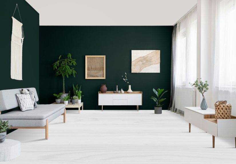
Dark green is the rare paint color that can look expensive in a rental and cozy in a mansion.
It’s moody without being gloomy, bold without screaming, and somehow manages to play “neutral” while still
bringing the personality. Think of it as the little black dress of wall paintexcept it pairs better with
brass, wood, and a basket of throw blankets you definitely did not mean to buy.
Designers keep coming back to dark green paint colors because they’re flattering in almost any style: modern,
traditional, farmhouse, maximalist, minimalist, “I just moved and everything is in boxes,” you name it.
The right deep green can make a bedroom feel like a boutique hotel, a dining room feel like a candlelit
bistro, or a kitchen feel like it belongs in a magazine spread (even if your “magazine spread” is two slices
of pizza on a paper towel).
Why dark green works in so many homes
Dark green is rooted in natureforests, gardens, olive grovesso it reads as familiar and calming, even when
it’s dramatic. It also has a chameleon-like quality: in bright light it can look fresher and greener; in dim
light it can shift deeper, moodier, and sometimes almost-black. That “it changes all day” effect is exactly
why designers love it (and also why sampling is not optionalmore on that soon).
- It adds depth fast: Dark green creates instant architecturelike your walls grew cheekbones.
- It’s surprisingly versatile: Works with warm neutrals, cool grays, jewel tones, and natural materials.
- It elevates “ordinary” spaces: Hallways, powder rooms, laundry roomssuddenly they feel intentional.
- It plays well with texture: Plaster, paneling, wainscoting, grasscloth, wood grain, stone, linen… yes.
How to choose the right dark green paint color
1) Start with undertones (aka: the secret personality of the color)
Dark green is not one shadeit’s a whole family. Some lean blue-green (cool and crisp), some lean olive
(earthy and warm), and some lean black-green (high drama, low forgiveness). If your room has warm bulbs,
honey oak floors, or lots of tan upholstery, an olive-leaning green will usually feel harmonious. If your
space is full of marble, chrome, bright whites, or north-facing light, a cooler green can feel cleaner.
2) Let lighting decide the final vote
Dark greens are famous for looking different depending on time of day and light source. A color that looks
like “rich forest” at noon can become “mysterious almost-black” at night. That’s not a flawit’s part of the
charmbut you want it to be the kind of dramatic you asked for.
3) Decide where you want the drama
If you want a bold statement with less commitment, use dark green on a single wall, built-ins, cabinets,
a front door, or wainscoting. If you want full immersion (the “I live in a stylish library now” vibe),
commit to all four wallssometimes even the ceilingfor a cocoon effect.
12 dark green paint colors designers always recommend
Below are 12 designer-loved dark green paint colors that show up again and again in professional spaces.
For each, you’ll get the vibe, the best places to use it, and a quick pairing tip.
1) Current Mood (Clare)
A bold, mysterious dark green that feels modern and cinematiclike your living room just learned how to
make a great espresso. This one is made for people who want drama without going full gothic castle.
- Best for: Accent walls, living rooms, dining rooms, home offices
- Pairs well with: Warm brass, crisp white trim, walnut wood, dusty pink accents
- Pro tip: Try it on ceilings for a “jewel box” room that still feels grown-up.
2) Studio Green (Farrow & Ball)
Studio Green is the ultimate “is it green or is it black?” conversation starter. In low light it can read
nearly black, but when light hits it, the green depth comes alive. If you want a space to feel intimate and
luxe, this is a designer classic.
- Best for: Bedrooms, powder rooms, libraries, dining rooms
- Pairs well with: Soapstone, matte black hardware, creamy off-whites, antique brass
- Pro tip: Use in a small room to create depthdark can actually feel expansive when done right.
3) Vintage Vogue (Benjamin Moore)
A smoky, ultra-dark green that can stand in for black or brownbut with more character. It’s dramatic, yet
flexible enough to work like a “designer neutral,” especially if your décor includes layered textures and
warm materials.
- Best for: Living rooms, accent walls, cabinetry, built-ins
- Pairs well with: Linen upholstery, natural oak, warm whites, muted terracotta
- Pro tip: Great starter dark green if you’re nervoussmoky greens feel softer than inky ones.
4) Goodwin Green (Benjamin Moore)
A deep, intense green with a historic, verdigris-inspired richness. It’s bold in a confident, collected way,
like a vintage watch or a leather-bound novel you didn’t buy just for looks (okay, maybe you did).
- Best for: Dining rooms, studies, statement cabinetry
- Pairs well with: Aged brass, dark wood, creamy whites, botanical prints
- Pro tip: If you love a monochromatic look, this is a strong “all-over” candidate.
5) Enchanted Forest (Benjamin Moore)
This dark green has a soft gray cast that makes it feel misty and calmless “Christmas tree,” more “foggy
woodland stroll.” It’s a great choice if you want depth without the sharpness of a near-black green.
- Best for: Bedrooms, family rooms, hallways
- Pairs well with: Stone, warm whites, light oak, charcoal accents
- Pro tip: Works beautifully with textured walls (limewash, plaster, grasscloth).
6) Essex Green (Benjamin Moore)
Essex Green is a deep, classic near-black green that feels timeless and tailored. If you want “historic
estate energy” without needing to inherit an estate, this is a top pick.
- Best for: Front doors, built-ins, dining rooms, mudrooms
- Pairs well with: Bright white trim, brick, polished nickel, natural fiber rugs
- Pro tip: Use a slightly higher sheen on doors and trim to make it look extra crisp.
7) Nature’s Reflection (Benjamin Moore)
A rich moss green with an organic, lived-in quality. This one feels earthy and groundingperfect if you want
a dark green that’s warm and welcoming rather than sleek and severe.
- Best for: Bedrooms, bathrooms, cozy living spaces
- Pairs well with: Warm taupes, creamy whites, woven textures, antique brass
- Pro tip: Add lots of soft lighting (lamps!) to make mossy greens feel extra inviting.
8) Field Trip (Clare)
Field Trip is a deep forest green that feels adventurous and naturallike your walls just came back from a
very refreshing hike and now want to talk about it (in a good way). It’s bold, but not overpowering.
- Best for: Accent walls, entryways, dining rooms, wainscoting
- Pairs well with: Warm wood tones, ivory textiles, black accents, vintage art
- Pro tip: If you’re unsure, try it on the lower half of the wall with a warm white above.
9) Secret Path (Benjamin Moore)
A lush, green-forward shade that feels fresher and more botanical than “almost black.” If you want a deep
green that still reads clearly green, Secret Path is a strong contender.
- Best for: Kitchens, breakfast nooks, bathrooms, playful studies
- Pairs well with: Bright whites, natural stone, light wood, warm metals
- Pro tip: Great in rooms that need a liftthis one can feel surprisingly bright for a deeper tone.
10) Duck Green (Farrow & Ball)
A smart, deep green inspired by the rich plumage of a mallard. Duck Green reads jewel-like and sophisticated
a “grown-up true green” that looks especially good in rooms meant for lingering.
- Best for: Dining rooms, bedrooms, statement walls, built-ins
- Pairs well with: Chocolate brown leather, brass, warm whites, traditional wood furniture
- Pro tip: Add velvet or bouclé nearbythis color loves texture.
11) Waller Green (Benjamin Moore)
Smoky, supple, and very deepWaller Green has a refined, “tailored suit” vibe. It’s a gorgeous alternative
to charcoal when you want something dark but less expected.
- Best for: Bedrooms, dining rooms, moody hallways, built-ins
- Pairs well with: Soft whites, warm grays, antique metals, layered neutrals
- Pro tip: Perfect for traditional spaces that need a modern edge without losing their charm.
12) Nicolson Green (Benjamin Moore)
A deep green with velvety richness and a historic pedigreethis shade feels grounded and sophisticated.
It’s the type of green that looks “collected” even in a brand-new room.
- Best for: Front doors, libraries, dining rooms, offices
- Pairs well with: Creamy whites, antique brass, dark woods, classic patterns
- Pro tip: If you love heritage style (or just want to look like you do), this one delivers.
Where dark green looks best
Kitchens and cabinetry
Dark green kitchen cabinets feel fresh but timelessespecially with warm brass pulls, natural stone, and
light walls. If painting all cabinets feels too intense, try an island, a pantry door, or lower cabinets only.
Bedrooms
Deep green walls create a restful, cocoon-like atmospherelike your bed just got upgraded to “luxury retreat.”
Add soft lighting and warm textiles to keep it cozy instead of cave-like.
Dining rooms
Designers love dark greens in dining rooms because they look rich in evening light. Pair with candlelight,
warm wood, and a few reflective surfaces (a mirror, glassware, metallic accents) to keep the room glowing.
Powder rooms
Small spaces are perfect for big color. A dark green powder room can feel like a jewel boxespecially with
bold art, a fun mirror, and hardware that shines.
Pairing cheat sheet: what makes dark green pop
- Trim: Warm whites (soft and classic) or crisp bright white (high contrast and modern)
- Metals: Brass and bronze for warmth; polished nickel for a sharper, tailored look; matte black for drama
- Woods: Walnut and espresso for a moody vibe; oak and rattan for an earthy, relaxed balance
- Accent colors: Blush/dusty rose, ochre, rust, navy, creamy ivory, and even plum if you’re feeling brave
- Textures: Linen, velvet, bouclé, leather, plaster, grassclothdark green loves a tactile supporting cast
How to sample dark green paint (without regret)
Dark colors are honest. They will tell you exactly what your lighting is doing, what your floors are doing,
and whether your bulbs are secretly the color of a nacho cheese sauce. Here’s how designers avoid surprises:
- Test in multiple spots: Put samples on the brightest wall and the darkest corner.
- Go big: A tiny swatch lies. Paint a large sample or use peel-and-stick samples big enough to judge.
- Check day AND night: Look at it in morning, afternoon, and evening with your actual lamps on.
- Compare to your fixed finishes: Hold the sample next to countertops, tile, flooring, and upholstery.
- Pick your sheen intentionally: Matte hides wall flaws and looks soft; satin/eggshell reflects more light and feels crisper.
Common mistakes with dark green (and how to dodge them)
- Skipping lighting: Dark green thrives with layered lightingoverhead + lamps + sconces when possible.
- Forgetting undertones: The wrong undertone can clash with floors and make the room feel “off.”
- Using the wrong sheen in high-traffic areas: Kitchens and hallways may need something more washable than flat.
- Not balancing with lighter elements: Use lighter rugs, art, trim, or textiles so the room feels intentionalnot heavy.
Real-life experiences people have with dark green paint (the extra )
If you’re considering dark green, it helps to know what it’s like to actually live with it day to daybeyond
the perfect photos. Based on common designer feedback and homeowner reports, here are the experiences that show up
again and again once the paint dries and real life moves back in.
First: people are often surprised by how “neutral” dark green can feel. Once furniture and rugs are
back in place, a deep green wall frequently reads less like a loud color choice and more like a backdrop that makes
everything else look intentional. Artwork looks sharper. Wood tones feel warmer. Even basic white bedding can appear
more luxe because the contrast is so clean.
Second: the color-shift is real. Many homeowners notice their dark green looks “different” throughout
the daysometimes in a good way, sometimes in a “wait, is this the same wall?” way. Morning light can bring out a
fresher, greener look; evening light can make the same shade feel deeper and moodier. This is why people who love
dark green usually become obsessed with lamps. Not because they suddenly got into lighting design, but because the
right warm bulbs make the space feel cozy, while cooler bulbs can make certain greens look more serious or slightly
stormy.
Third: dark green tends to collect compliments. It’s one of those colors guests notice immediately
often because it’s unexpected but still familiar. People commonly describe it as “cozy,” “elevated,” or “it feels like
a hotel in here,” which is basically the highest compliment a wall can receive without being offered a trophy.
Dark green powder rooms in particular get a lot of “wow” reactions, especially when paired with a great mirror and
hardware that pops.
Fourth: maintenance depends on finish and location. In hallways, kids’ rooms, or anywhere hands and
backpacks regularly graze the wall, homeowners often find that a washable eggshell or satin finish is easier to live
with than a dead-flat finish. Matte can look gorgeous, but it can also show scuffs more easily depending on the paint
line. In dining rooms and bedrooms, though, matte or flat can feel velvety and high-endespecially when the lighting
is soft and warm.
Finally: dark green can subtly change the mood of a routine. Rooms painted deep green often feel
calmer at night and more grounded during the day. People describe bedrooms feeling more restful, offices feeling more
focused, and dining rooms feeling more “special occasion” even on weeknights. It’s not magicpaint is not a therapist
but color absolutely influences how a space feels. And dark green, when chosen thoughtfully, has a knack for making
everyday spaces feel a little more intentional, a little more styled, and a lot more “yes, I meant to do that.”
Conclusion: the best dark green is the one that fits your light
Designers recommend dark green paint colors because they’re timeless, versatile, and instantly elevating. The key is
matching the shade to your room’s undertone, your lighting, and the level of drama you actually want to live with.
Start with a few favorites from this list, sample them properly, and let the room tell you which green belongs there.
When you land the right one, it won’t just look goodit’ll make the entire space feel more finished.