Table of Contents >> Show >> Hide
- What Is Double Drenching?
- Why Double Drenching Is Trending in 2025
- The Best Rooms for Double Drenching
- Best Color Combinations for Double Drenching in 2025
- How to Try Double Drenching Without Regret
- Common Double Drenching Mistakes to Avoid
- Is Double Drenching Good for Small Spaces?
- Decor Tips for a Double-Drenched Room
- My Experience With Double Drenching: What It Feels Like in Real Life
- Conclusion: Why Double Drenching Deserves a Place in Your Home
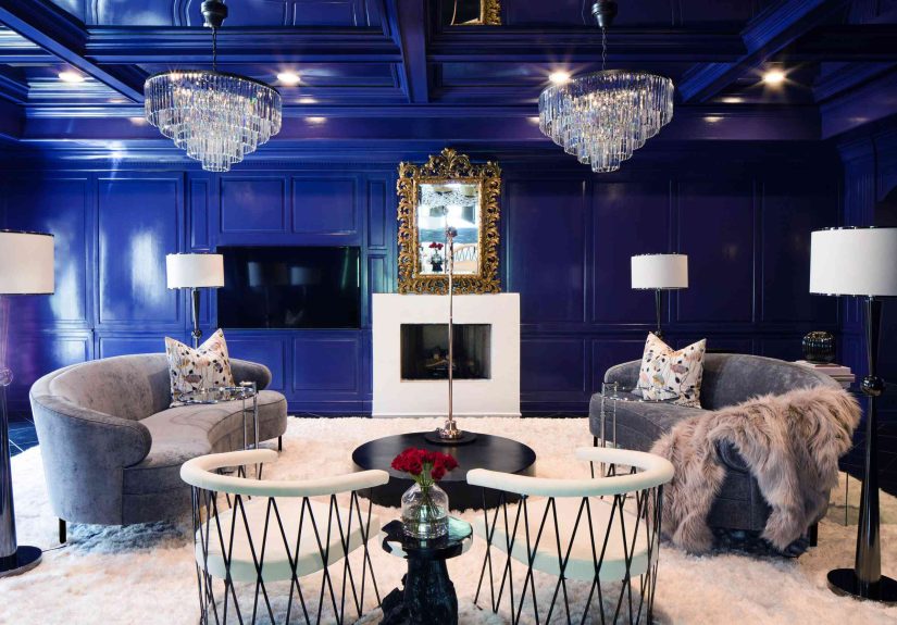
If color drenching walked so double drenching could run, then 2025 is officially the year interiors put on their best sneakers. For the past few years, homeowners and designers have been falling back in love with bold paint choices, wrapped-up rooms, moody ceilings, painted trim, and spaces that feel less like blank boxes and more like actual personalities. Now, double drenching is taking that idea one step further.
Instead of painting every surface in one single shade, double drenching uses two or more carefully related colors across walls, ceilings, trim, cabinetry, built-ins, doors, furniture, and sometimes even decor. The result is layered, immersive, and surprisingly livable. Think of it as color drenching’s cooler older cousin: confident, polished, and very good at choosing lighting.
The best part? Double drenching does not require a mansion, a celebrity designer, or a trust fund dedicated to throw pillows. It can work in a powder room, a hallway, a bedroom, a dining nook, or a living room that has been quietly begging for more personality since 2013. Whether you love deep burgundy, smoky blue-green, plum brown, warm beige, earthy red, or cozy chocolate tones, this 2025 interior color trend gives you permission to use color with intentionnot fear.
What Is Double Drenching?
Double drenching is an interior paint and decorating technique that surrounds a room with two or more colors instead of relying on one shade for the walls and a default white for everything else. These colors are usually connected by undertone, mood, or intensity. For example, you might pair a muted clay wall color with a deeper terracotta ceiling, or use soft sage on walls with a darker green-blue on trim and built-ins.
The goal is not random contrast. Double drenching works best when the colors feel like they belong in the same conversation. One color might lead, while the other adds depth, structure, or surprise. The ceiling may be slightly lighter than the walls to lift the room, or the trim may be darker to frame the architecture. In some spaces, the two colors are close cousins. In others, they are dramatic partners with just enough shared warmth or coolness to keep the look from turning chaotic.
Color Drenching vs. Double Drenching
Traditional color drenching usually means painting most, if not all, of a room in one color. Walls, trim, doors, and ceiling may all share the same shade or closely matched variations. This creates a cocooning effect that can make a room feel calm, bold, and intentionally designed.
Double drenching keeps that enveloping feeling but adds another layer. Instead of one uninterrupted color story, the room gets a richer palette. A bedroom might use dusty plum on the walls and velvety brown on the trim. A kitchen might pair deep red cabinetry with a warm beige ceiling. A home office could use a saturated green on built-ins and a softer moss tone on surrounding walls. It is still immersive, but it has more dimension.
Why Double Drenching Is Trending in 2025
Interior design in 2025 is moving away from flat, overly safe spaces. After years of white walls, gray floors, and rooms that looked suspiciously like they were afraid of joy, color is making a thoughtful comeback. Paint companies and designers are highlighting richer, warmer, more complex shades: dusty violets, earthy reds, blue-greens, plum browns, soft tans, chocolate browns, and warm neutrals with real personality.
Double drenching fits perfectly into this moment because it offers drama without messiness. It is expressive but not careless. It lets homeowners use bolder colors in a controlled way, creating rooms that feel custom, cozy, and editorial. In other words, your dining room can finally stop looking like a waiting room with better chairs.
It Makes Rooms Feel Designed, Not Decorated
There is a difference between a room that has been decorated and a room that feels designed. Decorating often means adding furniture, rugs, lamps, and art to a plain shell. Designing means the shell itself participates. Double drenching pulls the architecture into the story by treating ceilings, moldings, doors, shelves, and trim as part of the color plan.
This is especially helpful in homes with simple architecture. If your room does not have grand millwork, arched doorways, or dramatic beams, paint can create the sense of depth those features usually provide. A darker trim color can define edges. A painted ceiling can make a room feel complete. Built-ins in a related shade can look more expensive than they actually were, which is always a charming little victory.
It Adds Depth Without Clutter
Double drenching is also popular because it creates visual interest without requiring more stuff. Instead of buying another accent chair, three vases, two baskets, and a decorative object no one can identify, you can use paint to create atmosphere. The room gains richness from color relationships rather than clutter.
This makes the trend especially useful for small spaces. A powder room drenched in two moody tones can feel jewel-box chic. A narrow hallway can become memorable with a warm wall color and deeper trim. A small bedroom can feel restful when the ceiling, walls, and cabinetry are all part of one soft, layered palette.
The Best Rooms for Double Drenching
Double drenching can work almost anywhere, but some rooms are especially good candidates. The key is to choose spaces where atmosphere matters. If a room already has a clear purposeresting, working, dining, entertaining, readingcolor can strengthen that purpose.
Bedrooms
Bedrooms are ideal for double drenching because the technique naturally creates a cozy, cocoon-like effect. Try a muted rose-brown on the walls with a deeper plum-brown on trim, or pair soft blue-green walls with a smoky teal ceiling. These combinations feel restful without becoming boring.
If you prefer a lighter bedroom, use two warm neutrals instead. A creamy beige ceiling with taupe walls and matching trim can still count as double drenching when the colors are layered intentionally. The look is quieter, but still sophisticated.
Dining Rooms
Dining rooms love drama. They are often used in the evening, which means deeper colors can glow beautifully under warm lighting. Consider burgundy walls with chocolate-brown trim, olive walls with dark green built-ins, or dusty violet paired with a muted brown ceiling.
This is where double drenching can feel especially luxurious. Add brass lighting, linen curtains, wood furniture, and a few candles, and suddenly Tuesday pasta feels like it deserves a reservation system.
Powder Rooms
A powder room is the perfect place to experiment because it is small, separate, and low commitment compared with a main living area. You can go bolder here than you might in a family room. Try deep red walls with a blush ceiling, navy trim with smoky blue walls, or plum walls with warm brown cabinetry.
Because powder rooms are compact, double drenching can make them feel intentional instead of cramped. Add a mirror with character, warm sconces, and a small piece of art, and the space becomes a tiny design moment rather than a room people sprint through.
Home Offices
Color has a powerful effect on focus and mood. A double-drenched office can feel energizing, calming, or creative depending on the palette. Green and blue combinations are excellent for a grounded, productive space. Warm clay and brown tones can make an office feel cozy and serious. Plum and taupe can add elegance without feeling stiff.
For video calls, double drenching can also create a polished background. A painted bookcase or darker trim behind your desk can look much better than a blank wall and a lonely plant trying its best.
Best Color Combinations for Double Drenching in 2025
The most successful double-drenching palettes usually share undertones. Warm colors tend to work well with other warm colors, while cool colors pair best with cool or balanced shades. That does not mean you can never mix temperatures, but the relationship should feel deliberate.
Plum Brown and Soft Taupe
Plum-brown shades are having a major moment because they feel colorful and neutral at the same time. Use a heathered plum or cinnamon-brown tone on the walls, then layer it with taupe trim or a deeper brown ceiling. This combination is elegant, warm, and easy to pair with wood furniture, cream upholstery, and antique brass.
Ruby Red and Warm Beige
Deep red is one of the boldest 2025 color directions, but it becomes more livable when paired with warm beige, soft tan, or muted brown. Try red cabinetry with beige walls, or red walls with a calmer ceiling. The beige keeps the red from shouting across the room like it just won an argument.
Blue-Green and Deep Teal
Blue-green palettes are perfect for bathrooms, bedrooms, mudrooms, and offices. A soft blue-green can cover the walls, while deeper teal or green-blue highlights trim, doors, or built-ins. This pairing feels fresh, serene, and quietly luxurious.
Chocolate Brown and Creamy White
Brown is back, and no, it is not the sad brown of old basement paneling. Today’s browns are rich, earthy, and polished. Pair chocolate trim or cabinetry with creamy white walls, or use a mid-tone tan on the ceiling with deep brown doors. The effect is warm, grounded, and timeless.
Olive Green and Muted Gold
For a nature-inspired palette, combine olive green with a muted golden beige or soft ocher. This works beautifully in kitchens, breakfast nooks, and reading rooms. The green feels organic, while the gold adds warmth and brightness.
How to Try Double Drenching Without Regret
Double drenching is bold, but it does not have to be reckless. A little planning can save you from repainting at midnight while muttering things about “undertones” that would alarm your neighbors.
Start With One Dominant Color
Choose the main mood first. Do you want the room to feel calm, dramatic, romantic, cheerful, earthy, or tailored? Once you know the mood, select your primary color. This shade will usually go on the walls or the largest surface area.
Then choose a second color that supports the first. It can be darker, lighter, warmer, cooler, or more muted, but it should have a clear reason for being there. Use it on trim, ceiling, doors, cabinetry, or built-ins.
Test Paint in Real Light
Never choose a double-drenching palette from a tiny paint chip under store lighting. Paint samples on the actual surfaces you plan to cover and observe them during morning, afternoon, and evening. Colors change dramatically depending on natural light, artificial light, and what surrounds them.
A color that looks chic in the store may look muddy in a north-facing room. A red that feels rich online may turn into “ketchup with ambition” under cool bulbs. Testing is not optional; it is the part where your future self thanks you.
Use Finish Strategically
Finish matters almost as much as color. Matte or flat finishes can make walls and ceilings feel soft and velvety. Satin or semi-gloss can highlight trim, doors, and cabinetry. Using the same color in different finishes can create subtle contrast, while using two colors in similar finishes can make the palette feel seamless.
For high-traffic areas, choose durable, washable paint. For bathrooms and kitchens, make sure the finish can handle moisture and cleaning. A beautiful color is less charming when it cannot survive toothpaste splatter or spaghetti night.
Common Double Drenching Mistakes to Avoid
The biggest mistake is choosing two colors that compete instead of cooperate. Double drenching is not about grabbing two trendy shades and hoping they become friends. The palette should feel connected through undertone, saturation, or style.
Another mistake is forgetting the floor. Flooring has color, too. Warm wood, cool gray tile, beige carpet, black slate, or patterned rugs can all affect how paint reads. Always look at your paint samples next to your floor, furniture, and major textiles.
Finally, do not ignore lighting. Double drenched rooms often look best with layered lighting: overhead fixtures, sconces, lamps, and accent lights. Good lighting brings out depth. Bad lighting makes even expensive paint look like a questionable decision made during a long weekend.
Is Double Drenching Good for Small Spaces?
Yes, double drenching can be excellent for small spaces. In fact, it can make them feel more intentional. Many people assume small rooms must be painted white to feel bigger, but white can sometimes make a small space feel plain and unfinished. A layered color scheme can blur awkward edges, highlight charming details, and give the room a stronger identity.
For small rooms, try pairing close tones rather than high-contrast opposites. Soft sage with deeper green, dusty pink with clay, warm beige with caramel, or pale blue with smoky blue can all create depth without overwhelming the space. If you want contrast, keep it controlled by using the darker color on trim, doors, or cabinetry instead of every surface.
Decor Tips for a Double-Drenched Room
Once the paint is doing the heavy lifting, decor should support the palette rather than fight it. Bring in texture through linen, wool, velvet, rattan, leather, ceramic, wood, and metal. These materials prevent the room from feeling flat.
Art can either echo the palette or introduce one small accent color. Rugs should connect the paint colors to the furniture. Curtains can match the wall for a seamless look or contrast softly for movement. If the room is very saturated, balance it with natural materials and simple shapes.
Plants also work beautifully in double-drenched spaces. Greenery adds life and breaks up strong color fields. Just do not rely on one tiny succulent to rescue a dramatic burgundy room. That is too much responsibility for a plant the size of a muffin.
My Experience With Double Drenching: What It Feels Like in Real Life
The most surprising thing about double drenching is how quickly it changes the emotional temperature of a room. A plain room can be perfectly functional, but once you layer two intentional colors across the walls, trim, and ceiling, it begins to feel like a place with a point of view. The room stops being a container for furniture and becomes part of the experience.
One of the easiest ways to understand the trend is to imagine a small reading room. Before double drenching, it might have white walls, white trim, a beige chair, and a floor lamp. Pleasant? Sure. Memorable? Not exactly. Now imagine the walls painted a muted olive, the trim and built-ins painted a deeper green-blue, and the ceiling finished in a soft warm neutral. Add a brown leather chair, a brass lamp, and cream curtains. Suddenly, the room has depth. It feels calm, layered, and a little cinematic. You want to sit down, open a book, and become the kind of person who says things like, “I’m just finishing this chapter.”
In a bedroom, double drenching can make the space feel more restful because there are fewer harsh visual breaks. White ceilings and trim can sometimes chop up a room, especially when the wall color is deep. When the ceiling or trim is painted in a related tone, the eye moves more smoothly. This creates a softer, more cocooned feeling, which is exactly what many people want in a bedroom. Sleep already has enough enemies: screens, stress, caffeine, and that one mysterious noise from the hallway. Your paint color does not need to join the list.
In practical terms, the trend is also more flexible than it looks. You do not have to paint every single object in sight. A beginner-friendly version might involve painting the walls and ceiling in one color, then painting the trim, doors, or a bookcase in a deeper related shade. Another option is to keep walls soft and use the second color on cabinetry or furniture. Even painting the inside of a built-in bookcase a darker tone can create the double-drenched effect without overwhelming the room.
The biggest lesson is that confidence matters. Double drenching looks best when it feels intentional. If you paint one wall dark, leave the ceiling white, ignore the trim, and add unrelated decor, the room may look unfinished. But when you commit to a palette and repeat the colors across surfaces, the design feels cohesive. The room may be bold, but it will not feel random.
Another real-life advantage is that double drenching can make older or imperfect homes feel more charming. Uneven trim, awkward corners, and low ceilings can become less noticeable when color is used strategically. A darker ceiling can make a dining room feel intimate. Painted trim can give ordinary windows more presence. A tone-on-tone palette can make a small hallway feel like a designed transition rather than a forgotten passage to the laundry basket kingdom.
For anyone nervous about trying the trend, the best first step is a small room with a clear purpose. Powder rooms, offices, entryways, and guest bedrooms are great testing grounds. Choose two sample colors, paint large swatches, live with them for several days, and look at them in different lighting. If the colors still make you happy after breakfast light, afternoon glare, and evening lamps, you may have found your palette.
Double drenching is not about following a trend just because designers are talking about it. It is about using color to make your home feel more personal, more finished, and more alive. In 2025, that feels refreshing. Homes do not need to be loud to be expressive, and they do not need to be neutral to be timeless. Sometimes, the most stylish choice is simply giving a room the color story it has been waiting for.
Conclusion: Why Double Drenching Deserves a Place in Your Home
Double drenching is one of the most exciting color trends of 2025 because it combines boldness with sophistication. It gives homeowners a way to use rich, expressive color while still creating rooms that feel balanced, layered, and livable. Whether you choose plum and brown, red and beige, sage and teal, or chocolate and cream, the technique can turn ordinary spaces into memorable ones.
The secret is intention. Choose colors that connect, test them in real light, consider your finishes, and let the architecture participate. When done well, double drenching does more than change the color of a room. It changes the mood, the depth, and the way the space makes you feel. And honestly, if paint can make your hallway look expensive and your powder room feel glamorous, it deserves at least a polite round of applause.