Table of Contents >> Show >> Hide
- Why How to Decorate Still Matters
- What the Book Actually Teaches You
- The Decorating Philosophy Behind Farrow & Ball
- Standout Ideas You Can Steal for Your Own Home
- How the Book Connects to Today’s Color Trends
- Who Should Read How to Decorate?
- Final Thoughts
- Experiences Inspired by How to Decorate
- SEO Tags
If paint chips have ever made you feel like you were choosing a life partner under fluorescent lighting, How to Decorate from Farrow & Ball will feel oddly comforting. This is not a book that pats you on the head and says, “Just pick beige.” It is a decorating guide for people who want rooms with personality, polish, and a little nerve. In other words, it is for anyone who has stared at a wall and thought, “You could be better.”
What makes this Farrow & Ball book so appealing is that it treats color as more than surface-level prettiness. It looks at how paint interacts with light, architecture, mood, trim, ceilings, and even the strange emotional power of a hallway. That may sound dramatic, but anyone who has ever painted a room the wrong white knows that walls can absolutely ruin your week.
At its best, How to Decorate feels like a stylish friend walking through your home, coffee in hand, gently steering you away from tired shortcuts and toward smarter, more confident choices. It is practical without being boring, beautiful without becoming precious, and opinionated in the most useful way. If you love interior design books, paint color ideas, or home decor inspiration that actually helps you make decisions, this one earns its place on the stack.
Why How to Decorate Still Matters
Plenty of decorating books are gorgeous to look at and almost useless in real life. They show immaculate rooms with expensive lamps, twelve-foot ceilings, and not a single phone charger in sight. Farrow & Ball’s approach is more grounded. The book is built around the idea that great decorating comes from understanding how color behaves in real homes, not fantasy houses where nobody spills coffee.
That is why the lessons still feel relevant. The central message is not “buy this exact shade and your home will be transformed.” Instead, the message is “learn how to think about color, contrast, proportion, and mood, and you will decorate better forever.” That is a much more useful promise.
The book also aligns with where interior design has been heading in recent years. Homeowners are moving away from sterile, one-note spaces and toward rooms with warmth, texture, history, and color that feels lived in. Earthy reds, nostalgic yellows, nuanced greens, and muddy blues are back in the conversation. So are richer neutrals, layered finishes, and color-drenched rooms that feel cocooning rather than cold. In that sense, How to Decorate does not read like old advice. It reads like a manual for getting out of the endless loop of safe-but-forgettable design.
What the Book Actually Teaches You
1. Color is architecture, not just decoration
One of the smartest ideas running through the book is that paint changes how a room is perceived. It can widen a narrow hall, soften harsh edges, highlight molding, downplay awkward features, or make a tiny room feel more intentional. That is a big mental shift. Instead of treating paint as the final cosmetic layer, Farrow & Ball treats it as one of the first structural decisions in a room.
This is especially helpful if your home has architectural quirks. A dark, low-light hallway does not always need to be forced into fake brightness. Sometimes it makes more sense to lean into its mood and give it depth. Likewise, an odd ceiling line or busy trim detail may work better when blended into the room rather than outlined like it is trying to win an award.
2. Small rooms do not need timid colors
Here is one of the book’s most satisfying decorating truths: small spaces are not automatically improved by pale paint. In fact, strong color can make a compact room feel more cohesive and confident. When walls, trim, and even nearby woodwork sit in one tonal family, the eye does not stop and start at every edge. The room can feel calmer, bigger, and more deliberate.
This is why monochromatic decorating and color drenching continue to resonate. When everything is working together, even a modest room can feel polished rather than pinched. The trick is not just choosing a bold shade. It is choosing one that fits the mood you want and committing to it with enough confidence that the room feels styled, not accidental.
3. Trim is not required to be white forever
White trim is a habit in many homes, not a law of nature. How to Decorate makes a strong case for rethinking that default. Sometimes a crisp contrasting white is exactly right. But sometimes white rails, frames, or moldings can chop up a room and make it feel busier than it needs to be.
Painting trim in the same color as the walls can create a smoother, quieter envelope. Using a sympathetic tone can also add harmony without flattening everything. This is one of those details that sounds subtle on paper and makes a dramatic difference in person. A room with thoughtful trim choices often feels more expensive, even if the only thing that changed was the paint can.
4. Finish matters as much as color
Another strong lesson from the book is that sheen changes everything. A high-gloss finish on woodwork can bounce light and add dimension, especially in more traditional or detail-heavy rooms. Meanwhile, lower-sheen finishes can make a space feel softer, quieter, and more enveloping. The same color can read dramatically differently depending on whether it appears chalky, velvety, satin, or glossy.
This is where inexperienced decorators often get tripped up. They spend weeks agonizing over the perfect shade and then treat finish like an afterthought. Farrow & Ball’s advice reminds readers that decorating is about orchestration. Color, light, texture, and finish all need to play in the same band.
The Decorating Philosophy Behind Farrow & Ball
Part of the appeal of a Farrow & Ball decorating book is that the brand has always understood color as emotional. Its best shades are rarely loud just for the sake of being loud. Even the more dramatic options tend to have a dusty, complex, slightly historical quality that makes them easier to live with than trend-chasing brights.
That philosophy comes through clearly in How to Decorate. The book encourages readers to think about undertones, light exposure, the purpose of each room, and how colors relate from space to space. A kitchen does not need to feel like a separate planet from the dining room. A hallway can prepare you for what comes next. A bedroom should not just photograph well; it should also make you want to stay in it.
There is also a clear appreciation for homes that feel collected rather than over-coordinated. That matters. Many people assume that decorating well means matching everything to everything else until the room starts looking like it was assembled by committee. Farrow & Ball’s worldview is more nuanced. Harmony matters, but so do contrast, surprise, and the quiet tension between old and new.
Standout Ideas You Can Steal for Your Own Home
Use yellow more bravely
Yellow is often unfairly treated like the class clown of interior paint colors: cheerful, loud, and a little hard to take seriously. But the book shows how sophisticated yellow can be when it has warmth and depth. In hallways, breakfast rooms, or anywhere lacking energy, the right yellow can wake a space up without tipping into cartoon territory.
If your home feels flat, bland, or permanently overcast, a buttery or sun-washed yellow can be a smart antidote. The key is avoiding harsh, artificial-looking versions and choosing one with enough complexity to feel grown up.
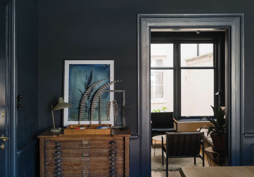
Let darker colors do their job
Dark paint is often misunderstood. People worry it will shrink a room, swallow the light, and make the walls close in like a Victorian novel. Sometimes that happens. But often, darker colors create depth, intimacy, and calm, especially when used consistently across surfaces or balanced with texture, art, and warm materials.
In bedrooms, dens, libraries, and moody entryways, deeper shades can make the room feel finished and comforting. The point is not to make every room dramatic. The point is to stop assuming pale colors are always the superior choice.
Decorate with the light you actually have
Natural light changes everything. North-facing rooms, for example, can pull cool and flat if you choose the wrong shade. South-facing rooms can make some colors glow and others feel washed out. That is why sample pots, test patches, and looking at paint at different times of day are not signs of indecision. They are signs of intelligence.
If a room gets little light, choose colors that create warmth rather than fighting for airy brightness that the space will never naturally offer. If the room is flooded with sunlight, you may have more freedom to use nuanced cools or richer tones. Decorating gets much easier when you stop forcing rooms to be something they are not.
How the Book Connects to Today’s Color Trends
Even though the title sounds timeless rather than trendy, How to Decorate feels right at home in the current design moment. Designers and editors are still talking about color drenching, earthy kitchen shades, saturated stair halls, historic-feeling blues, and warm neutrals with more character than plain gray. In other words, the market has caught up with the book’s point of view.
That is especially obvious in the renewed love for colors that feel familiar and comforting. Clay reds, softened greens, nostalgic yellows, muted pinks, and layered browns all fit the larger shift toward homes that feel personal instead of showroom perfect. Farrow & Ball has built much of its identity around exactly that kind of palette.
So if you are wondering whether this decorating book is still worth reading in a world of endless social media inspiration, the answer is yes. Instagram can show you a pretty room in three seconds. It cannot always explain why the room works. This book can.
Who Should Read How to Decorate?
This book is ideal for homeowners planning a refresh, renters looking for paint confidence, interior design lovers who collect decorating books, and anyone who knows they want a better-looking home but needs help translating taste into action.
It is especially useful for readers who are tired of generic advice. If you have read too many articles telling you to “keep it neutral” and “add pops of color” without defining anything, Farrow & Ball’s book will feel refreshingly specific. It gives you real principles: when to contrast, when to blend, when to embrace mood, when to make trim disappear, when to use gloss, and when a stronger color is the more practical move.
And yes, it also makes you want to repaint at least one room immediately. Possibly two. Maybe the hallway first. Hallways have been getting away with mediocrity for too long.
Final Thoughts
How to Decorate succeeds because it offers more than pretty pages. It gives readers a way to think. That may be the most valuable thing any interior design book can do. Rather than chasing fleeting trends or handing down stiff rules, it teaches a decorating mindset rooted in mood, proportion, light, finish, and personality.
The result is a book that feels stylish but usable, elegant but not intimidating. It respects the idea that homes should look beautiful, but also lived in. If your goal is a house that feels layered, welcoming, memorable, and unmistakably yours, this Farrow & Ball title is worth opening before you open the paint can.
Experiences Inspired by How to Decorate
One of the most relatable experiences tied to a book like this is the moment you stop decorating for imaginary buyers, imaginary guests, or imaginary magazine editors and start decorating for your actual life. That shift sounds simple, but it changes everything. Suddenly, the dark green study you love does not feel “too much.” The muddy pink dining room starts to feel sophisticated instead of risky. The hallway that once felt like a design afterthought becomes a chance to create mood the second someone walks in.
Many readers will probably recognize the trial-and-error rhythm that comes with using Farrow & Ball ideas in real homes. You test a sample. It looks dreamy at 10 a.m. By 4 p.m. it looks like oatmeal having a minor identity crisis. So you test another. Then another. At first it feels mildly ridiculous. Then, somewhere along the way, you start noticing undertones, shadows, and reflections like a detective in a stylish trench coat. That is when the process gets fun.
There is also a particular joy in watching one brave decision fix an entire room. Maybe it is painting the trim to match the walls so the space suddenly feels taller and calmer. Maybe it is using a richer tone in a small bedroom and realizing the room feels cozy instead of cramped. Maybe it is swapping a cold white for a warmer one and discovering that your art, wood furniture, and old brass lamp all look happier. Decorating wins are rarely loud. Often, they show up as a room finally exhaling.
Another real-world experience connected to this topic is learning that confidence matters almost as much as color. Hesitant decorating tends to look hesitant. A pale wall, bright white trim, random accent wall, and safe beige rug can all coexist in the same room, but they rarely create magic together. Once you commit to a direction, whether that means color drenching, strong contrast, or layered neutrals, the room starts making sense. It feels intentional. People may not identify exactly why it works, but they feel it.
And perhaps that is the biggest experience readers take from How to Decorate: decorating gets better when it becomes personal. Not chaotic. Not trend-blind. Personal. A home with thoughtful color, a little tension, a little warmth, and a few surprising choices simply feels more alive. It tells the truth about the people who live there. And honestly, that beats a perfectly safe room every single time.