Table of Contents >> Show >> Hide
- Before You Pick Anything: 6 Quick Rules That Save Money (and Regret)
- Budget Key (So You Can Scroll With Confidence)
- 75 Backsplash Ideas, Grouped by Style
- Smart Pairings: Make the Countertop and Backsplash Get Along
- Maintenance That Won’t Ruin Your Weekend
- DIY Reality Check: When It’s Worth Doing Yourself
- : Real-Life Experiences Living With Kitchen Backsplashes
- SEO Tags
A kitchen backsplash is basically the room’s eyeliner: it can make everything look sharper, brighter, and more “put together”
with a surprisingly small amount of effort. And unlike eyeliner, you’re allowed to redo it years later without anyone asking,
“Wait… is this a new face?” Whether you want timeless subway tile, a dramatic stone slab moment, or a renter-friendly glow-up
that peels off like a sticker (because it is), these ideas cover the whole style spectrumwithout pretending everyone has the
same budget or the same tolerance for grout maintenance.
Before You Pick Anything: 6 Quick Rules That Save Money (and Regret)
- Match undertones first. Look at your countertop and cabinets. Are they warm (cream, beige, honey oak) or cool (crisp white, gray, blue-black)? Pick a backsplash that plays nicely with that “temperature.”
- Decide the height early. A short 4-inch “countersplash” is budget-friendly; a full-height backsplash (counter to upper cabinets or ceiling) is a statement and easier to wipe in splash zones.
- Make the range area tougher. Behind the stove is where grease goes to start a new life. Consider fewer grout lines (larger tiles, slabs, panels) or a finish that cleans easily.
- Pick grout like it’s paint. High-contrast grout looks graphic, but it also highlights every line. Mid-tone grout is forgiving. Minimal-grout options (slabs, panels, large-format tile) are the low-maintenance MVPs.
- Test “real life lighting.” Under-cabinet lights can make glossy tiles sparkle (good) or make uneven handmade tile look extra “rustic” (also goodif you meant it).
- Spend where your eyes land. If money is tight, do a full-height feature behind the range and a simpler, cheaper field tile elsewhereor stop at a shelf ledge for a stylish half-height look.
Budget Key (So You Can Scroll With Confidence)
$ = budget-friendly DIY materials and/or simpler installs
$$ = midrange materials, more pattern/detail, or moderate labor
$$$ = premium tile, custom work, or full-height slabs/panels
75 Backsplash Ideas, Grouped by Style
Classic & Timeless Tile (1–15)
- White subway tile, classic running bond ($). It’s popular because it worksclean, bright, and easy to resell with.
- Subway tile stacked straight (vertical or horizontal) ($–$$). Same tile, more modern attitude.
- Beveled subway tile ($–$$). Adds shadow lines and dimension without changing your whole kitchen personality.
- Subway tile to the ceiling behind the range ($$). A tall “feature zone” that feels custom, even with basic tile.
- Warm off-white subway with warm grout ($). Perfect for wood cabinets and “cozy but not beige” kitchens.
- Marble subway tile with soft gray grout ($$–$$$). Elegant, light-reflecting, and quietly fancy.
- Small white hex tile ($$). A classic that reads fresh, especially with brass or black hardware.
- Penny tile in a neutral ($$). Retro charm; choose a medium grout if you don’t want to clean tiny circles forever.
- Herringbone subway ($$). Classic-meets-dynamicgreat when the rest of the kitchen is simple.
- Basketweave mosaic ($$). A timeless “tailored” look that pairs beautifully with marble-look counters.
- Classic checkerboard backsplash ($$). Black-and-white done small feels playful, not overwhelming.
- Glossy ceramic 4×4 squares ($). A vintage nod that’s having a comeback moment.
- Crackle-glaze ceramic ($$). Adds old-world character; keep the pattern simple so the texture shines.
- Glass subway in a soft tint ($$). Brighter than paint, easier to wipe than most textured tiles.
- Neutral stone-look porcelain ($$). Classic stone vibes with less worry about sealing and staining.
Modern Minimal & “No-Grout-Drama” Looks (16–25)
- Full-height countertop slab backsplash ($$$). Continuous stone/quartz up the wall = sleek, high-end, fewer seams.
- Porcelain slab panels ($$–$$$). Big impact, fewer grout lines, and you can get marble looks without marble stress.
- Waterfall veining behind the range ($$$). Let the stone pattern be the “art” and keep everything else calm.
- Two-thirds-height stone with a ledge ($$–$$$). Modern, practical, and gives you a place for oils, salt, and your “I cook” décor.
- Stainless steel sheet backsplash ($$). Restaurant-clean energy. Bonus: it reflects light and makes small kitchens feel bigger.
- Brushed metal tiles ($$). If you want shimmer without going full “commercial kitchen.”
- Back-painted glass panel ($$–$$$). One smooth wipe and it’s doneperfect for bold color lovers.
- Microcement or plaster-look finish ($$). Seamless and modern; keep it sealed and use gentle cleaners.
- Large-format matte porcelain tile ($$). Minimal grout lines, soft texture, and a calm, modern backdrop.
- “Counter-to-hood” feature only ($$–$$$). Put the premium material behind the range, then go simpler elsewhere.
Color & Pattern for the Bold (26–40)
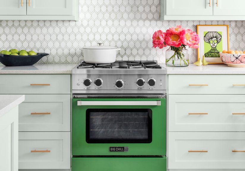
- Deep green zellige-style tile ($$). Rich, moody, and beautiful with brass, walnut, or creamy counters.
- Cobalt or navy glossy tile ($$). A high-saturation pop that still feels classic in the right layout.
- Terracotta tile ($$). Warm, earthy, and perfect for Mediterranean, farmhouse, or eclectic kitchens.
- Black backsplash tile with matching dark grout ($$). Sleek, dramatic, and surprisingly forgiving for stains.
- Soft “cashmere” neutrals ($). Mushroom, taupe, and creamy putty tiles make the kitchen feel warm and current.
- Bold encaustic-look patterned tile ($$). Go all-in or use it as a framed insert behind the stove.
- Geometric pattern in a muted palette ($$). Visual interest without making your countertop jealous.
- Color-blocked backsplash ($$). Two stacked tile colors create a modern stripe effect.
- Ombre/gradient tile layout ($$). Start light at the counter, go deeper as you risesubtle, artsy, unexpected.
- Hand-painted artisan tile accents ($$–$$$). Use a few as “jewelry” mixed into simpler field tile.
- Mosaic mural moment ($$–$$$). A range alcove is a perfect canvas for something scenic or abstract.
- Jewel-tone glass mosaic ($$). Looks especially good with under-cabinet lightinghello sparkle.
- Soft pastel tile ($$). Mint, blush, or powder blue can feel grown-up when paired with warm neutrals.
- High-contrast grout on white tile ($). Crisp and graphicjust know it will highlight every line (that’s the point).
- Color-matched grout for a “tile wallpaper” effect ($$). The pattern pops; the grid disappears.
Texture, Shape, and “Touch-Me” Tile (41–55)
- Fluted/reeded tile (vertical) ($$). Adds depth and makes ceilings feel taller. It’s like a backsplash with cheekbones.
- Fluted tile (horizontal) ($$). Great for long kitchenspulls the eye across the space.
- Kit-Kat/finger tile ($$). Skinny vertical sticks that look modern and a little architectural.
- Picket tile ($$). A fun shape that sits between classic and quirky.
- Scallop/fish-scale tile ($$). Soft curves that work beautifully in coastal and boho kitchens.
- Elongated hex tile ($$). Sleek geometry; looks especially good in warm neutrals or smoky blues.
- 3D geometric relief tile ($$–$$$). Choose monochrome so shadows do the talking.
- Mixed matte + glossy tiles ($$). Same color, different finishsubtle texture without busy patterns.
- Tumbled marble mosaic ($$–$$$). Old-world softness that pairs well with vintage-inspired hardware.
- Terrazzo tile backsplash ($$). Speckled and playful; pulls together multiple cabinet/counter colors easily.
- Mirror tile insert ($$). Use sparinglybehind a coffee station or barso it feels chic, not like a dance studio.
- Mixed-size subway layout ($$). Combine 2×8 and 3×12 tiles for subtle variation.
- Brick-lay “skinny” subway ($$). A more delicate, modern cousin of classic subway.
- Diagonal tile layout ($$). Simple tile becomes instantly more dynamic (and a tiny bit more labor).
- Stone mosaic border as “framing” ($$). A thin accent strip can make budget tile feel custom.
Natural, Rustic, and Warm Materials (56–65)
- Sealed exposed brick ($$). Cozy, textured, and full of characterseal it well so grease doesn’t move in permanently.
- Brick veneer panels ($$). Similar vibe, easier install, and less thickness than full brick.
- Natural stone slab (marble/quartzite) ($$$). High drama, high beautyplan for sealing and gentle care.
- Stone-look porcelain “marble” ($$). Luxury look, easier living, and no fear of acidic splashes.
- Warm limestone-look tile ($$). Soft, relaxed, and a great match for creamy cabinets and brass.
- Wood-look porcelain planks ($$). The warmth of wood, the wipeability of tile.
- Real wood slats (sealed) ($$–$$$). Gorgeous in a coffee nook; keep it away from direct stove splatter if possible.
- Shiplap backsplash (sealed + washable paint) ($). Farmhouse charmjust be realistic about grease zones near the range.
- Beadboard backsplash ($). Sweet, classic texture that works in cottage and traditional kitchens.
- Tin tile or faux tin panels ($$). Vintage personality; looks amazing with antique brass or oil-rubbed bronze finishes.
Budget-Friendly + Rental-Friendly Wins (66–75)
- Peel-and-stick tile panels ($). Fast upgrade with minimal messgreat for renters and commitment-phobes.
- Peel-and-stick wallpaper as a backsplash ($). Use in low-splash areas (coffee bar, dry wall zones) for big pattern impact.
- Painted “backsplash” with scrub-resistant enamel ($). Clean, simple, and surprisingly modern with the right color.
- Paint a faux tile grid ($). Tape, paint, peelyour wall gets a tile look without tile labor.
- Chalkboard or dry-erase panel ($). Grocery lists, doodles, and the occasional “DO NOT EAT THIS, IT’S MARINATING.”
- Acrylic or polycarbonate clear panel ($). Protect a wallpaper or painted wall behind the sink without losing the look.
- Stainless or aluminum sheet from a home center ($). Affordable, durable, and cleans like a dream.
- Laminate sheet backsplash ($). Easy wipe, lots of patterns, and a practical match for laminate counters.
- “Frame” the stove with a statement insert ($$). A small area of premium tile behind the range = maximum wow per square foot.
- Cover an outdated backsplash with a removable overlay ($). Panels and stick-on options can buy you time until a full remodel.
Smart Pairings: Make the Countertop and Backsplash Get Along
If your kitchen feels “almost right,” it’s usually a pairing issue. Here are combinations that tend to look intentional (instead of accidental):
- Black countertops + warm white tile: High contrast, but the warmth keeps it inviting, not sterile.
- Butcher block or warm wood cabinets + green tile: Sage, olive, or forest tones look grounded and timeless.
- Veiny stone counters + simple tile: Let the counter be the star; choose calm shapes and quieter grout.
- Plain counters + patterned backsplash: If the countertop is minimal, your backsplash can be the “art piece.”
- Stainless appliances + glossy tile or metal accents: Repeating finishes makes the whole room feel coordinated.
Maintenance That Won’t Ruin Your Weekend
- Daily reality: Smooth, glossy surfaces wipe easiest. Deeply textured tile looks gorgeous, but it can collect grime in the grooves near the stove.
- Be gentle: Skip harsh acids on grout and many natural stones. Mild soap + warm water goes far, especially for routine cleaning.
- Seal what needs sealing: Natural stone and many grouts benefit from periodic sealing. Your future self will thank youquietly, while sipping coffee in a clean kitchen.
- Pick finishes that match your lifestyle: If you cook daily, fewer grout lines can be a sanity upgrade.
DIY Reality Check: When It’s Worth Doing Yourself
DIY backsplashes are doableespecially simple subway tile, mosaics on mesh sheets, and adhesive tile mats. If your wall is very uneven,
you want a perfect bookmatched slab, or you’re installing something heavy (large stone panels), that’s where pros earn their keep.
- DIY-friendly: peel-and-stick panels, small ceramic tile, mosaic sheets, short countersplashes, straightforward layouts.
- Consider a pro: large-format tile that needs perfect lippage control, natural stone slabs, complex patterns, or anything requiring precision around outlets and open shelving.
: Real-Life Experiences Living With Kitchen Backsplashes
Here’s what homeowners tend to discover after the “before-and-after” photos stop getting likes and the kitchen goes back to doing kitchen things.
First: grout is either your best friend or your tiny enemy army. In real life, bright white grout in the cooking zone can feel like a bold life choice
the kind you make on a Tuesday and question on a Friday after spaghetti night. Mid-tone grout (think soft gray, warm greige, or even a color-matched grout)
often wins the long game because it doesn’t broadcast every splash like it’s breaking news.
Texture is the other big surprise. Fluted, handmade, and heavily ridged tiles look incredible under under-cabinet lightsinstant depth, instant “designer.”
But the same grooves can hold onto fine cooking residue if they’re right behind a busy stove. People who love to cook often end up appreciating smoother surfaces
in the highest-splatter zones, saving the textured tile for a coffee bar wall or a feature panel that doesn’t take daily heat.
Slab backsplashes earn their hype in everyday use. Fewer seams means fewer places for grime to set up camp. The visual payoff is big, too:
when the countertop material climbs the wall, the kitchen feels calmer and more expensiveeven if the rest of the finishes are fairly simple.
The “experience” catch is that slabs are a commitment. You’ll want to be sure you love the stone pattern because it’s going to be a main character,
not background scenery. For those who worry about stains or etching, porcelain slabs and quartz-look panels can deliver a similar vibe with less anxiety.
Budget and rental-friendly options can feel surprisingly satisfying. Peel-and-stick has improved a lot; when installed on a properly cleaned, smooth surface,
it can look convincing from normal standing distancewhich is how people actually live. Many renters also find that removable wallpaper “backsplashes”
make the kitchen feel personal without starting a battle with the lease. The key is placement: use wallpaper in areas that don’t get direct, frequent grease splatter,
and protect high-splash zones with a clear, wipeable panel if you want the look to last.
Finally, the biggest “I didn’t expect that” moment is how much a backsplash changes the mood of the room. A simple white tile can make a kitchen feel brighter
and more open. A deep green or navy backsplash can make it feel richer and more intentionalalmost like the kitchen is dressed for dinner.
Patterned tile can make the space feel joyful and custom, especially when the rest of the palette is restrained. In other words: the backsplash isn’t just protection.
It’s the kitchen’s personality, quietly doing its job while looking good in every photo.